Machi Building by UID Architects
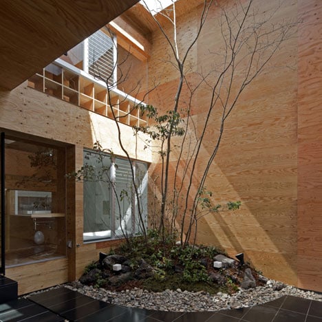
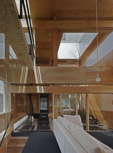
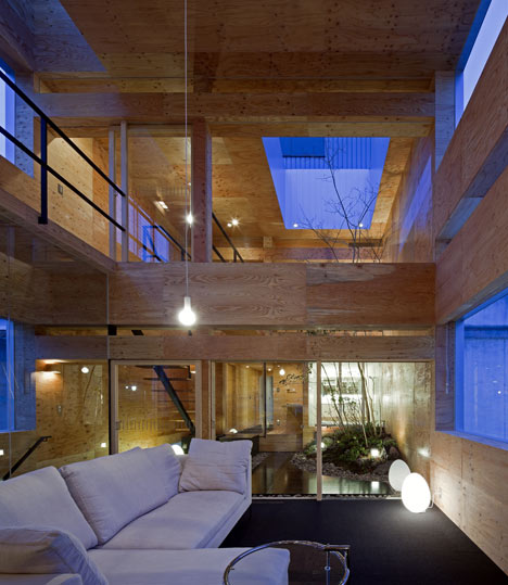
Japanese studio UID Architects installed a mound of earth and a tree into the centre of this renovated 40-year-old townhouse in Hiroshima.
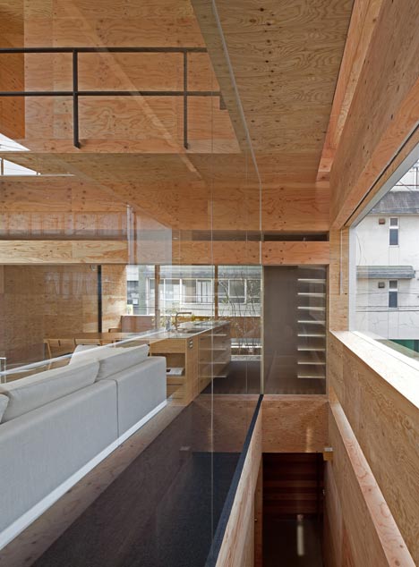
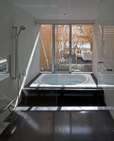
An opening in the roof brings natural light into the double-height courtyard, which is sandwiched between the living room and the bathroom on the middle floor of the house.
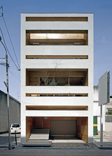
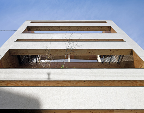
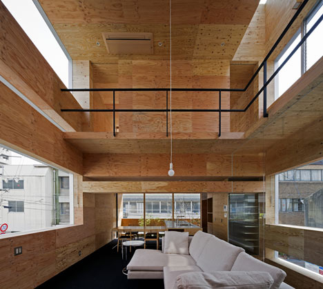
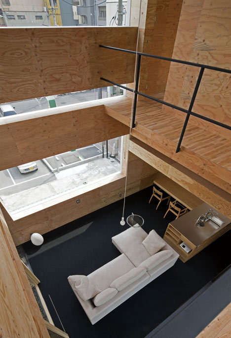
Architect Keisuke Maeda explains that there "were very few openings" in the walls before the renovation, so he created horizontal slices through the front and rear facades to bring in more daylight.
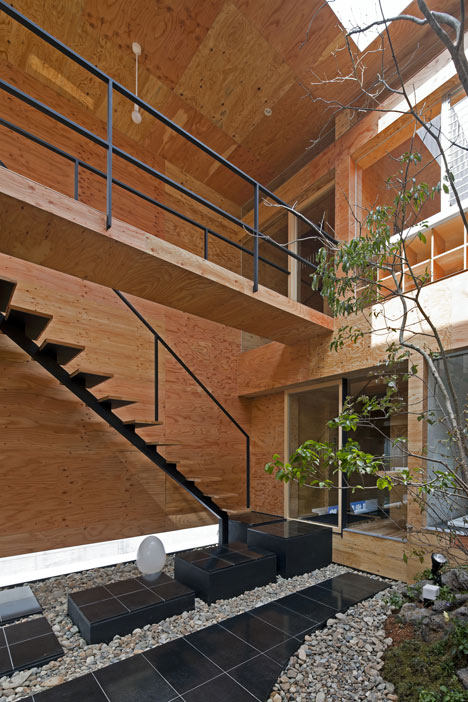
Timber boards line walls and ceilings throughout the house, and a new staircase connects the rooms on the first floor with bedrooms and balconies upstairs.
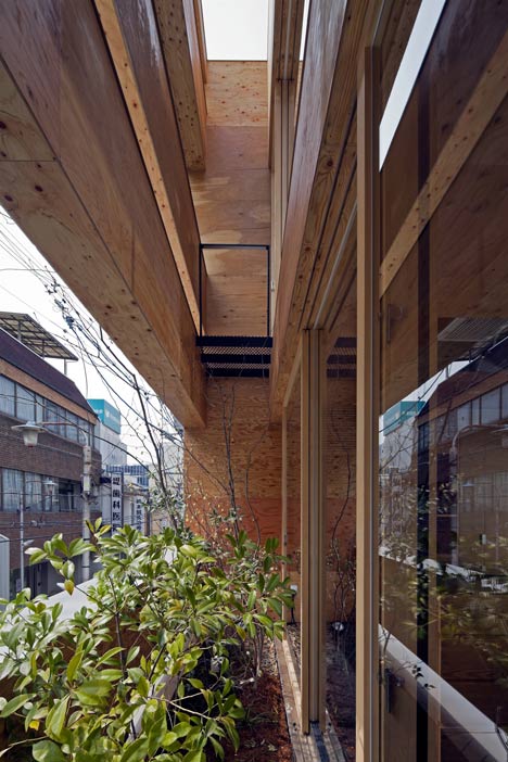
A garage occupies the ground floor, so residents enter the house at first floor level by using an outdoor staircase tucked between the two walls that make up the front elevation.
Maeda hopes this building will "become a catalyst" for renovation projects in the nearby area, giving "new value" to existing buildings "without dismantling them".
This is the second project we've featured this week by UID Architects, following a house with sunken rooms and curved balconies.
Other projects by the studio include a timber house at the foot of a mountain and a residence comprising four cedar-clad blocks.
See more Japanese houses on Dezeen »
Photography is by Hiroshi Ueda.
Here's some extra information from Keisuke Maeda:
This old steel-frame building was built about 40 years ago. The building was build when client’s parents did business. Therefore, it had a large parking space on the first floor and was three story building with high floor height. The site for this project has a narrow but deep frontage, which is typical in the center of town.
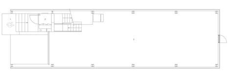
Ground floor plan - click above for larger image
The young couple and their children lived in the building, and they consulted me about the renovation when they intended to renew children’s room. I suggested a method to choose a renovation while I investigated the existing building without the drawing. The reason was that frame structure had high flexibility and I could secure existing total floor area by shifting demolition cost to earthquake strengthening as much as possible.
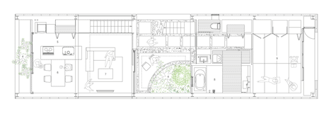
First floor plan - click above for larger image
I considered the height of the building across the road, and I planned to do the renovation which spent money on the second floor and the third floor. Because the building was in the situation there were very few openings before a renovation, clients couldn’t let in light and air from outside to inside. And the building did not have the connection of the upper floor and the lower floor. Therefore I divided north and south space centering around terrace on the second floor.
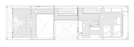
Second floor plan - click above for larger image
I expected that this project became a catalyst to give the new value that was new group of buildings built 40 years without dismantling by securing a new place to stay by using an existing frame. And I thought that this project became a renovation to be able to spin the time from parents to their children because I could achieve the theme to see children’ happy face.
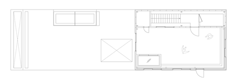
Third floor plan - click above for larger image
Name project: Machi Building
Architects: UID - Keisuke Maeda
Location: Fukuyama, Hiroshima, Japan
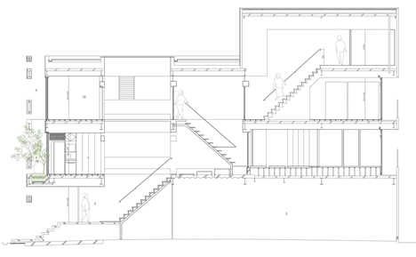
Section - click above for larger image
Consultants:
Structural engineers: IKE Structural Design - Hidekazu Ikeda
Landscape: Toshiya Ogino Environment Design Office - Toshiya Ogino
General contractor: OHKI KENSETSU Co.,Ltd.- Nao Inoue - Tomoyuki Matsuda
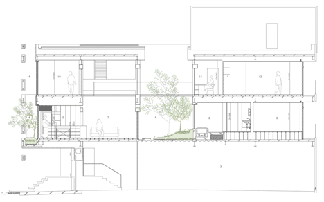
Section - click above for larger image
Structural system: steel construction
Site area: 130.24 sq m
Built area: 104.16 sq m
Total floor area: 262.85 sq m
Date of completion: March 2011