Bianco Nero by NI&Co. Architects
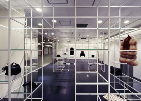
Garments and accessories are sparingly displayed in a three-dimensional grid of white steel cubes at this boutique in Osaka by NI&Co. Architects (+ slideshow).
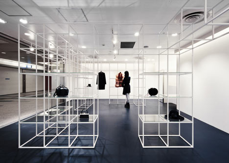
Named Bianco Nero, which translates as 'Black White', the shop has a monochrome colour scheme to complement the selection of clothing on show.
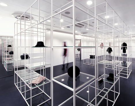
Some of the metal cubes contain glass shelves for hats and bags, while items of clothing hang from the horizontal elements.
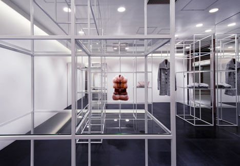
Gaps in the grid create frames for larger items, as well as doorways for shoppers to wander through.
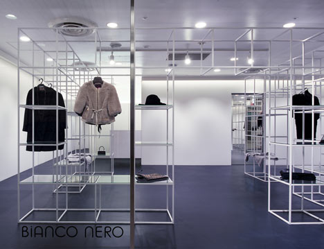
The installation is the only shelving within the space, giving it the look of a temporary shop, but designer Nina Funahashi says that she has created "a sustainable and changeable design that can be used for a long period."
Photography is by Yuko Tada.
The information below is from the designers:
‘Bianco Nero’ in Japan / Architect : NI&Co. Architects
It is an Italian mode boutique in Osaka, Japan.
‘Bianco Nero’ means ‘white and black’ in Italy, and we were required that the shop design suit the monotone clothes selected. We designed the small space in underground shopping center as widely as possible, and the space still keeps the functionality as a shop. The steel grid shelf in the shop has two functions that are to part the big space as if it were divided into some small ones and to bring a moderate distance between salesclerks and customers.
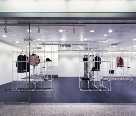
The layer-like shelf that overlaps several times creates a depth feel and a sense of unity to space, and has an effect that tightens the whole space. In addition, the shelf consists of 6 units and it can respond to various shopping space by changing the combination of units.