Winners of the Dutch Design Awards 2012
Dutch Design Week: this animation by filmmaker Christian Borstlap celebrates fashion house Louis Vuitton and has won the award for best Dutch design project at this year's Dutch Design Awards (+ movie).
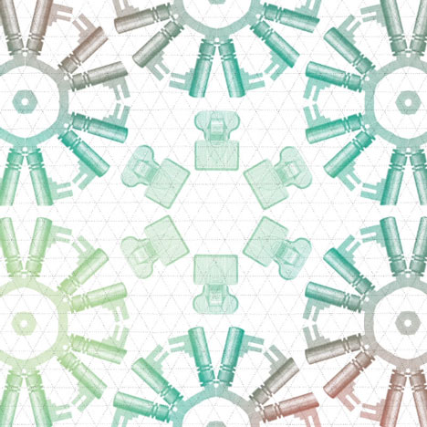
Above: still from Louis Vuitton I animation by Christian Borstlap
Top: Louis Vuitton I animation by Christian Borstlap
Titled Louis Vuitton I, the animation illustrates the history of the fashion house and was created for the Louis Vuitton Marc Jacobs exhibition at the Musée des Arts Décoratifs in Paris earlier this year.
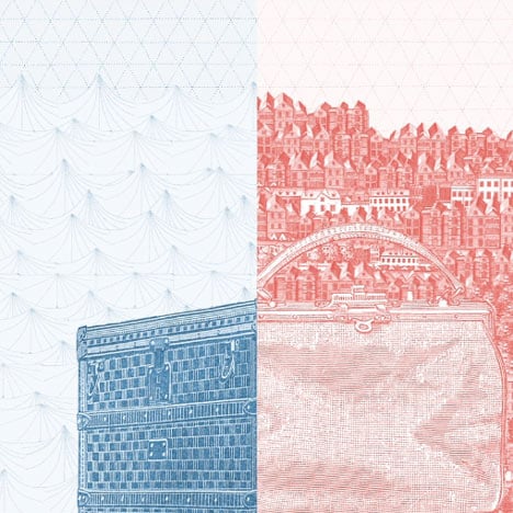
Above: still from Louis Vuitton I animation by Christian Borstlap
The movie won the Golden Eye award for best project and also came top in the motion design category.
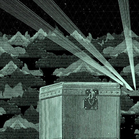
Above: still from Louis Vuitton I animation by Christian Borstlap
The awards were presented at a ceremony in Eindhoven during Dutch Design Week, which continues until 28 October.
The other winning projects are featured below, with captions provided by the judges.
Golden Eye: Louis Vuitton I by Part of a Bigger Plan, Christian Borstlap (above and movie)
Commissioned by Nowness, Christian Borstlap of Part of a Bigger Plan has created a new animation for Louis Vuitton. The design is a graphic homage to the designer Louis Vuitton, who in 1854 founded the famous fashion house.
International Jury: This animation is an ode to the industrial revolution through the ages. There is a good balance between serious and playful, without ever becoming childish. We praise the multi-layeredness: the message, the execution, the historical value, the story and even some kind of mild self-mockery are all present and in balance. Analogue craftsmanship and digital mastery go hand in hand
Photo credits: Christian Borstlap
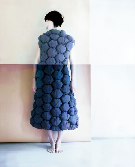
MINI Young Designer Award: Borre Akkersdijk (above)
Selection committee: The projects of (fashion) designer Borre Akkersdijk incorporate various disciplines such as graphic design, animation and fashion. In addition, the designer places existing materials in a new context and experiments with ancient techniques for new applications. This combination results in a fresh and individualistic style.
International Jury: Borre uses innovative materials and production methods. He also has an innovative and fresh approach to textiles. He looks at textiles from a product perspective, not necessarily as an aspect of fashion. By his way of textile use, he gives the dress an extra three-dimensionality. His portfolio shows excellent work, in which his story is propogated consistently in various artistic disciplines (film, fashion, graphic) consistently propagated.
Photo credits: Marie Taillefer
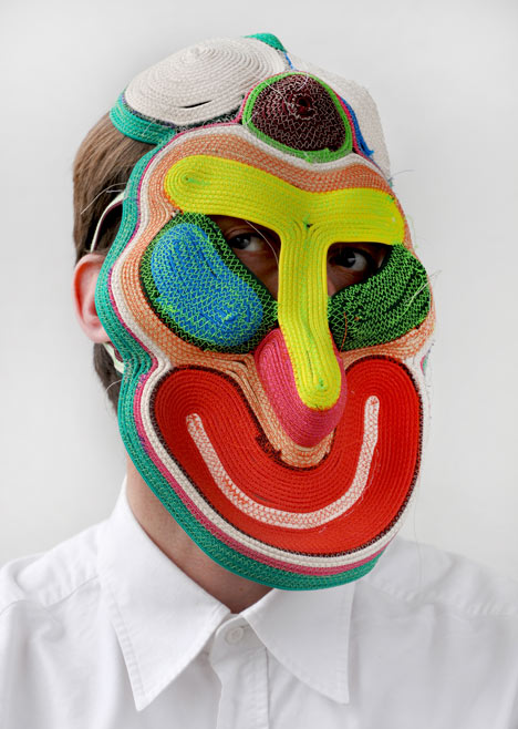
Best Autonomous Design: Masks by Studio Bertjan Pot (above)
In 2010, Bertjan Pot started a material experiment with the aim of constructing a flat carpet by threading ropes. Ultimately, the experiment resulted in a series of impressive masks.
Selection committee: the designer plays with the material, without being commissioned. He creates imaginative designs. Joy radiates from these masks.
International Jury: In the execution, the concept of craftsmanship is central. Moreover, this work represents the development that a design can go through. The designer travels from his initial goal, a carpet, to a new work that is an absolute expression of free design: a mask. A cheerful and attractive design.
Photo credits: Studio Bertjan Pot
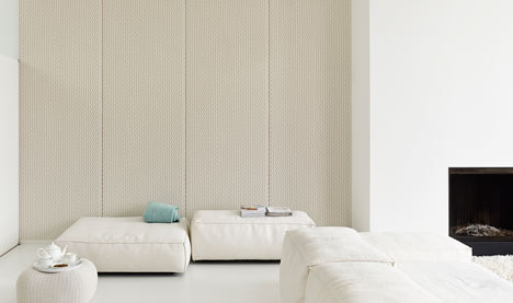
Best Professional Product: Casalis Architextiles by Aleksandra Gaca (above)
This series of sound-absorbing fabric with a textured 3D structure contributes to a more subdued atmosphere.
Selection committee: In the design, function, beauty and technology come together and craftsmanship is central. The design challenges us to think differently about the added value of textiles in contemporary interiors.
International Jury: Aleksandra Gaca shows a completely new way of applying textiles; in the current zeitgeist this innovation is very interesting. Gaca skilfully combines the synthetic and natural fabrics, which is a major technical challenge. Poetic design, with endless possibilities.
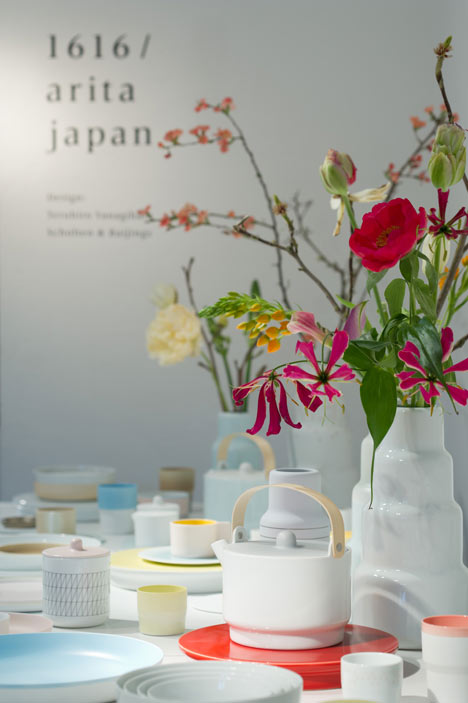
Best Consumer Product: Colour Porcelain by Scholten & Baijings (above)
Scholten & Baijings have developed tableware for Arita 1616, one of the oldest porcelain manufacturers in Japan. Colour and shape play an important role in the various table objects.
Selection committee: The designer duo has succeeded in applying a recognisable colour palette based on a thorough colour analysis of historical Japanese masterpieces, in a refreshing way. The tableware has a beautiful formal language. Surprising choices have been made with respect to the forms, lending them a specific kind of naturalness.
International Jury: This delicate service emanates absolute harmony, both in form, color and the application of glaze. The design subtly makes use of the past, which is what makes it strong. It is an ultimate match between consumer culture on the one hand and the design proposition on the other.
Photo credits: Takumi Ota
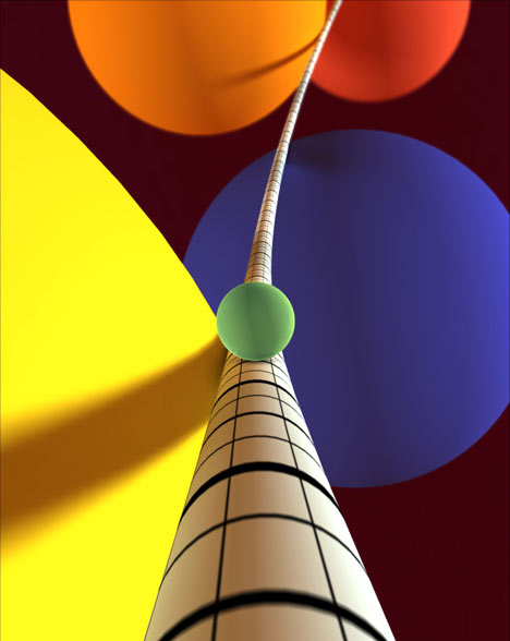
Best Digital Media: Proun by Joost van Dongen (above)
Proun is a free racing game of Dutch origin. You tear (in the shape of a little white ball) along a metal tube, avoiding various obstacles on the way.
Selection committee: The game includes exciting visuals and a unique game design. The tactile aspect, often a difficult element in digital games, is conveyed well. Proun is made by one single person, which is rather unique in the gaming world.
International Jury: Proun has succeeded in translating art into the world of games. An interesting conversion of static, abstract forms in moving pictures and attractive graphics. The work of Lissitzky is very well known, which makes it risky to deploy it in such a manner. Joost van Dongen has done an excellent job. His interpretation was expressed in a striking visual language that in the gaming world is experienced as a new language.
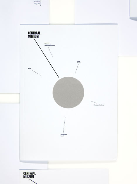
Best Graphic Design: Visual Identity Centraal Museum by Lesley Moore (above)
The new visual identity responds to the name of the Centraal Museum; the dot represents the central location – in the middle of the Netherlands – and the significance of the museum as cultural centre in the city of Utrecht.
Selection committee: The identity reaches beyond the scope of a logo. Despite its dominance, the image merges well with the content, which makes the application of the logo very wide. Besides, the logo hold its own in every expression. The symbol is significant for the location and the museum.
International Jury: Strong in its simplicity. This visual identity radiates a typical Dutch no-nonsense mentality, said the international jury. The identity is timeless, and lends itself to flexible applications in the various manifestations. The identity is continuously well integrated.
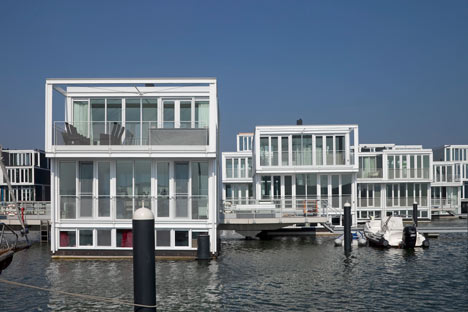
Best Exterior: Waterwoningen IJburg, Amsterdam NL by Architectenbureau Marlies Rohmer (above)
On the Steigereiland in the IJ, a compact, urban floating water district was designed, with homes in various categories, ranging from owner-occupied housing to social housing.
Selection committee: A good example of an urban solution, which through the application of modules has resulted in an almost natural-looking variation. It has an almost Venetian appearance and from a distance, it looks like an inspiring marina. The rudimentary design is a strong feature.
International Jury: Aesthetically strong design that responds to a new way of living. The floating homes have an interesting composition that clearly refers to the structure and layout of the Amsterdam canals. Despite the fact that these are new premises, they already fit in the history of Amsterdam.
Photo credits: Luuk Kramer
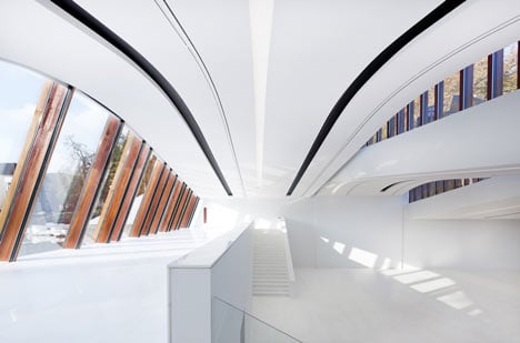
Best Interior: Drents museum, Assen by Erick van Egeraat (above)
The new development of the Drents Museum was carried out by architect Erick van Egeraat. In the design, the existing Koetshuis has been given a new function as the Museum’s main entrance. The staff building is put on a glass plinth. In addition, underground spaces have been added, connecting the old and the new part.
Selection committee: The museum has a strong sculptural power. Emerging from its restraint, the design becomes a dominant presence. Despite this, the design does not stand in the way of potential exhibitions. Furthermore, all the classic elements that a museum should have, are implemented carefully. By reversing the routing – i.e. by turning the Koetshuis into the entrance and adding an underground museum space – the Drents museum itself becomes part of the exhibition. In this way, the history of the museum remains intact, but the premises get an entirely new look. In addition, the garden is an interesting complement to the existing park in the vicinity. In terms of urban planning, this is an extremely strong project.
International Jury: An overwhelming experience and change. It is a great challenge to be innovative without affecting the old. The design has a modern look in which the original architecture is well preserved. Designed and implemented with respect for the spirit in which the museum was built.
Photo credits: J Collingridge