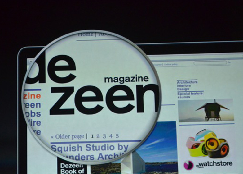
News: Dezeen featured in a presentation of new products by Apple for the second time at an event in San Jose, California, yesterday evening.
The Dezeen homepage was used in a talk by Apple's senior vice president of worldwide marketing Phil Schiller to illustrate the clarity of text on the screen of the new 13-inch MacBook Pro, which features a 4,096,000-pixel retina display (above).
Also launched during the keynote presentation was Apple's new iPad mini (above), a scaled-down version of the iPad which features a 7.9-inch touch screen display and 5 megapixel cameras, plus it runs all of the same apps as it's larger counterpart.
Last month Dezeen featured in the launch of the iPhone 5 and made an appearance in the official movie. Dezeen editor-in-chief Marcus Fairs explained how the collaboration came about in a story on Dezeen that was picked up by technology site MacRumors, who speculated over whether Apple would use Dezeen again and sent so many visitors our way that the site went down for a moment.
Thanks again to long-term collaborators Zerofee for creating the bespoke pages that were used in the demo.
Also last month, Apple was named best design studio of the past 50 years by D&AD and it emerged that their senior vice president of industrial design Jonathan Ive is to design a camera for German brand Leica. See all our stories about Apple.

