Hard hats and high visibility jackets are displayed as fashion items at this Singapore boutique that architects Ministry of Design designed for a safety equipment brand (+ slideshow).
As the flagship store for Durasafe, the shop was conceived as a retail space that would attract mainstream shoppers. "The intention is to broaden the appeal to capture new interest from anyone interested in cool hats, boots, gloves, etc." explained Ministy of Design's Joy Seah.
She also described how the store will appeal to industry professionals. "For example, a structural engineer may prefer to get his own streamlined Raf-Simons-looking safety boots instead of the standard issue ones, or an architect might want his own construction hard hat in a gorgeous colour," she said.
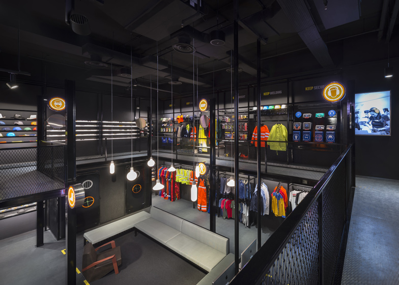
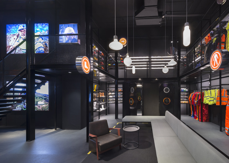
The shop is styled like an industrial warehouse with black walls, metal staircases and cage-like balconies.
"We drew inspiration from the building and manufacturing industries for the scaffold-inspired display system, signage and floor markings and the watertight bulkhead doors at the changing rooms," explained architect Colin Seah.
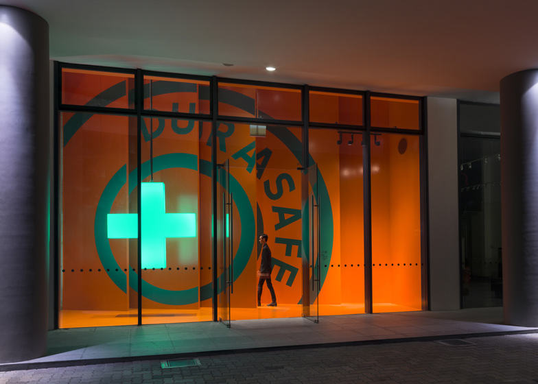
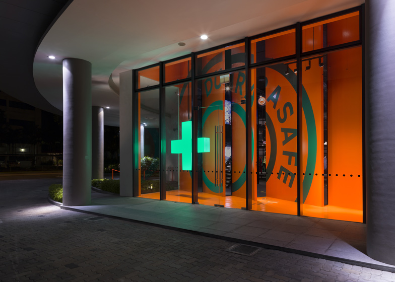
Bright orange screens mark the entrance to the shop, where customers pass by a bright green cross that forms part of the company logo. "The whole frontage of the boutique is essentially about the logo and you walk right through it," said Colin Seah. "There is no product or even hint of the product at the start, which is quite atypical for most boutiques."
Dashed yellow lines on the floor denote different display zones, which are also marked with orange graphics designed by the studio.
Other recent projects by Ministry of Design include a property showroom with a rampart-like facade and an extremely pointy pavilion.
Photography is by Edward Hendricks, CI&A Photography.
Here's a project description from Ministry of Design:
Durasafe Retail Store
Ministry of Design continues its exploration of retail and exhibition design with the unique Durasafe store - the flagship retail environment for Singapore's leading supplier of premium safety gear and equipment.
Durasafe, extending its reach beyond the "business to business" model to include a consumer based store, approached Ministry of Design to create a retail environment that would reinforce its existing strong brand presence as well as provide an exciting shopping environment for its predominantly male customer base.
Situated in a 6m high modern warehouse space, MOD's design for the Durasafe store is a multi-layered spatial experience that dramatizes the entire process of shopping. The entire facade of the store serves as a backdrop for an over-sized Durasafe logo and dominates one's first visual impression.
Passing through this strongly coloured backdrop, one walks into a completely different space, an entirely black environment which allows the multi-coloured safety products on display to visually pop and take a place of prominence.
The space comprises a double storey display scaffold-like structure surrounding a feature display area and retail lounge. Inspired by the industrial environments and construction sites where Durasafe's products are most commonly employed, the 'scaffold' allows the products to be clearly displayed in distinctive categories - these are further called out with custom designed graphic logos in light boxes.
Ground and first floor plans - click above for larger image
The 'scaffold' also exploits the high ceiling space and introduces a sense of adventure and exploration into the shopping experience. This "industrial chic" atmosphere is further enhanced by changing rooms adorned by actual water tight bulkhead doors, a display table made from a 6 m long customized floor trolley and yellow graphic boxes embedded in the floor calling the different zones.
Signage graphics
Scope: Interior Design + Graphic Design
Size: 175 sqm
Location: Singapore
Completed: 2012


