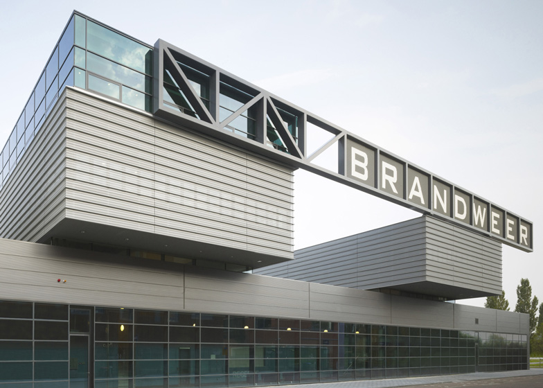
The upper floors are stacked at right angles across garages at this fire station in the Netherlands by René van Zuuk Architekten.
Located on an educational campus in Dordrecht, the fire station is positioned between the motorway and a school, so René van Zuuk Architekten was asked to design a building at least twelve metres high to function as a noise barrier.
The fire station comprises five building volumes, including a row of three at ground level, plus two more stretched across the rooftops.
Garages, workshops and a car park are contained inside the double-height ground floor spaces, while offices and social spaces occupy the two upstairs floors.
The architects used an industrial materials palette, including perforated aluminium, green-tinted-glass and translucent polycarbonate.
This is the second fire station we've published on Dezeen, following one with an illuminated glass tower.
We've also featured a few police stations, including one with a wall of copper louvres and one with four concrete arms.
Photography is by Christian Richters.
Here's a project description from René van Zuuk Architekten:
Fire Station Dordrecht – René van Zuuk Architects
Together with the GHOR and ROC on the Learning Park in Dordrecht, a plot was assigned for a second fire station. This 'Multi functional aid station' lies on the edge of an educational district. A triangular plot was assigned to the fire station, where the front line should form a zigzag border edge. The urban plan also states that the fire station should be a minimum of 12 meters in height to act as a noise barrier between the school it backs on to and the N3 road opposite.
The project mainly consists of fire engine garages, two workshops, a 24 hour social area and an office area. In total they occupy 5560 m². In addition, parking spaces are provided for 24 employees. There is also a smaller garage for the special ambulance service and supporting functions which covers 400m². A 190m² Regional Training Centre occupies the smallest part of the complex which houses a number of classroom and practice examination rooms.
The length of overhead doors required for all vehicles exceeds the length of the useable site parameter, the solution was found in creating two streets in which there was the right amount of space for all the doors.
Reading left to right, the three volumes that align the streets are firstly the fire brigade and the special ambulance service; secondly the workshop, and lastly 24 parking spaces.
The entrance can be found on the Western facade, from here you can access the upper levels. The upper levels consists of two perpendicular volumes; in the first, facing the highway, there are the workshops; in the second volume, which is over two storeys, is the 24 hour social area which is paired with the Regional training area. The offices are on the second storey.
The concept of stacking the volumes is enhanced by the detailing used. On the ground floor there is a combination of polycarbonate and dark sandwich panels. The translucent polycarbonate adds an even spread of light to the workshops and garages. The 24 parking spaces are enclosed by a stretched sheet metal fence.
The first storey is clad with perforated aluminium sheeting which simultaneously allows light into the spaces without compromising the privacy of the workers. On the second floor the facade is completely open using a green tinted glass to provide a light working environment. There is an industrial palette used to help read the building as fitting to its function.
Function: Fire station, special ambulance service and a regional trainings centre
Location: Leerpark - Professor Kohnstammlaan 10, 3312 KL Dordrecht, The Netherlands
Project: René van Zuuk Architekten
Project Team: René van Zuuk, Kersten Scheller, Peter Hagelaar, Wulf Oschwald,
Client: Municipality of Dordrecht,
Start of design: 2006,
Completion: 2010-2011,
Area: 7.000 m²,
Volume: 32.850 m³
Building costs: €10.000.000
Above: site plan - click for larger image
Above: ground floor plan - click for larger image
Above: mezzanine floor plan - click for larger image
Above: first floor plan - click for larger image
Above: second floor plan - click for larger image
Above: elevation A - click for larger image
Above: elevation B - click for larger image
Above: section C - click for larger image
Above: section D - click for larger image
Above: section E - click for larger image
Above: section F - click for larger image
Above: section G - click for larger image

