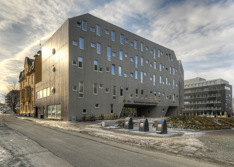
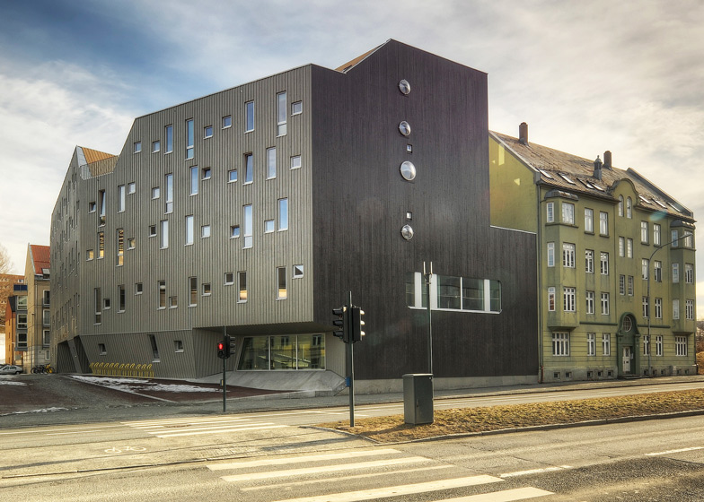
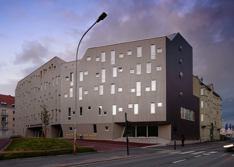
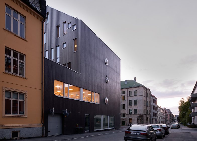
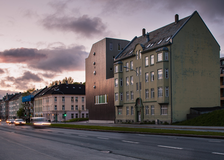
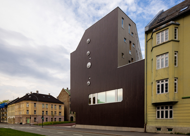
This student housing block in Norway by MEK Architects is named MySpace, as the architects imagined the building as a social network where each of the 116 residents can get to know one another (+ slideshow).
Above: photograph is by Matthias Herzog
MEK Architects, comprising Spanish studio Murado & Elvira and architect Enrique Krahe, designed the housing block for the Norwegian University of Science and Technology in Trondheim as part of the Europan housing design competition.
Above: photograph is by Matthias Herzog
Rather than group the building into separate apartments, the team decided to create large social areas that would unite every student, including a large lounge and a shared kitchen where everyone has their own separate storage area and fridge.
"The shared kitchen is the space where common life is negotiated," explain architects Juan Elvira, Clara Murado and Enrique Krahe, and they describe how this ground floor space is used for social activities such as pancake contests and cooking seminars.
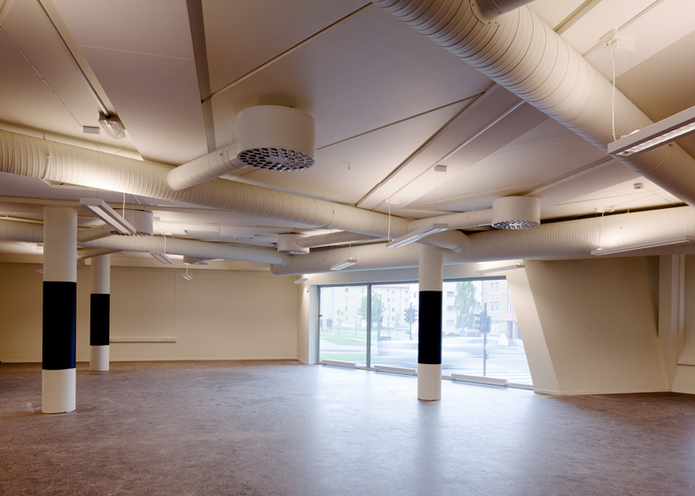
A lounge occupies most of the first floor and is divided into different areas, which students are encouraged to customise to suit their day-to-day activities.
Above: photograph is by Matthias Herzog
"The building can be looked upon as something that is unfinished, because it calls for permanent completion by its inhabitants in the search for a more satisfying community life," say the architects.
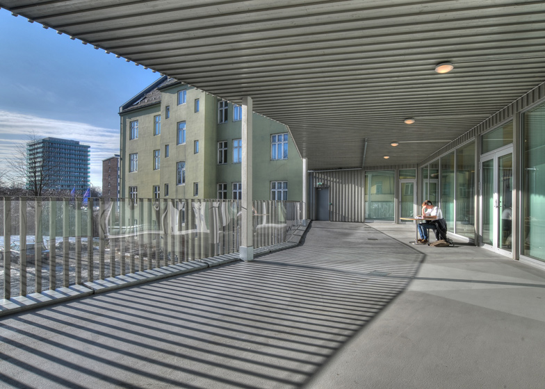
Bedrooms line one edge of this lounge and also fill the four floors above, while study areas are positioned in the corridors and on balcony terraces, allowing students to easily work in groups.
The building is located at the end of two existing housing blocks and copies the roof pitches of its neighbours.
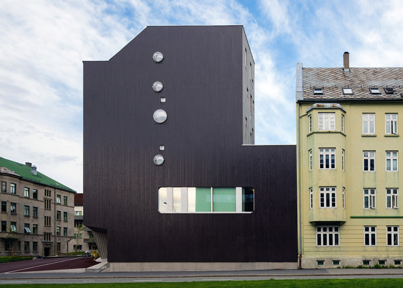
The facade is clad with pine and is painted in shades of grey and black.
Other student housing projects on Dezeen include a building modelled on a stack of baskets and a tower block with a patchwork of brown panelling on its facade.
See more stories about student housing »
Photography is by Miguel de Guzman, apart from where otherwise stated.
Here's an explanation from MEK Architects:
‘MySpace’ student’s housing in Trondheim (Norway) is the outcome of a winning entry of Europan 9 by MEK Architects, Clara Murado, Juan Elvira and Enrique Krahe. The competition brief called for a student house between the Nidelva River and the main University Campus.
MySpace residence proposes the compression, transfer and conditioning of the relational capacities of urban space. Soon the client (a student-run association named SIT that looks after student room availability) showed the need to fit in some extra 40% rooms within the original volume, also lowering the already tight budget.
Above: photograph is by Matthias Herzog
Assuming the existing urban conditions, the student housing detaches as much as possible from the surrounding buildings and shapes its volume in order to extract potential from the views and sun. Open-air terraces are spread around the building. Through them, students can experience outside conditions and relate with the city and the far views.
In order to stress a local initiative that intends to promote Trondheim as a wood-friendly city, and also seeking new challenges about wood use in large buildings, the entire exterior volume of the building is cladded with fir (pine) wooden planks, displaying different treatments, compositions and layouts.
As a result of a special regulation that considers Elgesetergate as a road instead a street, no windows for rooms are allowed to be opened on that elevation. The front and the rear are thus conceived as thick containing membranes, while only corridors and lounge are able to look over the street.
The core of the building contains a multipurpose lounge with no hierarchy, or spatial definition, in which different ambiances are located. Room floors surround this lounge. The general layout is articulated by stripes occupying the space as they approach or distance the existing limits. Rooms mimic the building's internal scheme, structured in functional bands (storage, prefabricated bathroom and a bed).
Since the construction started, and more details about the building were made public, a vibrant debate arose among residents-to be in specialized blogs and social networks. Architecture has still a long path to explore collecting data and seeking ways of transferring feedback into the making, just as information architects or videogame designers would do.
Above: ground floor plan - click above for larger image
Above: first floor plan - click above for larger image
Above: second and third floor plan - click above for larger image
Above: fourth floor plan - click above for larger image
Above: fifth floor plan - click above for larger image
Above: roof plan - click above for larger image
Above: cross section - click above for larger image
Above: cross section evacuation stairs - click above for larger image
Above: cross section - click above for larger image
Above: longitudinal section - click above for larger image
Above: south elevation - click above for larger image
Above: east elevation - click above for larger image
Above: north elevation - click above for larger image
Above: east elevation - click above for larger image
Above: exploded axonometric diagrams - click above for larger image

