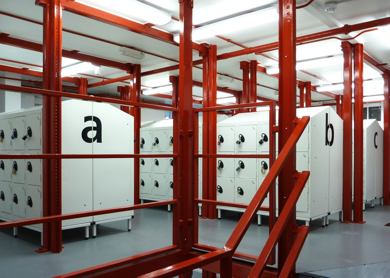
The locker room at the London School of Economics is now a village of cabinets with house-shaped profiles and bold graphics.
London studio Belsize Architects has completely overhauled the existing locker room, which is located in an awkwardly shaped two-storey space in the LSE's Old Building.
"The existing space was in bad shape," architect Shahriar Nasser told Dezeen, explaining how the rooms were badly ventilated and filled with dark corners that made students feel uncomfortable and unsafe. "The school wanted us to make a place that is exciting and inviting for students," he said.
The architects worked with a structural engineer to work out how many of the exposed columns they could remove. They then painted the remaining columns bright red and squeezed lockers into the spaces between.
"The height of the lockers is reduced to improve the lighting and to help students see what's going on around them," said Nasser.
He also explained how the gabled profiles of the lockers were actually designed to stop students placing items on top of them. "We realised as we were drawing them that they also had an interesting form," he added.
Bold letters painted onto the lockers help students to find their way around, while the glazed entrance is fitted with a security lock that prevents anyone else gaining access.
This is the second project we've featured from the London School of Economics, following a custom-built lounge with boxy white furniture.
See more interior design on Dezeen »
Here's a project description from Belsize Architects:
The Locker Room by Belsize Architects
London-based Belsize Architects were commissioned by the London School of Economics to design the refurbishment of the locker room in the LSE's old Building.
The existing space was overcrowded, unfriendly and poorly ventilated. The steel structure supporting the building was badly corroded, and the existing lockers were ugly, insecure and in a poor state of repair. Low ceilings, which carried bulky services in many areas, made usage difficult and were a particular design challenge. Despite the limitations as to what could be achieved in such an area, Belsize Architects have produced an attractive and more pleasant space that is safe and secure, well-lit and ventilated, and one that uses the restricted space to its best advantage.
A new load-bearing structure containing fewer columns addressed corrosion issues, and created improved sight-lines and visibility across the new space. The area was also damp-proofed and new ventilation installed. A new staircase was also built to comply with modern building regulations and create additional locker space, and services pipes were re-routed against a wall, away from the main circulation spaces to improve headroom. The most noticeable change, however, was the introduction of bold colour and branding (in keeping with the LSE’s brand identity) to place emphasis on the main elements in the space, create contrast, and lift the space to create an attractive, friendly and contemporary environment.
Graphics play an important role in the design, and continue the branding language used elsewhere in the building. Oversized letters and numbers offer both distinctiveness and legibility. A light colour palette brightens the space and reduces the need for artificial lighting. A transparent box at the entrance provides the controlled access required, important passive surveillance and clear views through to the new area. The lockers are kept low in height to give views over the top, providing additional safety and security.
The project was completed in eight weeks over the 2012 summer break and cost £110,000.

