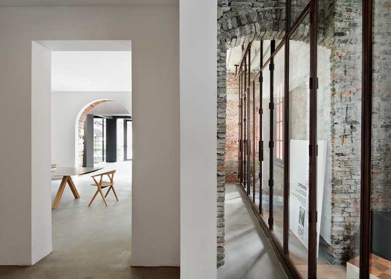
Architecture studio Neri&Hu has opened a design gallery, shop and event space in a former colonial police station in Shanghai’s Jingan district.
Named Design Commune, the renovated brick building houses a series of design stores and showrooms, including the new flagship for Neri&Hu's own furniture brand, Design Republic.
"The concept for the Design Commune is to bring designers from around the city to hopefully have a place where they can have a discourse in architecture, in product design, in interior design," Lyndon Neri told Dezeen. "To have a place where they could shop, a place where they could rest, a place where they could meander and wander and see different shops and different stores, different products, and at the same time be a part of an exhibition, or be part of a gallery, or be part of a talk."
The spaces will initially be used to showcase the best of international design in order to inform and educate Chinese designers and consumers. "We want to bring the best of what the world can offer to China and hopefully one day bring the best of what China can offer back to the world," said Neri.
For the conversion, the architects peeled back the decaying layers of wood and plaster, before restoring the original brickwork and adding new walls and rooms using a materials palette of glass, metal sheeting and white plaster.
"The existing building has a heaviness, and a kind of institutional feel," explained Rossana Hu, before describing how they wanted to offset this with lighter materials. "Big open glass lets you see through a lot of visual corridors, or openings between floors that didn't used to exist."
A new glass structure runs along the facade of the building, creating a modern shopfront for Design Republic.
Elsewhere in the building, the architects have created a restaurant, a cafe, a lecture hall and a one-room hotel.
Dezeen visited the The Design Republic Commune last week to take part in a series of discussions about architecture and design and you can see our snapshots in an album on Facebook. We'll also be publishing a full movie interview with Neri&Hu soon and you can also read about another Design Republic showroom in Shanghai in our earlier story.
During our visit, Hong Kong-based designer Michael Young also tipped China to have as many world-class designers as Japan within 20 years.
See more stories about Neri&Hu »
See more stories about Shanghai »
Photography is by Pedro Pegenaute.
Here's a project description from Neri&Hu:
The Design Republic Commune (Shanghai)
The Design Republic Commune, located in the center of Shanghai, envisions itself as a design hub, a gathering space for designers and design patrons alike to admire, ponder, exchange, learn, and consume. It houses the new flagship store for Design Republic, a modern furniture retailer, alongside a mixture of design-focused retail concepts, including books, fashion, lighting, accessories and flowers. The Commune will also have a design gallery, an event space, a café, a restaurant by Michelin-Starred Chef Jason Atherton, and a one-bedroom Design Republic apartment.
Situated within the historic relic of the Police Headquarters built by the British in the 1910s, the project takes a surgical approach to renovation. First, gently removing the decaying wood and plaster, then carefully restoring the still vibrant red brickwork, while grafting on skin, joints, and organs onto parts that needed reconstruction. And finally with the attachment of a brand new appendage which, like a prosthetic, enables the existing building to perform new functions, the nearly abandoned building begins its life again.
Replacing the rather dilapidated row-shops on the street front, Neri&Hu introduced a modern glassy insertion onto the brick façade. To accentuate the historic nature of the main building, the street level periphery is enveloped by transparent glazing to reveal the existing brickwork and rough concrete structures. Breathing new life into a traditional colonial building plan, Neri&Hu strategically removed certain floor plates, walls, as well as ceiling panels, to allow a renewed experience of the existing building, one that is fitting for the new functions to which the building now needs to respond.
Various small and precise incisions have been made in the interior architecture to reveal the building’s history and integrity while creating experiential intersections for a coherent experience when moving through the building. Contrasting with the exterior which has mostly been left intact due to historic preservation guidelines, the interior has been completely transformed. The starkly modern white rooms are juxtaposed with untouched remnants of brick walls, and in some cases, exposed wood laths underneath crumbling plaster walls. The clear intentionality behind the detailing of connections between the old and the new creates a visually and spatially tectonic balance in relation to the building as a whole.
Above: ground floor plan - click above for larger image and key
Above: first floor plan - click above for larger image and key
Above: second floor plan - click above for larger image and key

