Tour Total in Berlin by Barkow Leibinger
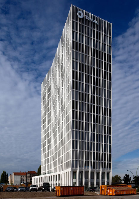
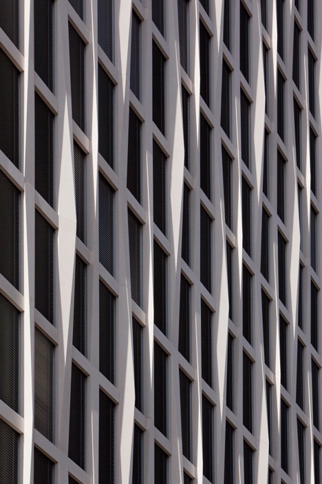
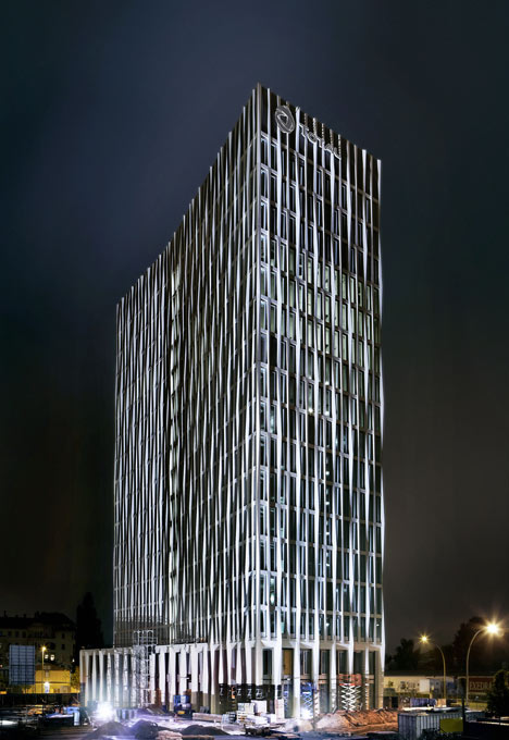
This tower with a rippling facade of faceted concrete piers is the new Berlin headquarters for French oil giant Total, designed by German architects Barkow Leibinger.
Above and top: photography is by Corinne Rose
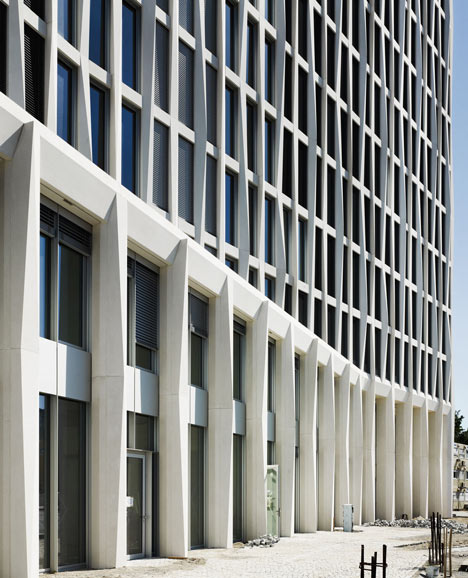
Architects Frank Barkow and Regine Leibinger told Dezeen how the grid of the facade design follows a common Berlin typology. "The faceting of the facade is a way of elaborating on this type, or subverting it a bit, to produce a visual effect that is in line with Total's requirement for a strong elegant image for their building," they explain.
Above: photograph is by Christian Richters
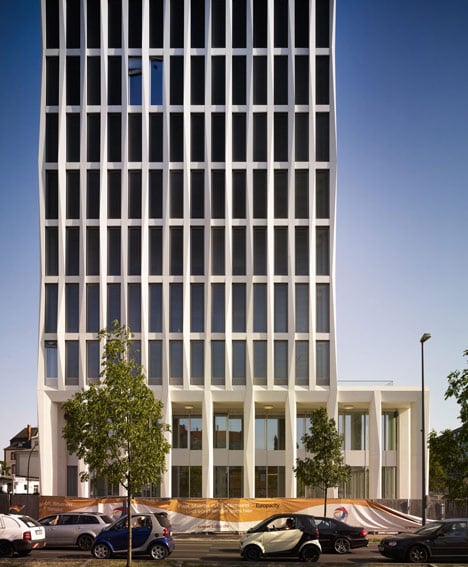
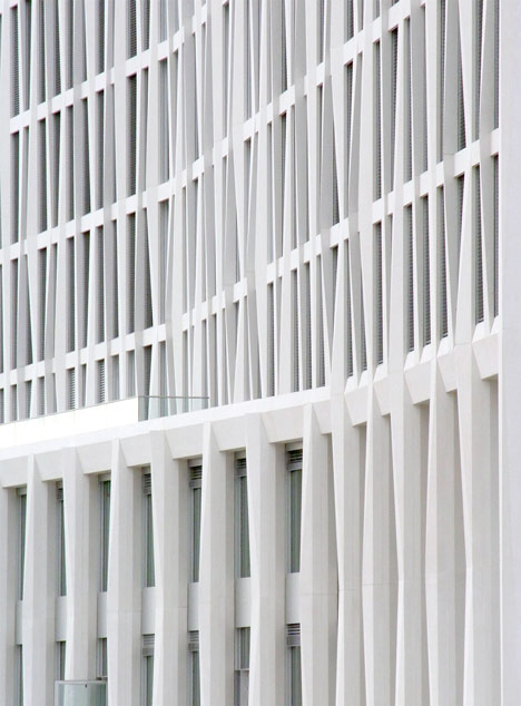
"Optically the facade emphasises the verticality of the building. It is closed and sculptural when seen obliquely," they added.
Above: photograph is by Christian Richters
The concrete grid clads every elevation of the 68-storey 68-metre tower and offers enough support to allow column-free spaces on each of the 18 floors.
Above: photograph is by Nicole Nunez
At ground level, columns project outwards to form an arcade along the north elevation and support a canopy across the main entrance on the south-west corner.
Above: photograph is by Corinne Rose
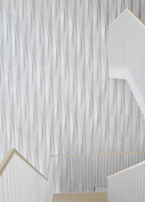
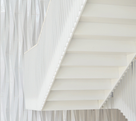
The faceted concrete reappears inside the building as a solid wall, lining the edge of a staircase in the reception lobby.
Above: photograph is by Nicole Nunez
See more projects from Berlin, including an all-grey apartment block and a hotel with an extreme mirrored cantilever.
Above: photograph is by Nicole Nunez
Here's some information from Barkow Leibinger:
Tour Total, Berlin, Europacity
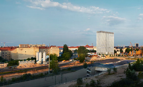
The Europacity is a masterplan for a new urban district of 40 hectares directly to the north of the main train station (Hauptbahnhof) in Berlin. The master plan will accommodate an art campus, marina, restaurants, residences, and offices along the Heidestrasse. The first building in this plan, for the French energy company Total, was completed in fall 2012. The Tour Total is a singular high-rise that gives the company and its 500 employees a clear identity and location for their headquarters in Germany.
Above: photograph is by Johannes Foerster
Barkow Leibinger's design was developed in a series of workshops with the client, the tenant, and the city-planning agency. The 68-meter building consists of 18 floors including the entry level lobby and bistro, offices, and a technical floor.
Above: photograph is by Johannes Foerster
An early goal for a DGNB Silver certificate for sustainability guided the planning decisions. Much of this was achieved through an intelligent facade system and energy re-use. The volume of the building (depth and length) generates well-lit and naturally ventilated office floors. The form of the building reacts to a number of existing urban conditions. Its front is oriented to Heidestrasse and to the planned future park to the north. The overall form then folds creating a concave and convex side in reaction to the orthogonal edge to the Heidestrasse and to the radial system generated by the curving Minna-Cauer Strasse. A two-storey arcade defined by columns wraps the building base with closed and open arcades for the main entrance and a pedestrian path to the north. The arcade acts as a filter between the lobby and the exterior and as a scaling device for the overall building.
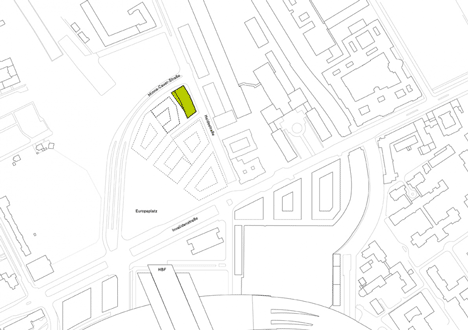
Above: site plan - click above for larger image
The free-standing tower defines a pedestrian passage that leads to a new public space with restaurants and other amenities, located between the new tower and a planned adjacent urban block. An offset core places the elevator lobby at the east facade giving each office floor daylight and orientation at the arrival point on each floor.
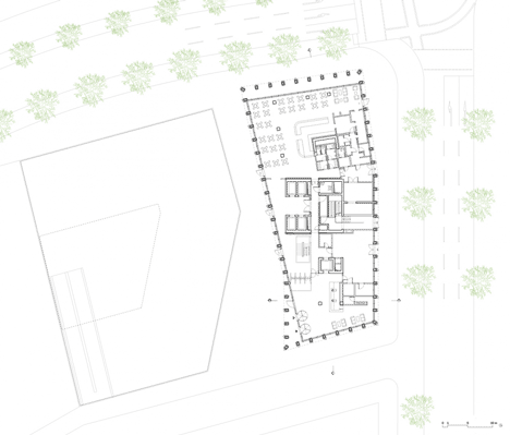
Above: ground floor plan - click above for larger image
Supporting the formal dynamic of the building and Total’s identity of mobility and energy, the load-bearing facade is made up of varying facetted pre-cast concrete elements that adjust to the building's changing form.
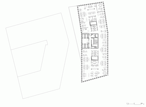
Above: typical upper floor plan - click above for larger image
The facade grid uses surface depth and sculptural definition to emphasize the verticality of the building. The grid consists of a geometric pattern which repeats itself diagonally, wrapping around the corners of the building like a thick curtain. It also acts as a mediator between the private interior spaces and the very public exterior space. The load bearing facade combined with the core provides for column free interior workspaces.
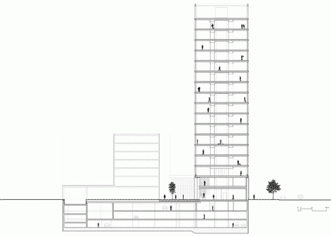
Above: section - click above for larger image
Program: lobby, offices, conference and seminar rooms, underground parking garage
Client/Investor: CA Immo Deutschland GmbH
Location: Berlin, Deutschland
Size: 28.000 qm gesamt / 18.000 qm oberirdisch
Time for Completion: 07/2010 – 09/2012