House Y2 by Destilat
This house by architects Destilat appears to climb down a hill at the foot of the Pöstlingberg mountain in Austria.
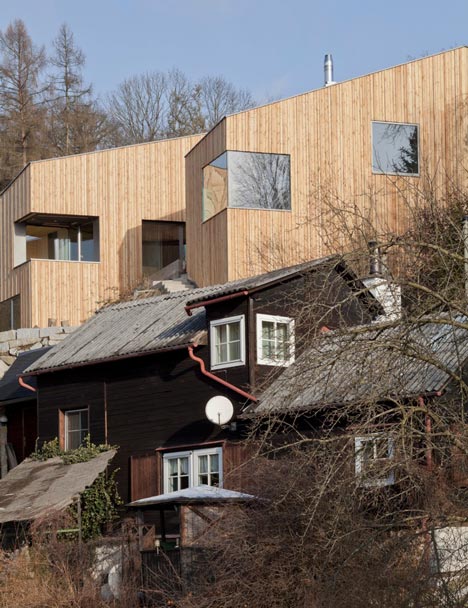
"The design incorporates the property’s topography," Destilat architect DI Wolfgang Wimmer told Dezeen. "Every floor is ideally adapted to its respective location on the steep slope, which turns the conventional order of public and private areas on its head. The house is structured from top to bottom."
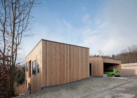
The residence is split between two larch-clad buildings with similar shapes, which are referred to as the "residential building" and the "sleeping building". The former accommodates the living and dining areas, while the latter contains all the bedrooms.
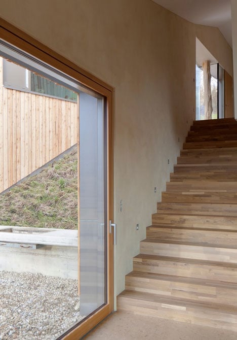
Residents enter through the top floor of the first three-storey building, where an oak staircase leads down into the open-plan living room on the middle floor. From here, an underground passage leads across to the second building.
Both buildings feature asymmetric roofs that create irregular ceiling heights and double-height spaces for the rooms inside.
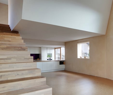
"The form of the roofs goes with the incline of the slope, so the buildings seem lower than they would appear with the construction of flat roofs," said Wimmer.
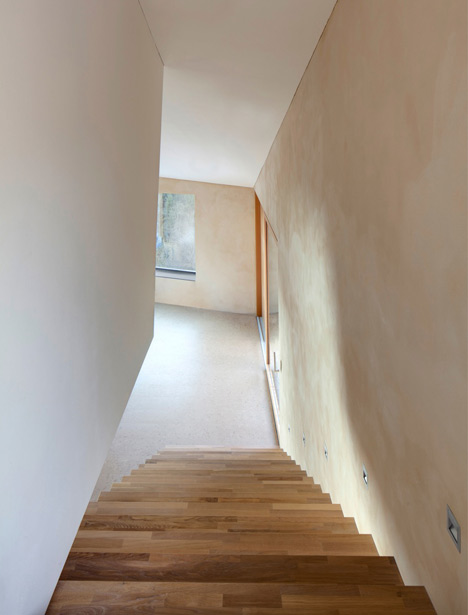
Rooms in both buildings feature cork floors, while one is covered with Tatami mats so that it can be used as a traditional Japanese room.
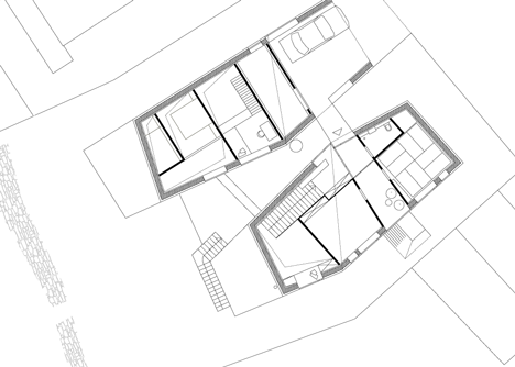
Above: top floor plan
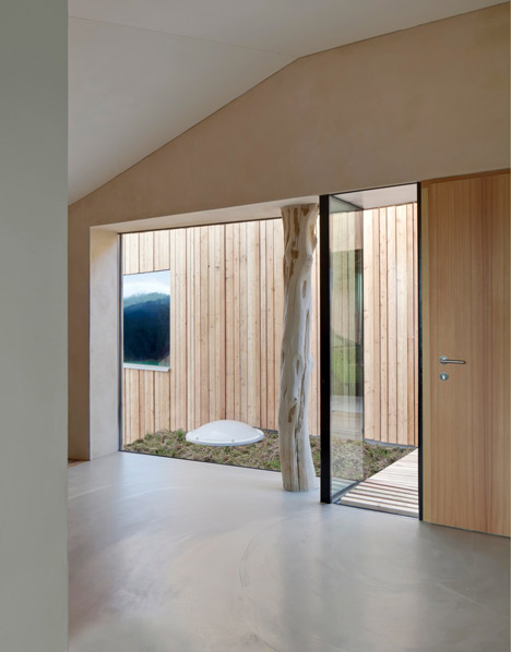
The architects had to fell a tree during the construction process, so they reused the trunk as a structural column along one of the inside walls.
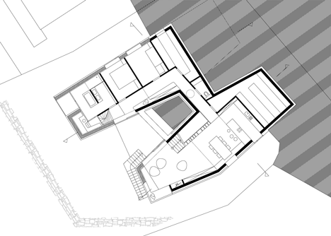
Above: middle floor plan
See more Austrian houses on Dezeen, including a stark white residence and a concrete house on stilts.
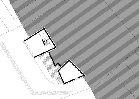
Above: lower floor plan
Here's a more detailed description from Destilat:
Haus Y2
The property is located on a steep slope at the foot of Pöstlingberg in the immediate vicinity of the Danube. Like all buildings along this residential estate’s main street, its width amounts only to 21m. Some of the neighbouring structures extend almost to the property’s boundary; therefore an orientation towards east and west was of lesser importance.
The building is divided into 2 slim structures. This division increases the effect of the interspace between the structures; it generates a strong relation between the two and ensures the desired link between all floors on this steep property.
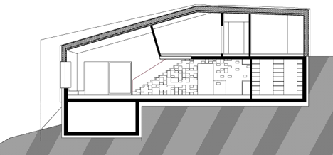
Above: residential building long section
Design
The design incorporates the property’s topography. Every floor is ideally adapted to its respective location on the steep slope which turns the conventional order of public and private areas on its head - this house is structured from top to bottom.
Integration into the property’s environment
The property’s layout is ideal for designs in accordance with the above mentioned principles. The back side of the building provides protection and is therefore raised while the front side is open and wide. The property’s location above the Danube River is ideal for this kind of design.
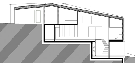
Above: sleeping building long section
Structure and shape
The room assignment was the basis for the project’s design with its two structures (residential building + ‘sleeping’ building) which are joined by a subterranean passageway. This way, the two structures are not set against the slope. They are both positioned along the fall line to let the energy of the slope flow through the centre. The structures appear to be one-storeyed on the sides that face the slope.
The residential building (southeastern side) almost seems withdrawn while the sleeping building (southwestern side) is open like a big gate. Formally, both structures are perceived as twin or duplex houses. They seem to be unusual and familiar at the same; their heights and dimensions are also very similar. The structures' exteriors follow the property’s boundaries; their inner sides, which are facing each other, generate unique dynamics in this context. Both houses are covered with irregularly inclined saddle roofs across the entire length of the respective structure. These roofs rise gradually from the side of the entrance and drop steeply at their narrowest point between both buildings along the slope’s inclination. The varying inclinations of the roofs are felt in every room of the house – with ceiling heights of up to 5 m.
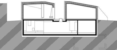
Above: cross section
Layout
The way to the entrance door was particularly important for this project: it does not lead to the door in a straight line but takes visitors to the structure’s back via a roofed concrete ramp that leads through the carport’s wide open gate. From this point a wooden bridge branches off to the left and ‘bridges’ the gap to the entrance of the residential building.
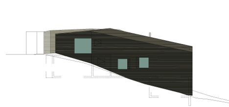
Above: massing diagram one
Residential building (southeastern side)
A draft lobby is located behind the front door and leads to the waiting area of the treatment rooms as well as to the private cloakroom. Natural light floods into the entrance area via a large window that provides a view of the front garden as well as the wooden bridge and the neighbouring sleeping house.
The sides of the Shiatsu treatment room are 3.6 m long. This room is meant for treatments on 8 rice straw mats which are placed on the floor. Tatami are used for floorings in traditional Japanese houses and may not be walked upon in shoes. At night, a futon is laid upon the tatami mat and turns this room into a sleeping area. This area can also be used as a guest room as it also works as an independent unit due to the adjacent bathroom on the entrance floor.
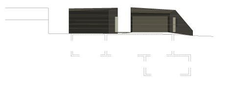
Above: massing diagram two
An oak wood staircase leads directly from the entrance area to the living area that comprises all functions from living and dining to cooking – in this order. This is the area where everybody come together. It is the most public room in the house and the very centre of communal life. Inhabitants and guest meet here to relax, listen to music, read, cook and communicate. There are almost no right angles in this entire - almost sacral - room. The freestanding staircase, the suspended body, windows in various formats and on different levels as well as ceiling heights of up to 5 m right below the roof enhance this effect even further. The living area consists of a fireplace, an all-glass corner window with a panoramic view and elevated seating/reading area at the parapet’s height of 45 cm which, at the same time, constitutes the back rest of the free-form seating ensemble. A sliding door offers a view of the wooden terrace that connects both buildings on the outside. The central dining area is located under the physiotherapy room which is suspended from the roof with no supports. The kitchen with its island unit lies right behind the dining area. Oak wood shelves in the back of the dining area, which were adapted to the shape of the staircase, provide clear and open storage space.
One reaches the sleeping house via the subterranean passageway, which is naturally illuminated by the skylight dome right above it, by taking a left turn at the top of the staircase. This way also leads to the slope-sided technical room, the wc and the utility room.
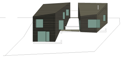
Above: massing diagram three
Sleeping house (northwestern side)
The hallways runs along the eastern side of the sleeping house and leads from the bathroom to a recessed balcony. The bathroom – upgraded to a private wellness area – includes an all-glass view across the balcony into the alpine foothills, a shower with mirrored glass walls and a view of the forest as well as an elevated rest area.
The bedrooms are oriented towards the west – the children’s room includes a gallery, the master bedroom extends across the floor above the hallway. This way, both rooms are exposed to morning light from the east.
The meditation room on the lowest level of the sleeping house can be accessed by e-stairs (space-saving staircase) and leads to the southwestern garden on the ground level.
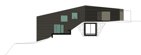
Above: massing diagram four
Construction and material
The house is built right onto the slope and is based on foundation slabs made of reinforced concrete. Walls made of reinforced concrete were only used for walls that touch the actual ground of the slope. All other walls that are visible from the outside as well as the roof are made of wood.
Future-oriented, sustainable construction with 'healthy' materials was of the utmost importance to the client. Wooden components were insulated with rock wool and the installation level was insulated with renewable materials (hemp). The inner sides of exterior walls were cladded with insulating soft fibre boards and finished with clay plastering or sand-coloured clay coating. The heating system consists of an air source heat pump supported by a controlled living room ventilation system. The house was designed as a low-energy building.
Domestic larch wood was chosen for the outer sides of exterior walls. The open and ventilated façade with vertically positioned boards and squared timber in various widths and depths – a so-called 'chaos formwork' are key elements of the building's distinctive look. These boards and squared timbers were cut with a gang saw, dried and then brushed on the outside. This procedure reduces soft parts within the wood and therefore ensures that the façade grays evenly.
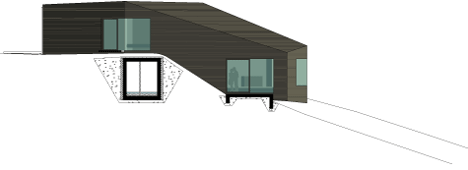
Above: massing diagram five
Cork and cast cementitious coatings alternate throughout the house’s floor areas.
The wood-aluminium windows consist of oiled larch wood on the inside and pearlescent-gray coating on the outside. They were either installed as flush windows or set deeply into the window reveal to create deep and useful recessed areas on the inside as well as exciting incisions in the exterior façade. The interior tilt-and-turn sashes were filled with panels to contrast the fixed glazing and bring more materiality from the inside to the outside.
A tree, that had to be removed for the construction of this house, was dried and stripped of its bark and is now used as a column. This natural column supports the tip of the house and is true testament to this building’s wooden construction.

Above: massing diagram six