Salmtal Secondary School Canteen by SpreierTrenner Architekten
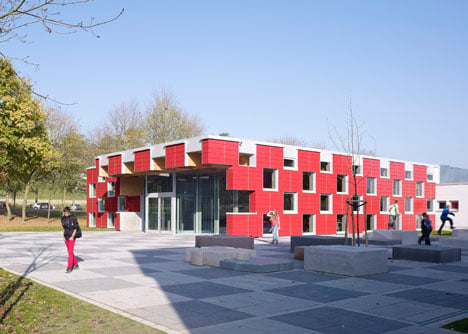
A chequerboard of opaque panels and windows surrounds this school canteen in western Germany by SpreierTrenner Architekten (+ slideshow).
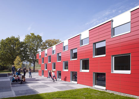
Located at a secondary school in the town of Salmtal, the new building provides a flexible events space that can also be used for plays, music recitals or Christmas fairs.
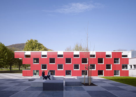
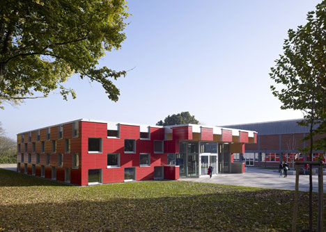
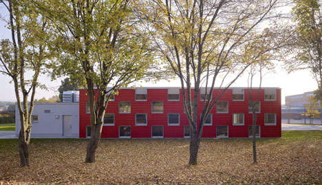
Around the windows, SpreierTrenner Architekten clad the exterior of the walls with vibrant red ceramic panels. "We wanted something vivid and playful to engage the children, but also welcome any visitors," architect Daniel Spreier told Dezeen.
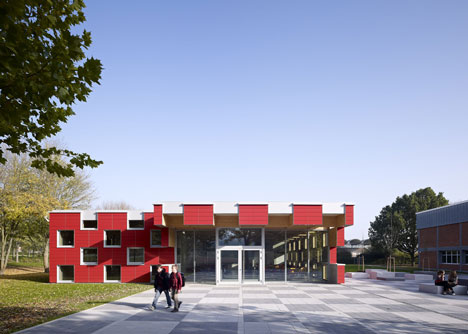
"The facade material draws its inspiration from the existing school building from the 1970s, which has a red brick facade," he added. "So a red ceramic facade using 30-millimetre panels was a close contemporary choice."
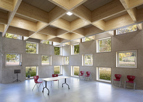
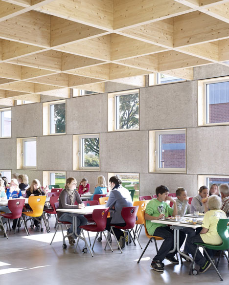
The interior surfaces of these panels are exposed concrete, formed against chunky chipboard to create a soft texture. The red exterior is barely visible, so to add colour the architects filled the room with an assortment of red, yellow and green chairs.
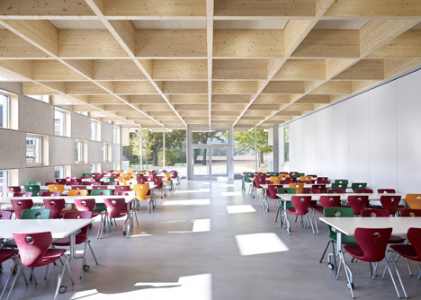
A grid of wooden trusses supports the ceiling and matches the chequered pattern of the walls. This structure allows for a column-free space that can be divided up using removable partitions.
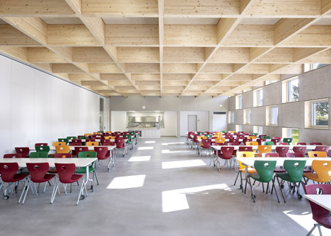
"The starting point was the square plan, which allowed for maximum flexibility" said Spreier. "To span a square plan most efficiently we thought of a two-directional grid. We then took that grid to the facade as well, so it determined the height of the room, the size of the windows and an efficient ratio for the wooden ceiling trusses."
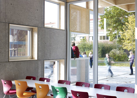
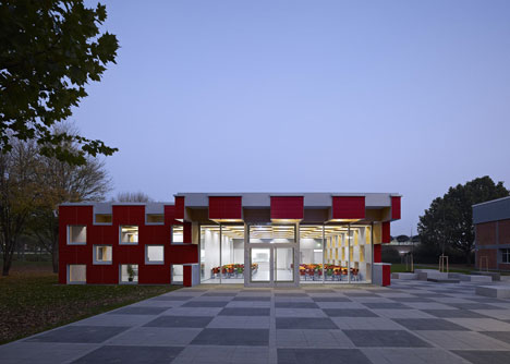
A glazed entrance opens the building out to the playground, where the grid continues as square paving panels and seating blocks.
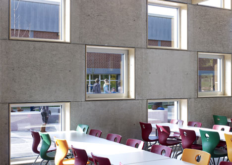
"The final result seems to remind people of a Rubik’s Cube," said Spreier.
We've published quite a few red building on Dezeen, including a youth centre in Denmark and a psychiatric centre in Spain.
See more red buildings on Dezeen »
Photography is by Guido Erbring.
Here's some more information from SpreierTrenner Architekten:
The new school canteen of the Salmtal Secondary School in Germany was designed by SpreierTrenner Architekten as a multifunctional building with the greatest possible flexibility. The space is used not only by children to eat every day, but also for special events such as music concerts, theatre plays or even Christmas fairs. This is why the main room was set out with a column-free square plan only subdivided by a mobile wall.
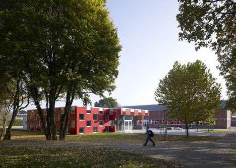
The adjoining section at the rear contains all supporting facilities, such as a kitchen, storage space, toilets and staff facilities, etc. It has been set out with the option of extending it in the future.
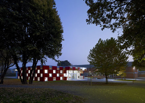
The big glazed entrance opens up the main canteen room to the outside and represents a welcoming gesture. The cantilevering canopy creates a transition zone between the interior and the playground.
The roof grid of the main room consists of 10cm thick and 1m high wood trusses. To keep the appearance simple all ducts, ventilation outlets and lighting are recessed in the ceiling. The integrated lighting produces glowing wood squares that turn the structural trusses into a design feature.
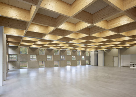
The squares were also used to perforate the building envelope, creating a human scale (1.25 x 1.25m) and allowing for changing outlooks and interesting insights. The surrounding landscape almost appears like pictures hung on the wall rather than mere windows. The checked windows also allow the pupils to interact and play around with their classmates relaxing outside in the schoolyard.
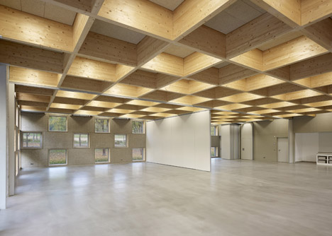
All materials used were kept natural, robust, durable and simple. The main components were concrete, wood and ceramics. The façade was clad with ceramic tiles reflecting the red bricks used to build the original school. Its glazed surface makes it more durable and easier to clean.
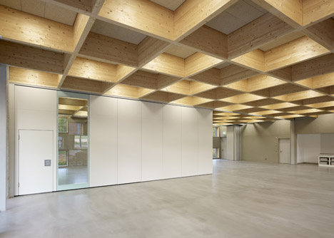
Although the façade is a bright red, no colours were used inside to allow the vibrant furniture to stand out. The concrete walls were constructed with a rough surface produced by standard OSB formwork that creates a warm texture. The floor shows the concrete screed surface, similar to the material used in car parks, covered with a transparent protective resin layer.
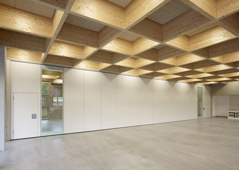
The architect, Daniel Spreier, wanted the children to take ownership of the building and use the surrounding spaces to relax and have fun. The checked pattern is playfully extended into the external space, which is framed by lawn areas and trees and subdivided by direct paths.
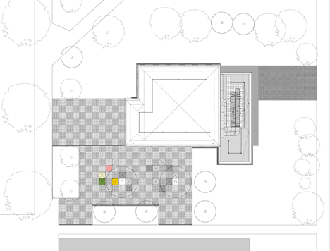
Above: site plan - click above for larger image
The area includes two “external classrooms” consisting of staggered concrete cubes, which allow the students to sit down, run around, jump over and let out any excess energy that builds up in classroom.
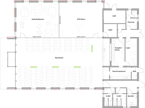
Above: floor plan - click above for larger image
Since the building opened, these cubes have proved to be very successful, with children hanging out with their friends at break times and after school.

Above: section - click above for larger image