The new Tokyo flagship store for Japanese fashion brand Takeo Kikuchi has been specifically designed by Schemata Architects to offer a richer experience than online shopping, with spaces for relaxation as well as display (+ slideshow).
"Today we can easily buy clothes online, and we already have enough knowledge and experiences and know how to judge good products from bad ones in our economically maturing society. What is the role of a flagship store then?" questions Schemata's principal Jo Nagasaka.
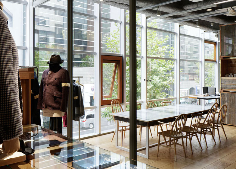
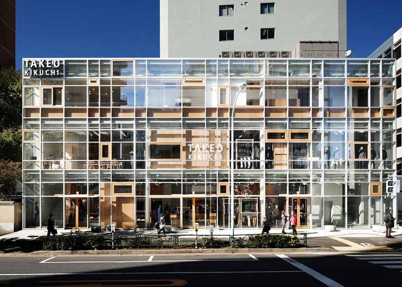
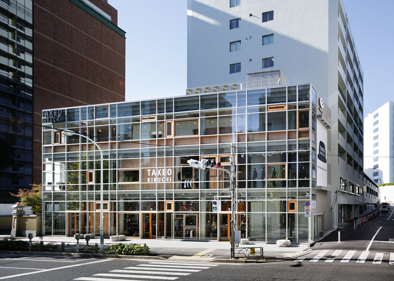
The architects created the new Takeo Kikuchi store within an existing three-storey building in Shibuya, where they upgraded the glazed facade that is typical of most retail buildings by adding timber-framed windows that can be opened individually to let fresh air into different spaces.
"We questioned the fact that most shops and offices are enclosed without natural ventilation throughout the year and usually heavily air-conditioned in summer and winter," explain the architects.
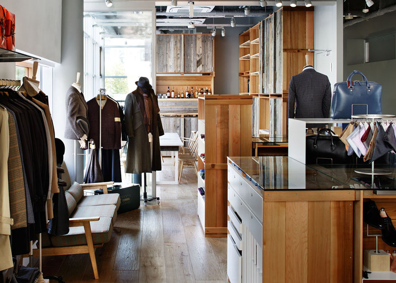
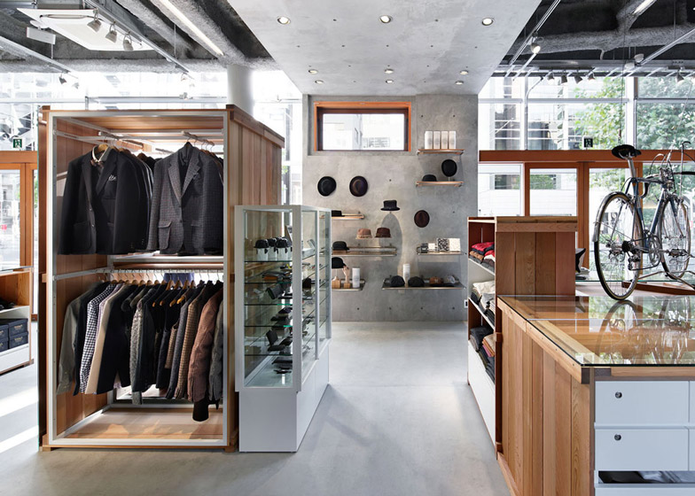
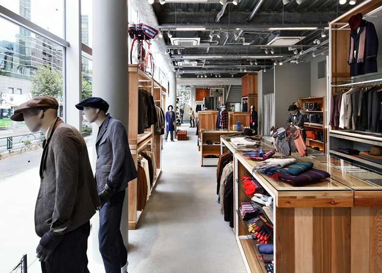
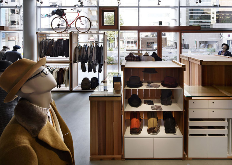
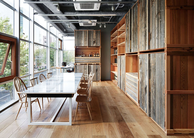
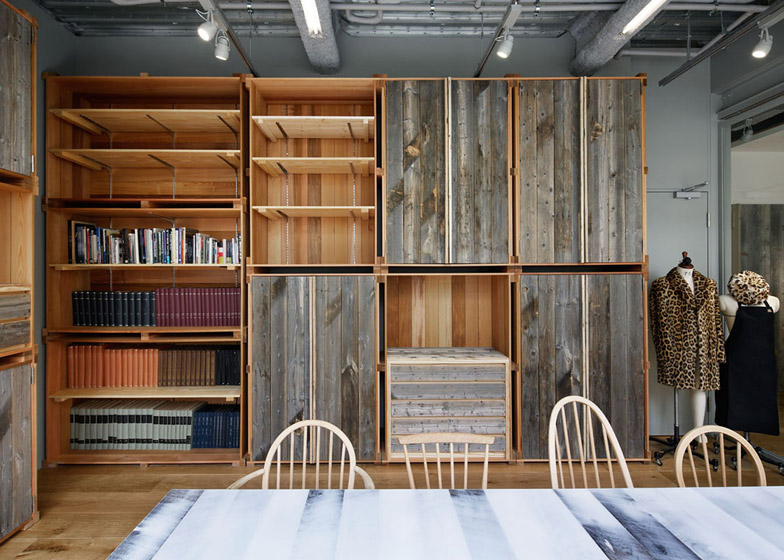
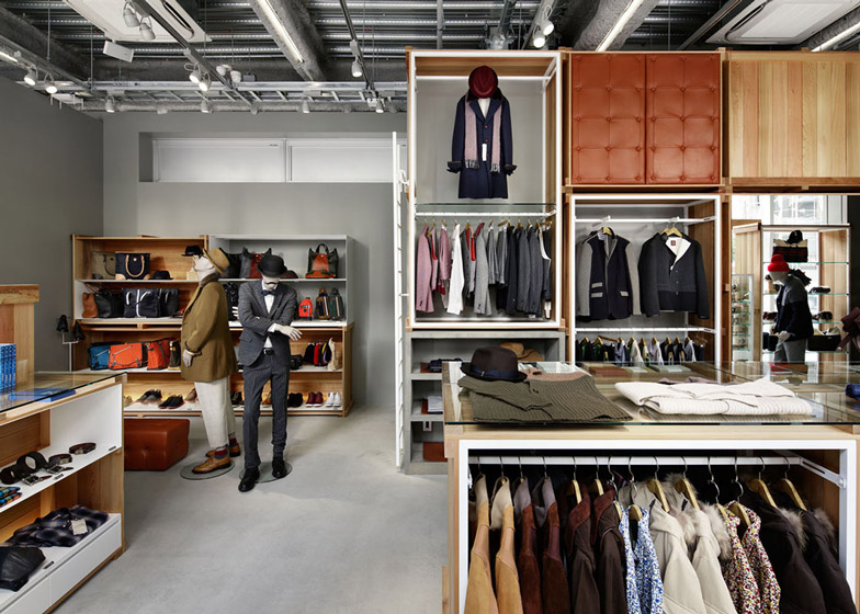
Inside, wooden boxes create partitions and display cases that look like packing crates, while chairs, stools and benches are dotted around between.
There are no checkouts, so shop assistants wander around the store to take payment from customers, who can enter the store using four different entrance points.
Visitors can also take time out from browsing by visiting a garden at the back of the store or having a seat on one of several concrete stools along the shopfront, which the architects cast inside fabric sacks.
On the first floor, glass walls offer a look into the atelier of brand designer, Takeo Kikuchi. "We intend to create a mutual relationship between designer and customers," explain the architects.
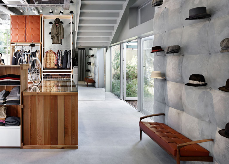
Other details inside the store include a concrete wall that appears to be padded, a set of reclaimed Windsor chairs that have been sanded to reveal the grain of the wood and cabinets with leather door panels.
"We want to inspire customers to look at things with fresh eyes and minds by revealing 'extraordinariness' in ordinary things," say the architects.
On Dezeen we've also featured a Japanese entertainment store designed in response to the rise of online shopping.
See more projects by Schemata Architects, including a food-photography studio and an office with a mirrored wall and a slide.
Photography is by Nacása & Partners.
Here's a project description from Jo Nagasaka:
Takeo Kikuchi SHIBUYA
Takeo Kikuchi is one of the most distinguished and long-time popular menswear brand in Japan established in 1984. The brand is opening the long-awaited Global Flagship Store in Shibuya.
The site is a very wide and flat site located along Meiji Douri Avenue. Four entrances are located along the street, so customers can enter from various points and freely stroll around the space, while looking at display furniture that is randomly located across the space like a forest.
We didn’t want to set a singular circulation route, and we prepared multiple circulation routes as if the streets are extending into the store. Customers can freely move around and enjoy unique shopping experience according to his/her taste and mood.
We did not provide any cash register counter, as the key to this new Takeo Kikuchi store is intimate person-to-person communication between shop staff and customers.
So we eliminated cash register counters, which would normally strongly dominate space in typical stores, and encourage direct communication for more joyful shopping experiences.
Above: ground floor plan - click above to see larger image
Completion date: November 2012
Location: Shibuya-ku, Tokyo, Japan
Above: first floor plan - click above to see larger image
Building area: 198.96 sq m
Total floor area: 397.92 sq m(1F+2F)
Floors: 1F 2F
Structure: steel
Above: front elevation - click above to see larger image

