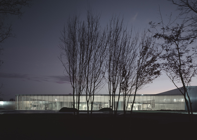
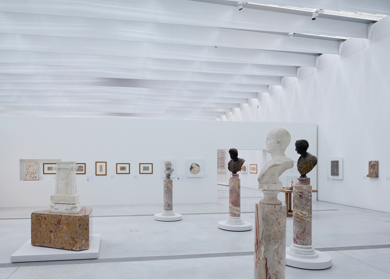
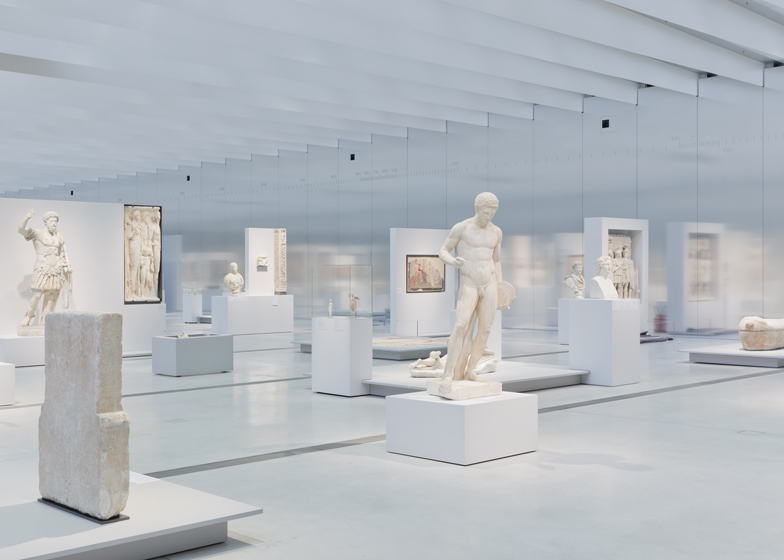
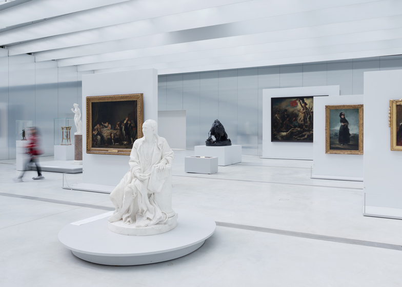
The Louvre Lens, a new outpost of the Musée du Louvre by Japanese architects SANAA and New York studio Imrey Culbert, opens to the public next week in Lens, northern France (+ slideshow).
Above: photograph is by Iwan Baan*
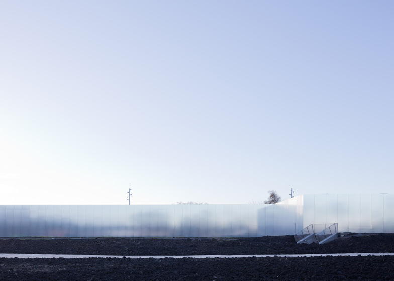
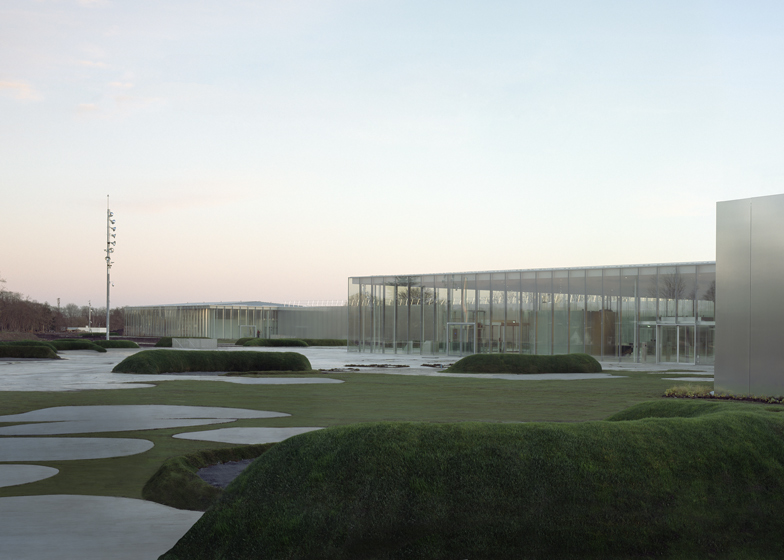
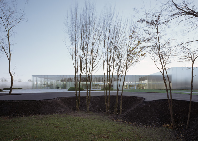
Comprising a chain of rectangular volumes, the 360-metre long-building has walls of glass and brushed aluminium that appear to be straight but actually feature subtle curves.
Above: photograph is by Hisao Suzuki
"The project avoids the strict, rectilinear shapes that would have conflicted with the subtle character of the site, as well as of free shapes that would have been overly restrictive from the perspective of the museum’s internal operations," explain SANAA architects Kazuyo Sejima and Ryue Nishizawa. "The slight inflection of the spaces is in tune with the long curved shape of the site and creates a subtle distortion of the inner areas while maintaining a graceful relationship with the artwork."
Above: photograph is by Iwan Baan
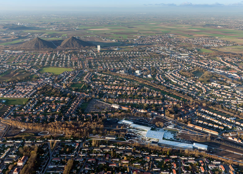
SANAA and Imrey Culbert won a competition to design the museum back in 2006 and it is located on the site of an overgrown coal mine that had been closed down since the 1960s.
Above: photograph is by Iwan Baan
"In keeping with a desire to maintain the openness of the site and to reduce the ascendancy of this large project, the building was broken down into several spaces," said Sejima and Nishizawa. "Through their size and layout, which follow the gradual changes in terrain elevation, the buildings achieve balance with the scale of the site and the shape of the paths and landscape features, evoking its mining history."
Above: photograph is by Iwan Baan
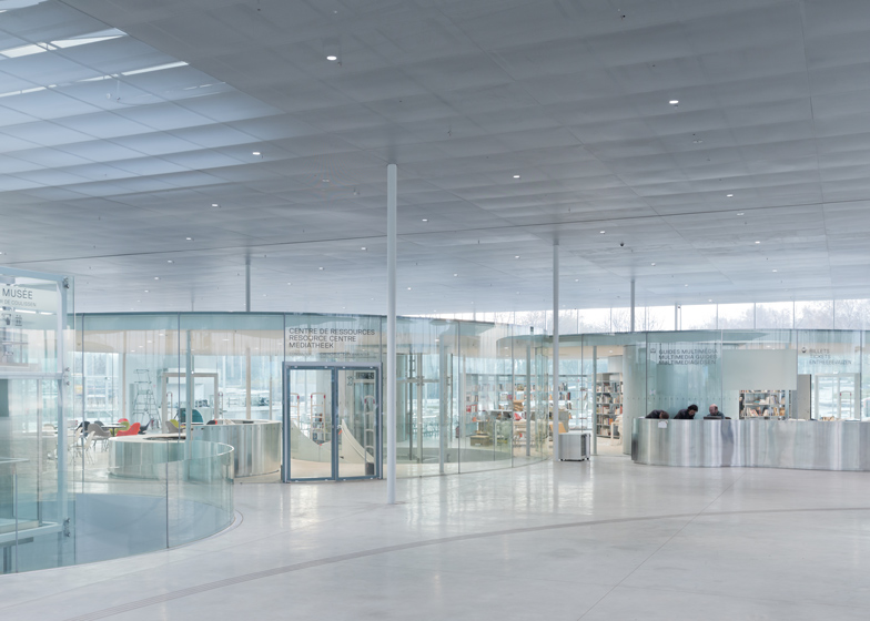
Visitors enter the building through the glazed central hall, where curved glass rooms contain a bookshop, a cafe and other facilities.
Above: photograph is by Iwan Baan
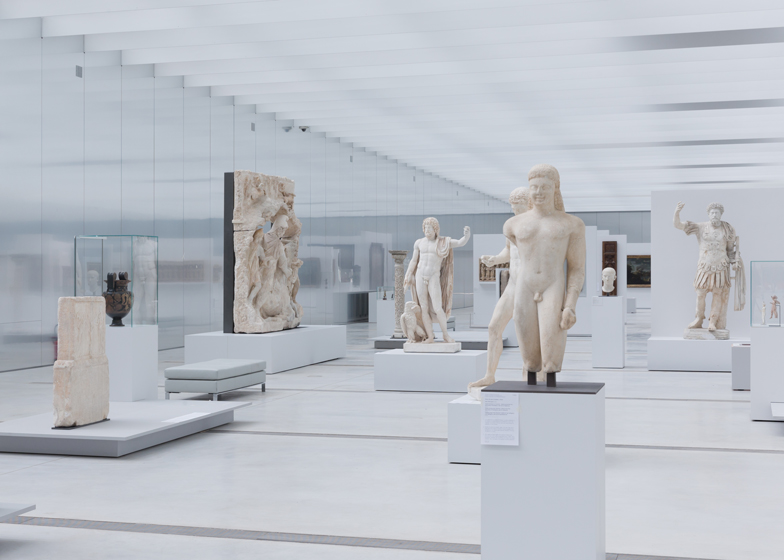
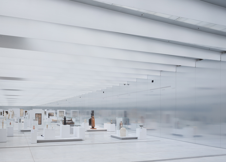
Doors at opposite corners of this hall lead through to the two exhibition galleries. To the east, the 125-metre-long Grande Galerie provides the setting for a permanent collection of artworks dating back through six centuries, while to the west is a gallery for temporary exhibitions that adjoins an auditorium.
Above: photograph is by Iwan Baan
Daylight filters into the galleries though glazed panels on the roof, but rows of louvres prevent direct sunlight from entering. Meanwhile, the aluminium walls create fuzzy reflections inside the rooms.
Above: photograph is by Iwan Baan
"Context makes the content of art speak differently to each of us," architect Tim Culbert told Dezeen. "The palette and forms of the gallery wings heighten our perceptive awareness in a subtle way, impacting how we look at the art."
Above: photograph is by Iwan Baan
Beyond the Grande Galerie is another room with walls of glass, used for displaying art from the neighbourhood of Lens.
Above: photograph is by Hisao Suzuki
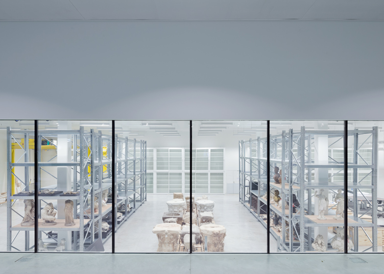
Storage areas are buried underground and can be accessed from the central hall, while two additional buildings accommodate administration rooms and a restaurant.
Above: photograph is by Hisao Suzuki
The architects collaborated with landscape architect Catherine Mosbach to surround the buildings with gardens and pathways, while the museum's exhibition spaces were designed by Studio Adrien Gardère.
Above: photograph is by Iwan Baan
SANAA is best known for designing the Rolex Learning Centre in Switzerland, but also designed a pavilion for the Serpentine Gallery back in 2009. See all our stories about SANAA »
Above: photograph is by Iwan Baan
Here's some more information from the design team:
Louvre Lens
The Architectural Design
The choice of placing the museum on a former mine illustrates the intent of the museum to participate in the conversion of the mining area, while retaining the richness of its industrial past. The Louvre-Lens site is located on 20 hectares of wasteland that was once a major coal mine and has since been taken over by nature since its closing in 1960. The land presents some slight elevation, the result of excess fill from the mine.
Above: ground floor plan - click above to see a larger image
The Japanese architects from SANAA, Kazuyo Sejima and Ryue Nishizawa wanted to avoid creating a dominating fortress, opting instead for a low, easily accessible structure that integrates into the site without imposing on it by its presence. The structure is made up of five building of steel and glass. There are four rectangles and one large square with slightly curved walls whose angles touch.
Above: basement floor plan - click above to see larger image
It is reminiscent of the Louvre palace, with its wings laid almost flat. The architects wanted to bring to mind boats on a river coming together to dock gently with each other. The facades are in polished aluminum, in which the park is reflected, ensuring continuity between the museum and the surrounding landscape. The roofs are partially in glass, reflecting a particular advantage to bringing in light, both for exhibiting the works and for being able to the sky from inside the building.
Above: section AA - click above to see larger image
Natural light is controlled by means of a concealment device in the roof and interior shades forming the ceiling. Designed as an answer to the vaulted ceiling, the surface retains in its light the change of seasons, hours and exhibitions.
Above: section BB - click above to see larger image
The entire structure of 28,000 square meters extends over 360 meters long from one end of a central foyer in transparent glass to the other. The buildings located to the East of the entrance - the Grande Galerie and the Glass Pavilion - primarily house the Louvre’s collections.
Above: floor plan of La Galerie du Temps- click above to see larger image
To the West of the entrance is the temporary exhibition gallery and La Scène, a vast «new generation» auditorium, whose programs are in direct relation with the exhibitions.
Above: section of La Galerie du Temps - click above to see larger image
The museum also includes a large, invisible, two level space, buried deep in fill from the site. This space will be dedicated to service functions for the public, but will also be used for storage and logistical functions of the museum. Two independent buildings house the administrative services, to the South, and a restaurant, to the North, thus establishing a link between the museum, the park and the city.
Above: elevation - click above to see larger image
*All images are c/0 SANAA (Kazuyo Sejima et Ryue Nishizawa), Imrey Culbert (Celia Imrey and Tim Culbert), Mosbach Paysagiste (Catherine Mosbach) and Studio Adrien Gardère

