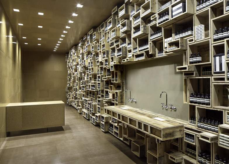
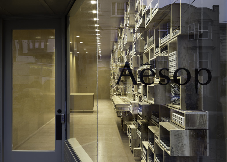
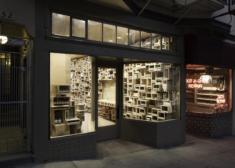
Reclaimed timber boxes are piled up to the ceiling to create a wall of shelves at the new San Francisco store for skin and haircare brand Aesop (+ slideshow).
Designed by Boston architects NADAAA, Aesop Fillmore Street draws inspiration from pre-twentieth century apothecaries, where assorted bottles and tubes would be displayed on a jumble of wall-mounted shelves.
The boxes were made to measure using reclaimed wooden boards, which were sanded on one side to create a variation between the inside and outside surfaces.
Architect Nader Tehrani explained: "Aesop has carefully considered dimensions of products as well as a clear methodology of display and presentation. We used these measurements as a means to create and array the boxes to best fulfill the quantity and types of products."
Due to the limited width of the store, the boxes are only located on one wall to prevent narrowing the room and they also integrate a wooden counter with two basins.
The remaining walls are lined with cork, as is a second counter that can be moved into different positions.
"The cork is used as a scalar and textural counterbalance to the wall," added Tehrani. "Cork has a material depth that softens the surfaces and helps attenuate undesired sounds."
Aesop stores always feature unique designs because brand founder Dennis Paphitis didn't want to create a "soulless chain", as he told Dezeen when we met up with him recently. Other interesting Aesop branches include a Singapore shop with coconut-husk string hanging from the ceiling and a New York kiosk made from piles of newspapers.
See all our stories about Aesop »
Here's a little more text from the brand:
Aesop Fillmore Street
San Francisco recently welcomed its first Aesop signature store at 2454 Fillmore Street, in a neighbourhood shaped by consecutive influxes of Eastern European, Japanese and African-American residents, and the heydays of American jazz and rock.
The result of a collaboration with Boston architectural firm NADAAA, this space is sibling to another launched simultaneously in Manhattan’s SoHo district. Both stores have been designed around a fascination with pre-twentieth century apothecaries and twenty-first century skin care. The predominant element in each is a tapestry of shelving crafted from reclaimed wooden boxes. Subdivided and pixilated by the varying dimensions of the boxes, the arrangement invites visual and tactile exploration; its dominance is balanced here by a cork wall and ceiling, and dark masonite flooring.


