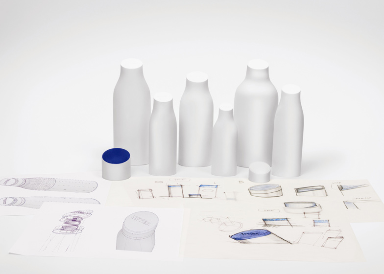
The classic blue Nivea tin inspired an overhaul of the skincare brand's packaging by San Franscisco-based designer Yves Béhar and his studio fuseproject.
Yves Béhar chose to reflect Nivea's trademark circular blue tin in the rounded contours and simplified blue and white colour scheme of the new packaging. It can also be seen in the round lids, which tilt upwards and are embossed with the Nivea logo.
"I was particularly drawn to this design project by the vast emotional potential of the Nivea brand and its 100 year heritage," explained Béhar.
In Milan last spring, Nivea collaborated with British designer Faye Toogood to create an installation populated by mysterious helpers dressed in white.
Last year we also reported that Béhar's SodaStream TV commercial was banned in the UK for allegedly "denigrating" rival products – see all projects by Yves Béhar.
See all our stories about graphic design »
See all our stories about packaging design »
Here's the full press release from Nivea:
Hamburg, January 15, 2013 – The blue tin has embodied NIVEA's brand values since 1925. It is the brand 'face' that consumers around the world associate with trust, closeness and expertise. Now Beiersdorf AG has introduced a new global design language based on the iconic blue tin. The new design consistently translates the successful NIVEA brand's values into a product that consumers can see and feel, thereby making products in all categories immediately recognisable. Beiersdorf has consistently developed the NIVEA brand with a focus on its global core values.
The gradual introduction of the new design for the entire NIVEA skin and body care portfolio will commence in more than 200 countries in January 2013.
'NIVEA stands for skin care, trust, quality and value for money. These are the values that our consumers all over the world appreciate. We have to ensure that our brand identity reflects these values, one aspect of which is our product design,' explained Ralph Gusko, executive board member for brands at Beiersdorf. "Around two-thirds of all purchase decisions are made at the shelf. The new NIVEA design's high recognition value will make it easier for consumers around the world to find the NIVEA products they are looking for. The consistent design language across all channels – from product packaging, through point of sale to advertising – also increases consumer identification with the brand and encourages them to additionally use products in other categories," continued Gusko.
The new design delivers additional functional and emotional value
Internationally renowned industrial designer Yves Béhar joined forces with the Beiersdorf Design Management team at his San Francisco-based fuseproject studio to create a new, unique and innovative design language that embodies the NIVEA brand values. The blue NIVEA tin wasn't just the basis of the design, but also a source of inspiration to the designers. The crème tin is used as a logo, reflected in the rounded contours of the new packagings and in the reduced blue and white colors of the new design. The round lid, which tilts towards the consumer, embossed with the NIVEA logo, has obvious similarities with the iconic blue tin and it provides customers with a “familiar face” on the shelf.
"Design is important because it adds value to an object's function," said Béhar. The multiple award-winning industrial designer is committed to "developing products that aren‟t just functional, but which also enhance the consumer experience and appeal to their emotions". "Unlike many other skin care brands, NIVEA isn't geared to a specific culture, gender or age group. I was particularly drawn to this design project by the vast emotional potential of the NIVEA brand and its 100-year heritage," continued Béhar.
The first consumer tests confirm that the development team's efforts were worthwhile because consumers – especially in the growth markets of Asia and South America - rated the new design line as very good.
A consistent NIVEA design language increases brand identification
"The new NIVEA design language was created from the ground up to offer consumers a tangible experience of our brand values before they even open the packaging. It's pure and authentic – like the brand itself," explained Ralph Gusko.
Since 1911 consumers around the globe have associated NIVEA with skin care and it is one of the most well-known brands in the world. More than half a billion people around the globe trust in NIVEA, the highest-selling skin care brand of all. Skin care is the fastest growing segment in the global cosmetics market. The new design language is an aspect of the new overall brand strategy focusing on sustainable and profitable growth for the NIVEA product family which was recently announced by CEO Stefan F. Heidenreich.

