Songwon Art Centre by Mass Studies
This ridged steel art gallery by South Korean studio Mass Studies has half of its floors buried underground while others balance on a pair of triangular pilotis (+ slideshow).
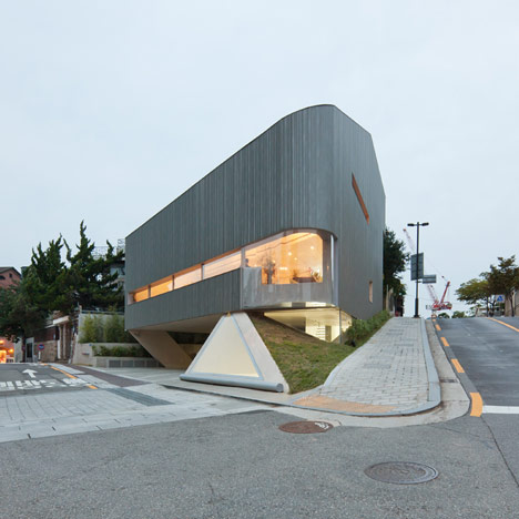
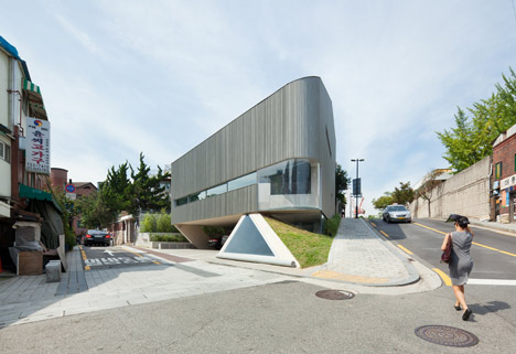
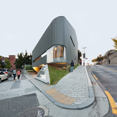
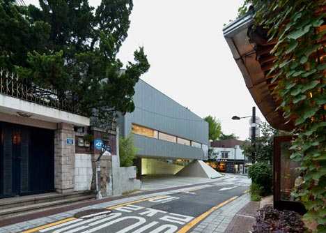
The Songwon Art Centre is located in Buk-Chon, a suburban district filled with traditional Korean Han-Ok houses, and the building is squeezed onto a steeply inclining site between two roads.
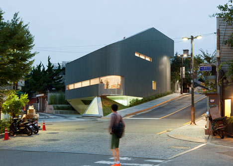
Mass Studies faced restrictions on the size of the new building and had no choice but to place some spaces below ground to maintain sight lines towards a neighbouring historic residence. "We neither wanted this project to become a compromise to the restrictions nor a mere negotiation between the contextual obligations," explained the architects.
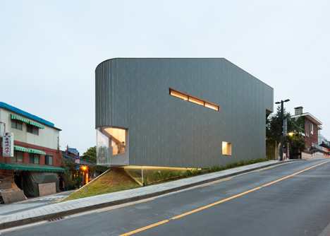
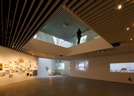
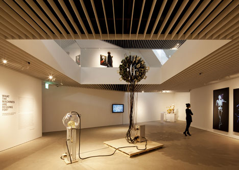
In response, they planned restaurant and event spaces on the two upper floors, while two exhibition floors occupy the basement and a car parking level is slotted in between.
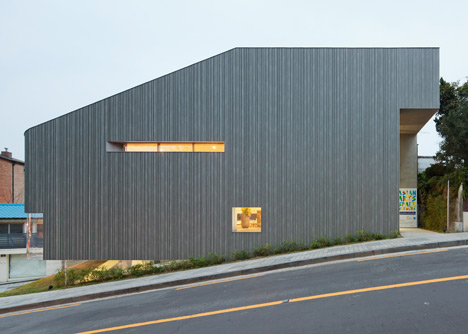
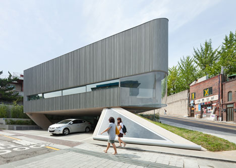
"We had to come up with a structural scheme that simultaneously lets us fit everything within the relatively small site and also lifts the building up," said the architects. "This composition allows the building to be seen as performing a 'silent acrobatic act,' slightly floating above ground while still staying close to it."
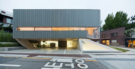
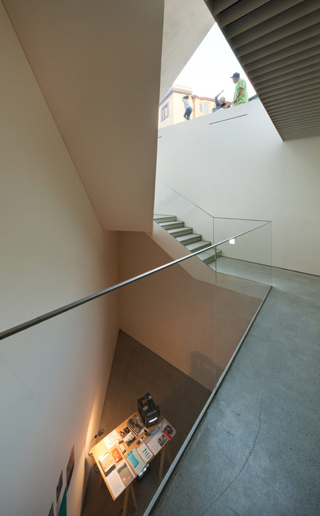
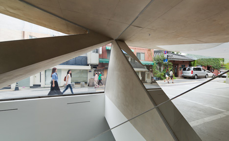
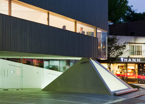
When approaching the building, visitors are faced with two large windows. A length of curved glazing offers a view into the restaurant while a triangular aperture faces down towards the entrance of the exhibition spaces. The architects describe this as a "sudden unexpected moment of vertigo" where "the entire height of the building suddenly presents itself".
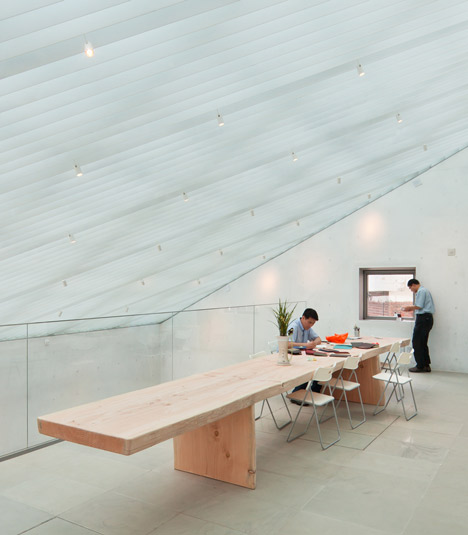
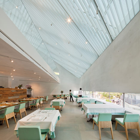
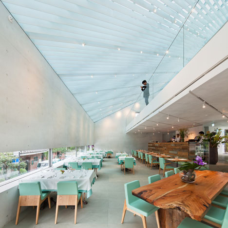
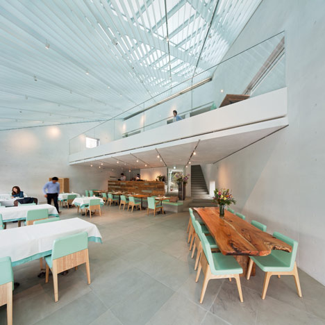
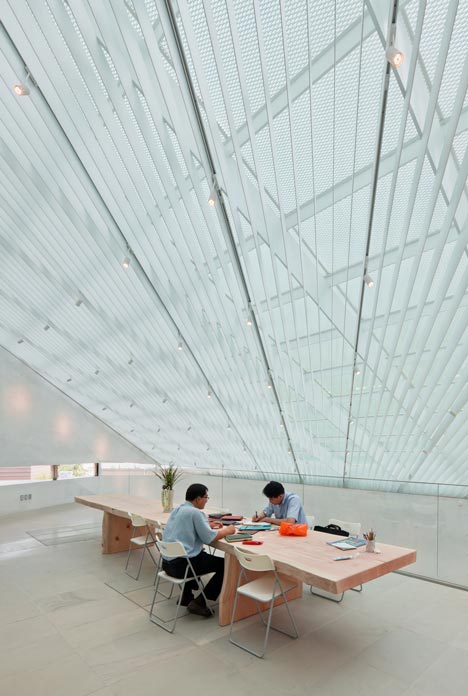
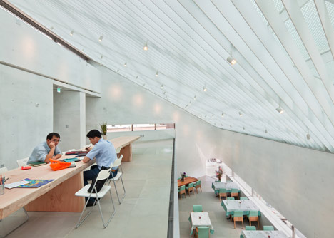
A sloping roof angles up to follow the incline of the hill and features a large skylight to brings natural light into the upper floors. Louvres across the ceiling moderate this light, while voids in the floor plates help it to filter through the building.
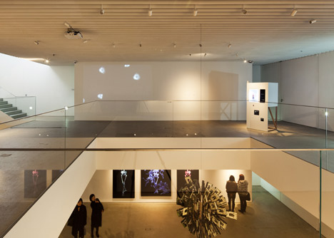
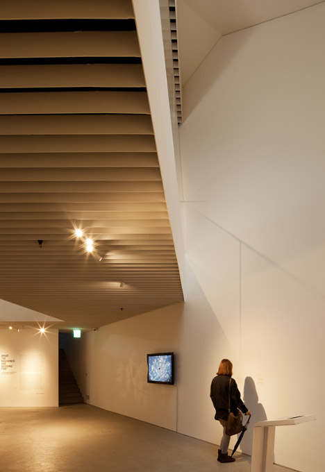
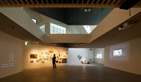
Louvres also crop up on the exhibition levels, where they allow curators to adjust artificial lighting.
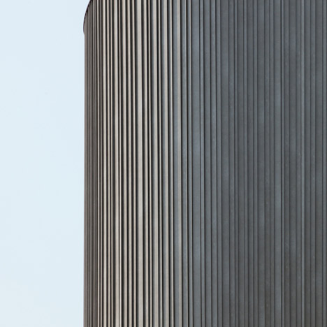
A surface of steel wraps the facade and is made of hundreds of vertical strips.
Seoul-based Mass Studies is headed up by architect Minsuk Cho. Past projects include the Xi Gallery in Pusan and the recently completed headquarters for internet company Daum.
See more architecture in South Korea »
Photography is by Kyungsub Shin.
Here's some more information from Mass Studies:
Songwon Art Centre
Buk-Chon, where Songwon Art Centre is located, is one of the few areas that were less affected by the heavy wave of development that has been sweeping through Korea since the fifties. The townscape is based on an irregular network of streets that weave through the area, where Han-Ok is the dominating architectural typology.
During the past 10 years Buk-Chon has seen lots of buzz primarily caused by the newfound interest of the public on the traditional townscapes. Han-Oks (traditional Korean houses) have become a subject of admiration again, and many commercial/cultural businesses have been brought into the area to take advantage of this setup. In this social context, it is consensual that any new development in the area intrinsically faces the challenge to simultaneously conserve existing values, and contribute in a new way to what already is.
Not surprisingly, with our project we faced numerous restrictions and conditions that were inherent to the site. The design development process took an unusual amount of time – as we neither wanted this project to become a compromise to the restrictions nor a mere negotiation between the contextual obligations. The design is a result of optimizing the parameters, sensitively reacting to the surrounding and simultaneously developing a rigorous logic.
A Pre-determined Shape
The site is an irregularly shaped piece of land, roughly 297 sqm in size, sitting in an entrance location to the Buk-Chon area when approached from the city center. The two adjacent roads meet in a sharp angle, with the main street sloping up towards the site. These situations give this small plot an unusually strong recognizability.
The massing of the building is largely limited by two conditions – the shape of the plot determined the plan of the building, and the adjacently located House of Yoon-Bo-Sun, a cultural heritage site, determined the elevation of the building to be cut in an angle in relations to sightline conservation. The volume trapped in these restrictive borders could only contain roughly two thirds of the maximum buildable floor area above ground (90% out of max. allowed 150% FAR). Therefore, much of the exhibition program had to be located below ground-level.
The resulting building is three floors below ground level and two floors above. The bottom two floors are used as an exhibition space, the semi-underground B1 level as parking, and the top two floors house a commercial restaurant and other social functions.
Structure - Silent Acrobat
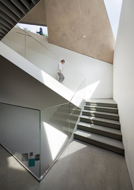
Another condition with the site was the parking requirement – 7 spots needed to be provided within the plot area. The only way to suffice this condition was to designate a semi-underground level that is made accessible from ground level through the use of a piloti scheme. We had to come up with a structural scheme that simultaneously lets us fit everything within the relatively small site and also lift the building up. By making the piloti structure out of two triangular walls, forming half a pyramid, we were able to also house the entrance and staircase leading into the main space below ground within the structural element.
With the exception of the sloping roof, the aboveground mass is generally represented in a set of strictly horizontal or vertical concrete planes, forming a hard shell-like unibody structure. The Mass is then balanced on the aforementioned ‘half pyramid’ on one side, and a leaning column on the other. This composition allows the building to be seen as performing a ‘silent acrobatic act,’ slightly floating above ground – while still staying close to it.
Vertigo Moment, Two Windows at the Corner
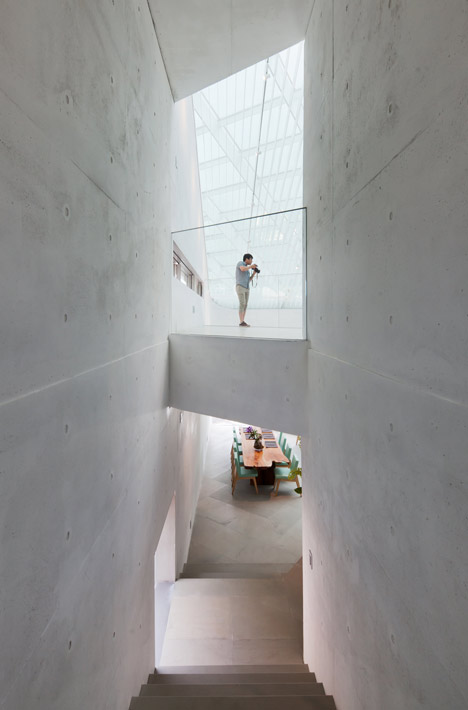
In section, the building can be seen as two programs separated by the parking area – the social function of the restaurant above, and exhibition spaces below. As the sharp corner of the site is approached by pedestrians, one encounters two acrylic windows each revealing one of these two spaces – a curved, seamless window to the top, revealing the 7-11m high space to the above, and a triangular window within the base of the pyramid reveals the 8m space below, resulting in a sudden unexpected moment of vertigo as the entire height of the building (some 19 meters) suddenly presents itself.
Two kinds of Light Conditions
The two main volumes differ in the way they deal with lighting conditions. The underground volume needs to provide varying lighting conditions depending on the requirements of the exhibitions it houses – thus flexibility is essential, and the system relies heavily on artificial lighting. The exception is made in the entrance to the exhibition space, where the previously mentioned triangular skylight dramatizes the entry sequence by providing natural light into the vertical space. One may think of a skylight as an object that is looked at from below, but in this case the triangular window greets the visitors as an opening in the ground and then later changes its identity into a skylight as we descend into the gallery. We think of this as an adequate, surprising way to begin the gallery experience.
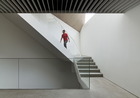
The walls of the social/ restaurant space above ground are mostly solid – with the somewhat limited exceptions of a few slits and small windows that were devised to provide ventilation and some amount of view towards the outside. The main source of lighting here is the skylight that takes up a large portion of the sloped roof – a response to the cultural heritage regulation from an adjacent building. The ceiling is composed of 3 layers of steel components – skylight frame, structure and louvers – each of these layers are oriented differently for a diffused lighting effect. The skylight itself is made of triple glazed panes with an embedded layer of expanded steel mesh which aids the process of primary sunlight filtering.
The steel louver system is applied to the ceilings of both the restaurant and exhibition spaces, albeit for different purposes. If the roof louvers were installed to control the daylight, the basement ceiling louvers were to add flexibility to the artificial lighting system. This gesture of using the same louver system in different ways was also to have the two spaces create a visual coherency.
The exhibition space has a polished concrete floor and white walls, whereas the more social restaurant space keeps the naturally exposed white concrete as its finished surface. The two spaces share a somewhat understated material and color scheme, but vary subtly according to the functions of the spaces.
Silent, but Unfamiliar Pleated Wall
It was suggested by the client that we use a material manufactured by a specific steel manufacturer – who is also an important supporter of Songwon Culture Foundation. This particular steel company has the technology to roll paint various colors and patterns onto rolled galvanized steel sheets. These products are commonly used as a reasonably priced exterior finishes, normally in a panel format.
With the help of the metal company we were able to apply a customized finish that resembles concrete or perhaps weathered zinc, in somewhat of a distressed tone. This finish was applied through the roll printing process and then these coloured Galvanized sheets were folded and cut into V shaped channels of 5 different widths – ranging from 3 to 7cm in 1cm increments. These channels wrap the exterior of the building forming a row of full height vertical strips, in a randomized array of the five different widths. Absent of horizontal breaks, this exterior finish gives an illusion of being casted in a single piece, rather than being an assembly of several smaller pieces. The intention was to have the building perceived as an ambiguous monolithic mass.
The resulting pleated texture, combined with the varying boundary conditions of the building plan – having straight and rounded portions - reacts with the natural lighting conditions in an unpredictable way and obscures the materiality and construction of the exterior. Here the building becomes ‘silent but unfamiliar.’
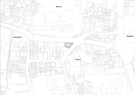
Above: site plan - click above for larger image

Above: top floor plan - click above for larger image

Above: upper ground floor plan - click above for larger image

Above: lower ground floor plan - click above for larger image

Above: upper basement floor plan - click above for larger image

Above: lower basement floor plan - click above for larger image
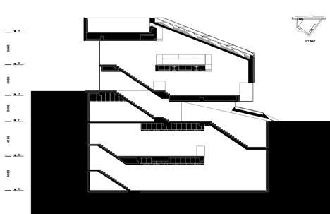
Above: section one

Above: section two