HomeMade by Bureau de Change
London studio Bureau de Change has combined two terraced houses in London by punching through original walls and adding a glazed kitchen and a floating staircase (+ slideshow).
An earlier extension behind the two properties had already created a route between them but Bureau de Change took this one step further by converting the two sides into a single property, with a new self-contained apartment upstairs.
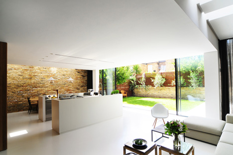
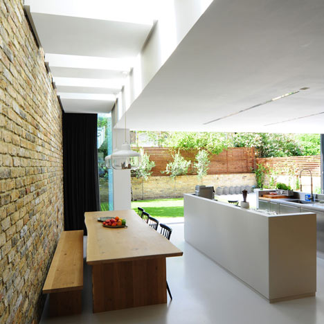
The new kitchen is inserted into the space beneath the extension, so that it appears to burst out from beyond the original line of the brickwork. Brick walls are also exposed inside the kitchen, while island worktops sit at the centre of a polished resin floor and skylights line the edge of the room.
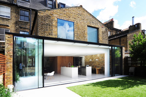
"We were very sensitive to how materials and colour were used to create a coherent identity for the house and balance between the old and new," said architect Billy Mavropoulos. "In the extension, the coolness of the polished resin floor is warmed by the large reclaimed brick walls."
Interior walls are removed on both sides to allow rooms to open out to each other and sliding glass doors lead out from the kitchen to the garden.
"We didn't want to be constrained by the old format, we wanted to address it as a single family space," added Mavropoulos. "A key part of this was identifying a new 'heart' for the home."
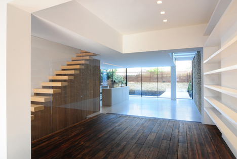
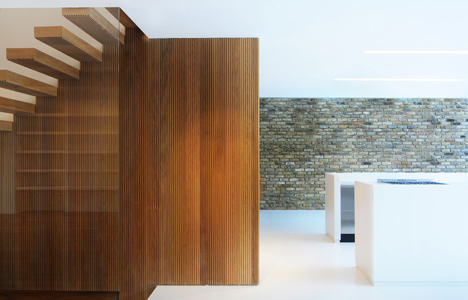
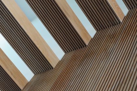
This heart is created by a slatted timber box at the centre of the house. A series of wooden treads cantilevers from the side of this box to create a new staircase, while a second set of stairs is contained behind the timber to provide access to the upstairs apartment.
Other recent London extensions include a house with a combined staircase and study and a residence with two tapered volumes projecting into the garden.
See more residential extensions on Dezeen »
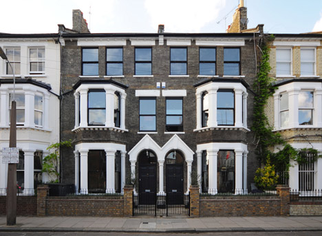
Photography is by Eliot Postma.
Here's some more information from Bureau de Change:
HomeMade by Bureau de Change Design Office
'HomeMade' is the first residential scheme by London-based design studio Bureau de Change. The project takes two neighbouring properties and merges them into a single family home with a new extension providing a kitchen and living space at the rear of the property.

Above: concept diagrams - click for larger image
The first design step was to connect the two properties by opening up many of the dividing walls and creating openings to give visibility, access and a more unified feel.
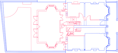
Above: former ground floor plan
A new 'heart' is created through an oak-wrapped box which sits at the meeting point between the original house and the new family space. Within this box is contained storage, partitions and a new cloakroom. At its edge sections of timber are peeled at right angles to form an open staircase leading to the floors above.
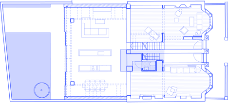
Above: new ground floor plan
Beyond this core sits the new kitchen and dining space – created by wrapping the entire rear facade in glass, as though the two buildings are being physically pulled together by the glazing.
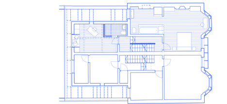
Above: new first floor plan
This 11 metre-long façade consists of tall sliding glass doors which blur the boundary between the inside and outside. At the edges, the glass doors 'climb' over the original building, creating skylights and windows with the same finish and detailing. Inside this space, the steel kitchen islands are hidden within two oversized resin shells which appear to have been pulled up from the floor.
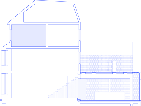
Above: long section
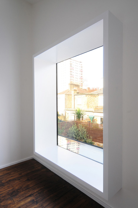
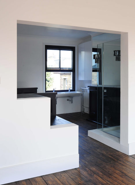
Inside the house, original features have been retained or reused wherever possible. But at the rear, the character of the new extension is also adopted in the first floor where new windows form large glass walls in the bathroom and at points, are extruded to create seating. Throughout the house the differences between old and new, light and dark are celebrated.