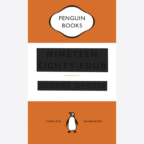
Graphic designer David Pearson has censored the cover of George Orwell's classic novel 1984 as part of his series of redesigned books for publisher Penguin.
Referencing the novel's themes of totalitarianism and censorship, David Pearson debossed the title and author and covered them with black foiling.
Penguin's Great Orwell series also includes Down and Out in Paris and London, whose cover by Pearson frames a Vorticist-style screenprint of the two cities by Paul Catherall.
Homage to Catalonia, an account of Orwell's experiences during the Spanish Civil War, features a repeated cubist line drawing of a soldier.
Animal Farm's cover is dominated by bold, cartoonish lettering in the style of an old movie poster, while Politics and the English Language uses a new font, Caslon Great Primer Rounded, which is inspired by a typeface created by Caslon & Catherwood in 1821.
We recently featured a font based on an impossible triangle and an alphabet of sculptural letters that can be read from four sides – see all fonts on Dezeen.
Other graphic design we've published lately includes stripy album artwork by British designer Peter Saville and a collection of recognisable products with their brand names removed – see all graphics on Dezeen.

