Deskontalia store in Donostia by Vaumm
Internet shoppers in San Sebastian can now pick up their purchases from a shop that appears to be furnished with nothing but cardboard boxes (+ slideshow).
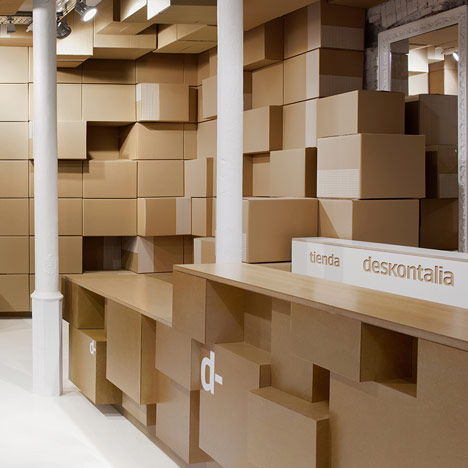
Spanish architects Vaumm designed the store for group discount voucher website Deskontalia as a place where customers can pick up their deliveries and find out about the latest offers.
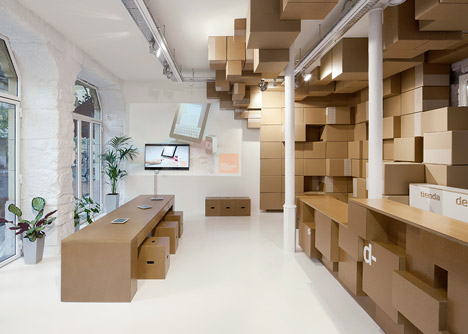
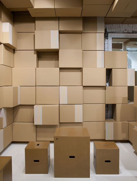
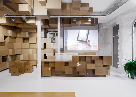
Unlike most shops, the space has no products to display, so the architects were challenged with filling an empty room. Inspired by the cardboard boxes used to transport purchases, they developed a concept to cover the floor and walls with boxy wooden furniture and shelving.
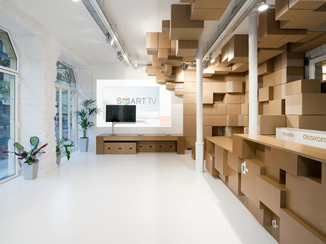
"Cartons are converted into the measurement unit of the architectural proposal," explain the architects. "Small cartons are elements to generate a kind of sculpture that envelops the walls and roof to create different environments which users can interact with."
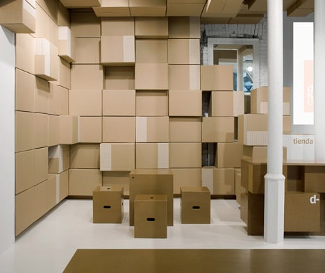
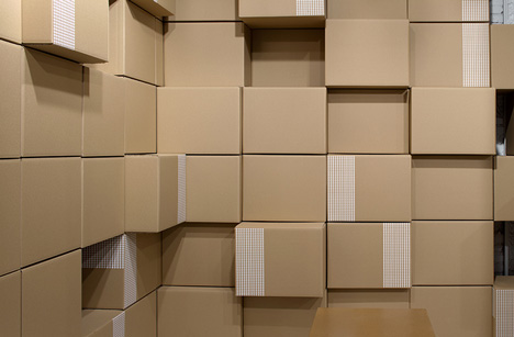
Most of the boxes are used as shelves that can be reconfigured to suit different displays. Others are made from wood and provide tables and stools where customers can sit and browse the website.
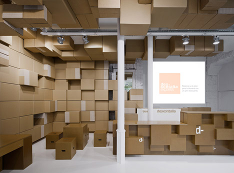
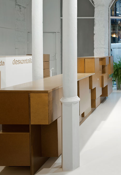
A reception counter lines the edge of the room and also resembles a pile of boxes.
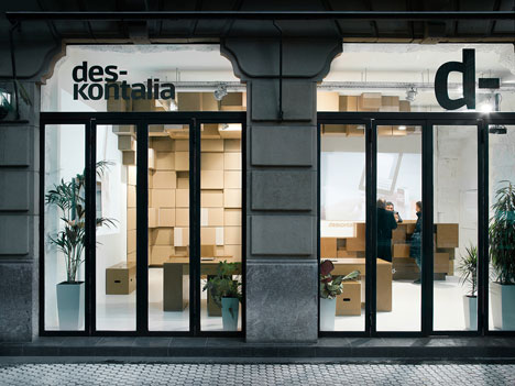
Aside from the boxes, the shop's interior is kept simple, with existing walls and columns painted white and plants positioned beside the windows.
Other cardboard interiors include a cardboard meeting room for Bloomberg, a cardboard bank and a fold-out cardboard shop.
Spanish architects Vaumm are based in San Sebastian. Past projects by the firm include a golden culinary centre and an outdoor elevator.
Photography is by Aitor Ortiz.
Here's a project description from Vaumm:
Deskontalia store in Donostia - San Sebastian, Gipuzkoa, Spain.
When somebody thinks about a shop, he can hardly avoid thinking about the products sold inside, and therefore those products are those which give sense of the need for a space. What would it happen if that object of desire was any? What if no one?
For Deskontalia store, located in a urban downtown street, the sale has occurred even before one reaches the local. The space should be a pick up point for any product that one could imagine buying over the Internet, but even something else.
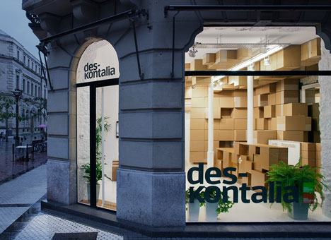
From that point of view the space should become not only a space to sell, but a space to be a meeting point between brand and people, an open space, a place of the city where an online business becomes a physical reality.
The store activity is linked to package traffic, cardboard containers in which travel purchased products, which are collected in this new architectural space. A small counter where to exchange these packages of hands, solves all the functional requirements of the trade.
The space has been treated as a white empty space where old items such as masonry walls or casting pillars are bathed in this colour, as well as more contemporary new resin pavement, in an attempt to transform the store not in a shop but in a store where different transformations may occur.
Cartons are converted into the measurement unit of the architectural proposal. Small cartons are elements to generate a kind of sculpture that envelops the walls and roof to create different environments which users can interact with.
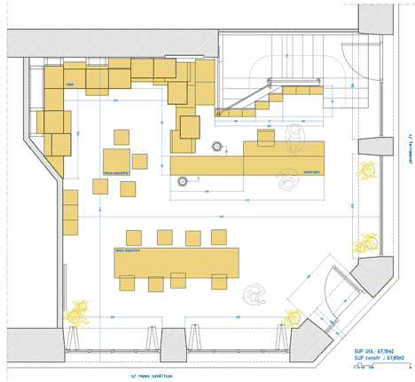
Above: floor plan - click above for larger image
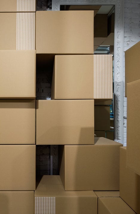
These packaging boxes incorporate the graphic image of the brand, a d-, like a strip on both sides, 90 degrees in space. Thus, the store gets a sculptural object at its scale by stacking the cartons with multiplications of their shapes and cubic components, qualified by the impression of the brand. Somehow it has been generated a kind of recycled space, in which low cost boxes transcend the value and meaning we could give to them individually, to become artistic and modulate the space when considered together.
The walls are not only boxes bookshelf but also part of the shell, the roof parts are not only sculptures but also shapes that break the echo sound of the store which also modulate the sound.
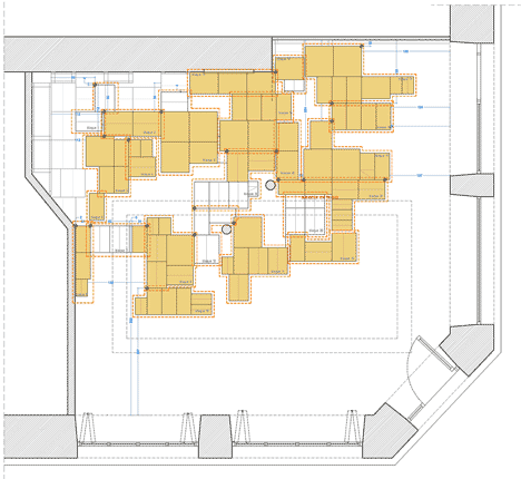
Above: ceiling plan - click above for larger image
Cartons are organized this way in which the white container has become the store, which can be moved at any time, changed or simply replaced by other objects. The cartons composition will be transformed as easily as the other part of the store, which is the Deskontalia web site, which is also shown in the store through two digital projections which interact with users.
Furniture is also involved in this changing condition, so its module-based design lets multiple configurations of the store, so you can have a lecture, read a newspaper, show a new product, or just hang out in internet.
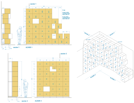
Above: shelving concept - click above for larger image
The counter, stools and tables, somehow show the same packaging language, that besides also incorporates to the design other meanings such as low cost, the ephemeral, the changing and the casual, all of them concepts that underlie also the Internet purchase which serves to this commercial space.