House DZ in Mullem by Graux & Baeyens Architecten
This house in Belgium by Ghent studio Graux & Baeyens Architecten is broken down into cubic volumes that are staggered to let more light into each room (+ slideshow).
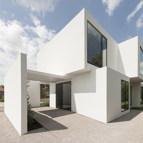
Located in the village of Mullem, the bright-white building accommodates a family house and a small practice for a physiotherapist.
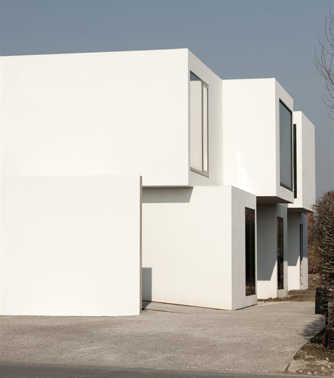
Graux & Baeyens Architecten were restricted from building too close to neighbouring houses, so were only left with a narrow plot to fit the house onto. This meant all rooms had to be organised on a linear axis with the physiotherapy practice tacked onto the end.
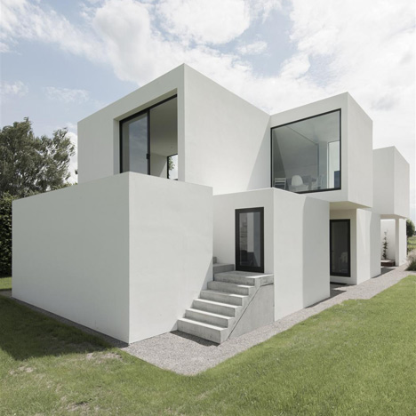
"Planning regulations required a minimum clear gap of four metres between the neighbours on both sides of the already narrow site, which meant that the building's organisation had to be very efficient with space," explain architects Basile Graux and Koen Baeyens.
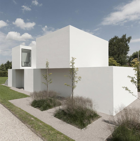
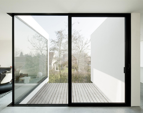
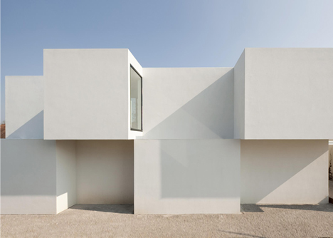
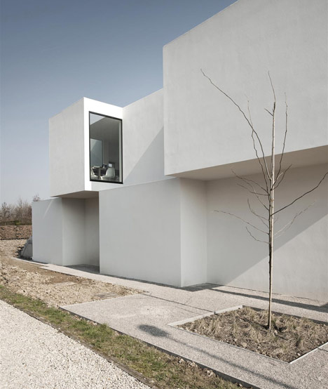
Rooms are staggered back and forth on both floors of the two-storey building, adding space for additional windows on the protruding walls. As well as letting in more light, this prevents any problems with overlooking the neighbours.
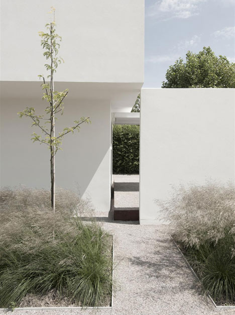
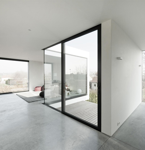
All bedrooms are positioned on the ground floor, freeing up space on the upper storey for an open-plan living and dining room with views out over the village rooftops. Different areas are loosely defined by the set backs in the walls, while balconies are slotted into the recesses.
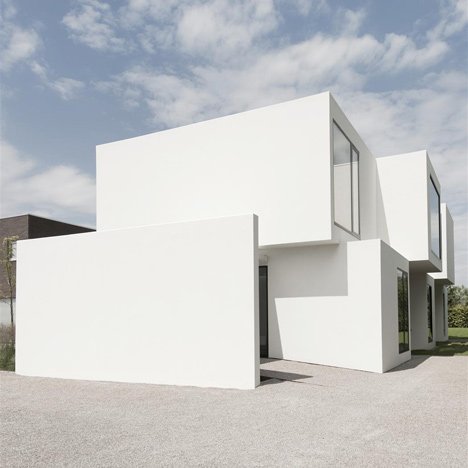
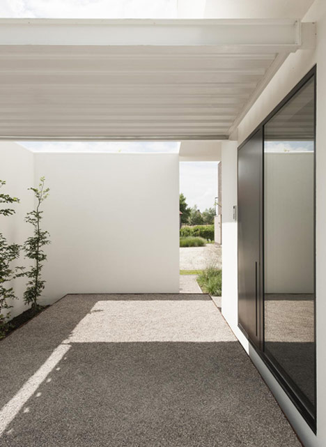
To integrate a parking space for the family car, the architects added an extra wall and shelter beside the house's entrance.
Other interesting houses in Belgium include a residence in a former laundry building and a glass house with a sunken swimming pool. See more architecture in Belgium.
Photography is by Luc Roymans.
Here's a more detailed description from Graux & Baeyens Architecten:
House DZ in Mullem, Belgium
New construction of a private house + physiotherapist practice
The general concept of the building is responsive to the narrow plot and dense program as required by the clients. The brief was for both a family home and a physiotherapy practice.
Planning regulations required a minimum clear gap of four metres between the neighbours on both sides of the already narrow site, which meant that the building's organisation had to be very efficient with space.
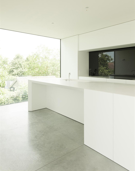
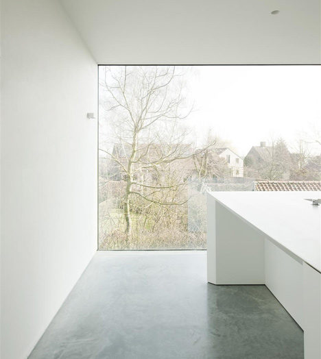
The first step in working with these limitations was to switch the traditional dwelling program. The daylight functions (kitchen, dining, living & terraces) are located on the first floor with bedrooms and bathrooms located on the ground floor. This allowed for better views from the spaces on the first floor along with much more natural light entering the most commonly used spaces. The monolithic volume was then separated into smaller blocks which could shift to achieve maximum direct sunlight entering the building along with selecting specific and beautiful views.

The first floor is kept open plan but the shifting rooms also act to define and separate the different spaces without actually creating physical divisions. Each space is visually connected but has its own atmosphere due to the location of the windows and shifting of the blocks. By shifting the blocks on the first floor balconies are also created for the kitchen and lounge space.
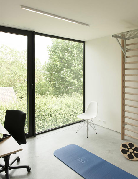
The windows were carefully placed in the facade to capture surrounding views in particular the green areas to the east of the site and also to allow direct sunlight into the living spaces. The south facade is kept closed for privacy and to block the sun when its at its highest point.
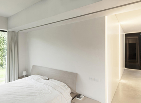
On the south west facade the windows are placed perpendicular to the neighbours. This is once again to maximise the amount of natural light entering the building and to ensure privacy for both the neighbours and our own clients.
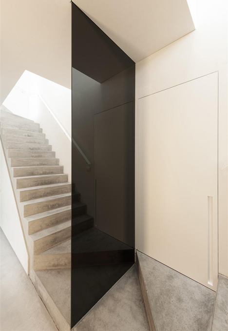
An efficient and sustainable volume is achieved due to the compact nature of the building along with its orientation to maximise natural sunlight wherever it's possible.
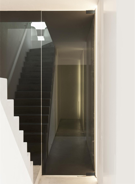
The buildings compactness is also evident with the efficiency of the program. The client requested a physiotherapy practice to be incorporated into the building. The ground floor is defined by a narrow corridor which has two stairs mirroring each other.
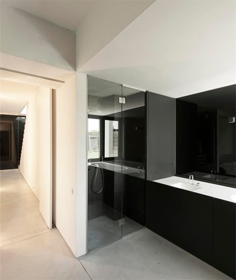
One stairs connects the bedrooms and bathrooms to the living areas on the first floor. The public stairs connect two physiotherapy practices one on the ground floor and one on the first floor. These stairs separate the private and public functions but also help to bring light into the ground floor and to open up the corridor space, creating an airy and pleasant entrance to the building.
The client also had a requirement for a car port and garden shed on the ground floor. These program requirements were used within the sites limitations to achieve their function and also define private external spaces.
The car port acts as a private and secluded entrance for the physiotherapy practice and the garden shed defines a terrace which is secluded from the neighbours and opens out into the garden. External steps lead up to the lounge area connecting the first floor living functions to the garden.
Address: Mullem, Belgium
Client: family DZ
Design: 2009-2010
Interior design: 2010-2012
Start construction: January 2011
Finished: February 2012
Site area: 810 sqm
Built area: 263 sqm
Design architect: Graux & Baeyens Architecten
Project architect: Graux & Baeyens Architecten
Materials:
- Facade Facade System on EPS insulation
- Construction concrete and brick
- Windows Aluminium
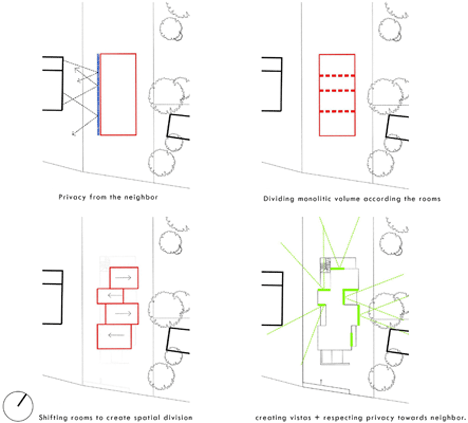
Above: concept diagram
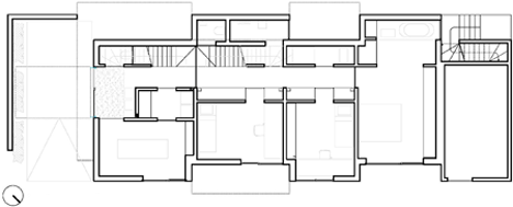
Above: ground floor plan
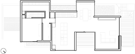
Above: first floor plan

Above: cross-section