Elsa Morante Library by DAP Studio
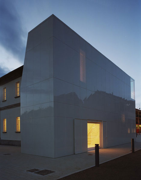
Italian architects DAP Studio added a perforated aluminium tower to this former chapel in the Italian town of Lonate Ceppino, converting the entire building into a public library.
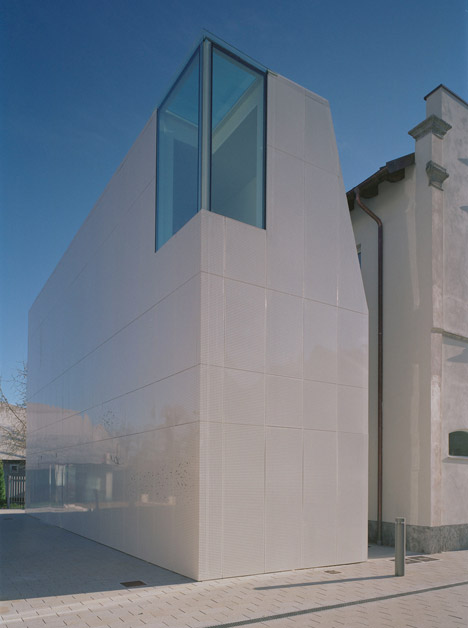
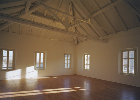
The Else Morente Library, which opened in 2009, was first constructed as the Oratory of San Michele: a two-storey chapel with an ornamental facade of symmetrical pilasters and intricate detailing. For the renovation, DAP Studio decided to restore these features, then replace an existing stair tower with another that would be more sympathetic.
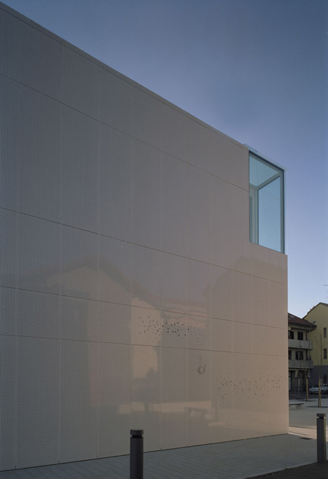
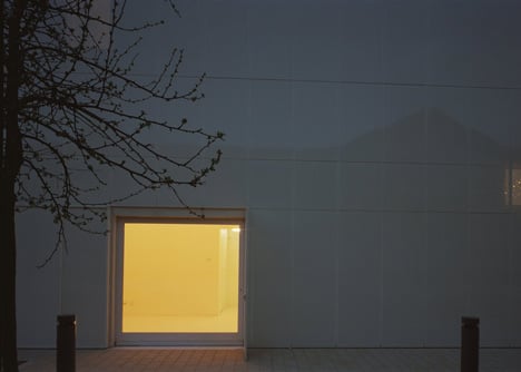
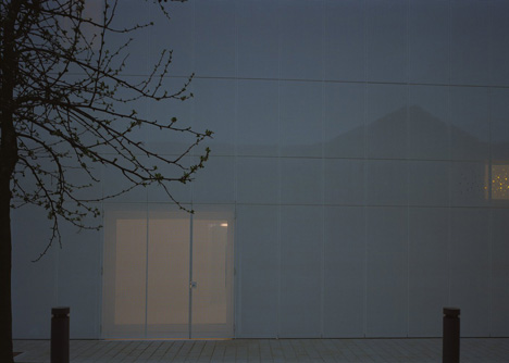
The architects designed a two-storey extension clad with perforated panels to match the light render of the old building. The upper storey of the volume is tapered inward, so that it pulls away from the overhanging eaves of the restored roof.

"The challenge was to respect the historical building but also to [show] its new public role with a contemporary element," architect Elena Sacco told Dezeen. "The new volume has not only an architectural value, but it also allowed us to clear the historical building of the functional and potentially invading elements."
An entrance corridor with a glass roof connects the two structures on the ground floor, while an enclosed wooden bridge branches across at first floor level.
"The relationship between the two volumes has a subtle nature, made of alignments and visual connections," added Sacco.
Toilets and archival areas are located in the extension, allowing the library shelves and reading areas to take up the entire ground floor of the renovated building.
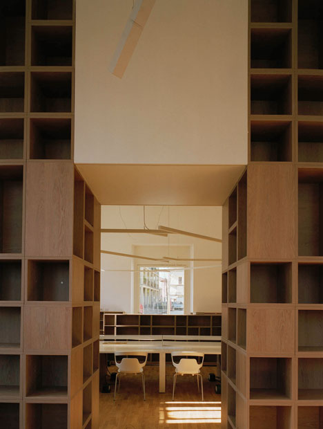
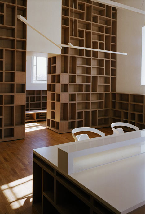
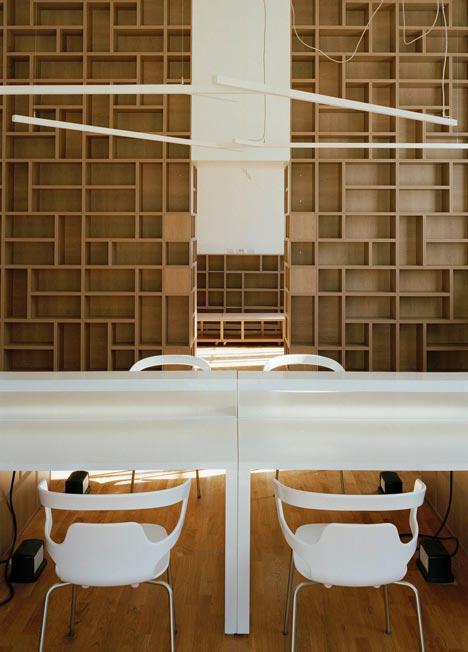
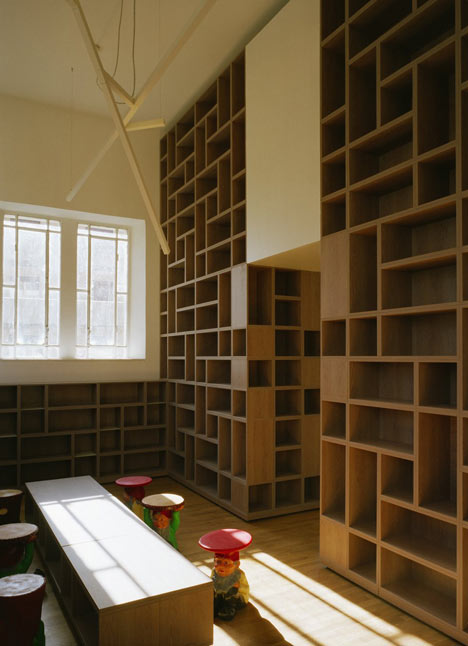
The library is divided into four sections and includes a reading room, a study area, a newspaper library and a children's section. High ceilings allow room for tall shelving systems, comprising a stack of modular wooden containers. These containers are also piled up to make desks.
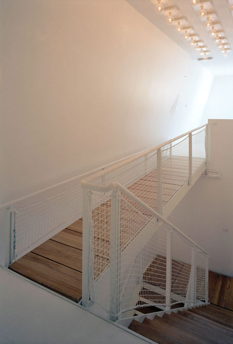
A multi-purpose room occupies the first floor and can be used as an exhibition room or a conference hall.
Milan-based DAP Studio more recently completed an office interior inside a former factory in Turin. See more architecture and interior design in Italy.
Other libraries we've featured include one that appears to float over a shallow pool and one that appears to be clad in translucent marble. See more libraries on Dezeen.
Photography is by Luigi Filetici.
Here are a few words from DAP Studio:
Elsa Morante Library
The pre-existing building for the new Lonate Ceppino Public Library already belonged to Lonate Ceppino's historical heritage. On a rectangular plan, the two levelled buildings housed the civic library on the ground floor, while the first floor had been left unused. From the outside, the main entrance façade has a higher decorative part which is independent from the roof structure. This façade stands out further on the building gutter line and laterally its design suggests the idea of an unfinished bell tower. In this case, neither the bidimensional outline has a counterpart in the interiors. A few ornamental elements mark the façade hierarchies. The design of the fronts is organized in horizontal bands at different heights while on the north, south and west fronts a system of vertical pilasters apportions the windows on both floors. The east front lacks any decoration and, before the intervention, it was badly compromised by a recently built volume for the service rooms.
The intervention aimed to restore the historical pre-existing building and to adapt the new building to its re-gained functional use. Being inadequate, the previous service's volume extension was removed together with the internal stairs, which were damaged and not according to laws. The project restored many areas injured by dampness, plasters, floorings and roofing.
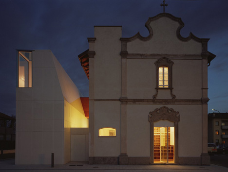
Besides the east front a new well balanced volume has been built, including bathrooms, archives and technical systems. This last choice allowed to clear the historical building out of the functional and potentially invading elements, minimizing any demolition and making the facility rooms easier to share.
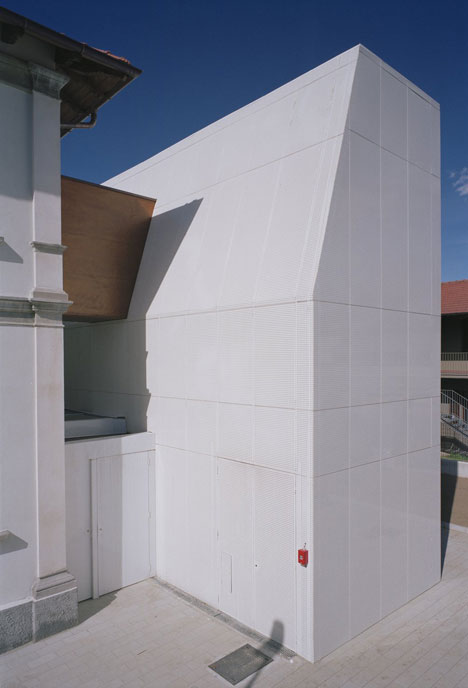
The new volume's architecture is marked by a narrower profile on its top, with a sloping side that restrains to give more space to the historical building pitches. The dialogue between the volumes is the key and main theme leading the whole intervention. The relationship between the two is nourished by juxtaposition between matterness and lightness, solidity and instability, opaque and reflecting materials.
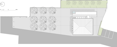
Above: site plan
The highlighting of differences underlines the peculiarities of both volumes, in a mutual figure-background relationship. The two buildings are connected through a glazed roofed little volume. The entrance is on the left side and a further wooden connection goes to the first floor.
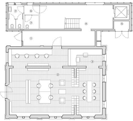
Above: ground floor plan - click for larger image
The library hall is divided into 4 specific areas: a conference area with a little newspaper library, the children's area, the bookcases' and the reading tables. On the first floor there's a flexible room for exhibitions or conventions.
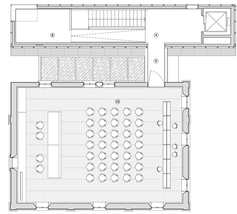
Above: first floor plan - click for larger image
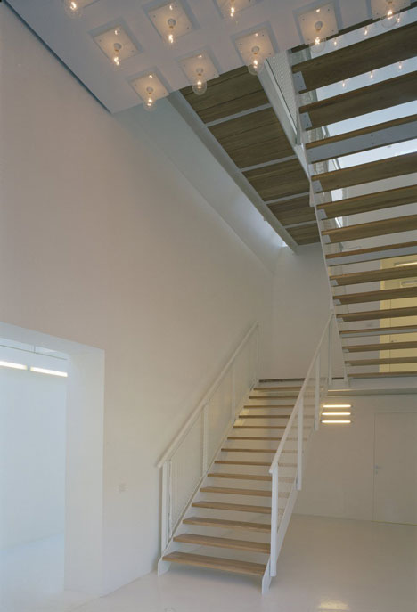
Inside the new volume space reduces while climbing upstairs. After the first floor a platform drives you to a little space lit up by a window on a corner. This spot is the zenit of the specific spatial sequence developing inside the building.
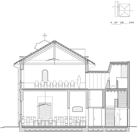
Above: section one - click for larger image
The interiors are monochrome, with a resin floor and enamel walls. The stairs and the white metal platform have durmast steps. Lighting is provided by a pattern of incandescent lamps.
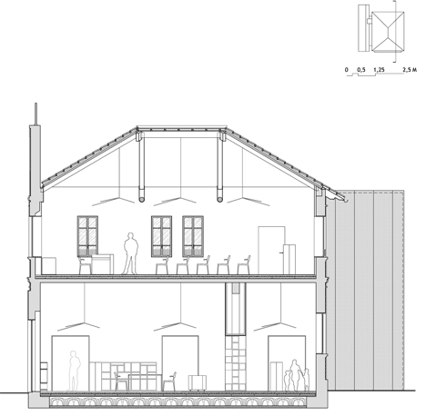
Above: section two - click for larger image
Inside the historical building the floor is in durmast too and the original roof has been restored. The wooden bookcases are designed as modular aggregations, able to be assembled at different heights and exhanged.
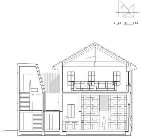
Above: section three - click for larger image
Client: Lonate Ceppino Municipality
Project: Dap studio Elena Sacco Paolo Danelli - www.dapstudio.com
Structures: GB. Scolari
Facilities: M. Piantoni, A. Bronzoni
Contractor: Gruppo Edilia
Interior Furniture: Habitat Italiana