Foursquare New York by Audra Canfield, Derek Stewart and Dennis Crowley
The New York headquarters of location-based social network Foursquare is filled with themed rooms based on the digital badges users earn from "checking-in" at different places using the service.
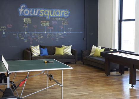
Foursquare co-founder and CEO Dennis Crowley and operations director Derek Stewart worked with interior designer Audra Canfield of Designer Fluff to develop a concept for the interiors, intended to create a fun and relaxed working environment that matches the style of the website.
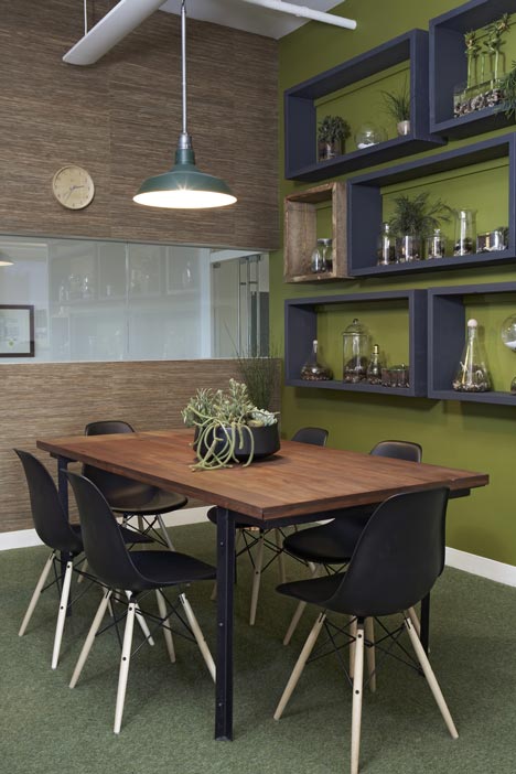
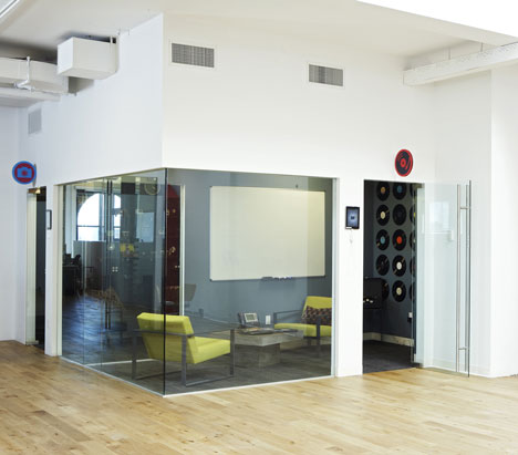
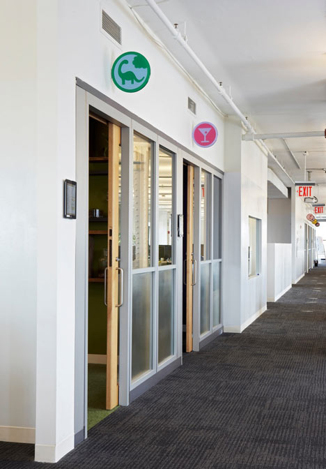
The team created a series of meeting rooms, each designed around a different badge. These badges are hung above the entrance to each room to help employees to find their way around.
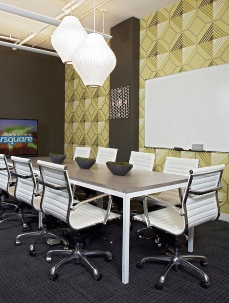
The Swarm badge, which Foursquare users earn by visiting busy places, is designated to a room with a beehive theme. Tessellated yellow wallpaper lines one wall, while pendant lights resembling beehives are suspended over the conference table and a honeycomb-patterned clock hangs from the wall.
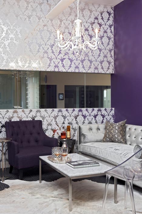
A nightclub-themed room is assigned to the Socialite badge, which users pick up by visiting one of several exclusive venues in New York and San Francisco. This room features flocked wallpaper, a cow-skin rug and a crystal chandelier.
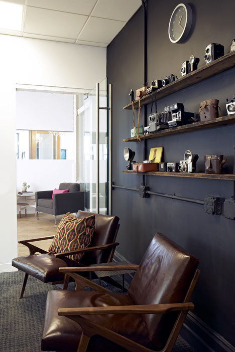
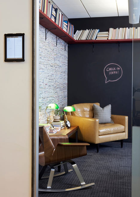
Antique cameras fill the Photogenic room, based on the badge earned for visting photo booths, while the Bookworm badge, for libraries, denotes an area with recycled magazine wallpaper and back-to-front books on its shelves.
The badge given for visits to vegetarian restaurants appears above the door of a meeting room containing a grassy floor and terrariums filled with plants and plastic animals. Meanwhile, the Vinyl room has records covering its walls.
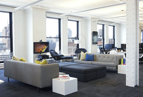
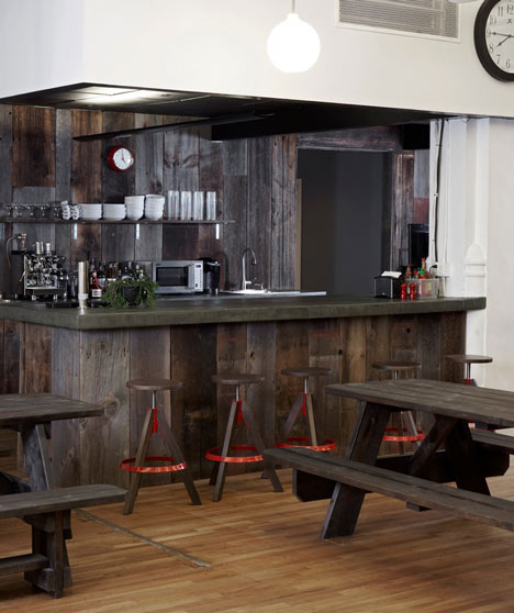
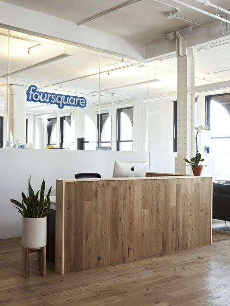
Other spaces in the headquarters include a lounge, where the team have added a pair of phone boxes, a bar and a general office with a simple monochrome colour scheme. "I felt a grey and white backdrop would allow the living colour of the office to speak for itself and also balance the fun and maturity that they desired," says Canfield.
The Foursquare New York offices are the latest in string of playful designs for technology company headquarters. Others completed recently include Google's Tel Aviv offices, which contain oranges trees and slides, and Adobe's Utah campus, where employees can play basketball and ping pong. See more of the offices here, or read a column from Dezeen columnist Sam Jacob calling for an end to the "tyranny of fun" in office design.
Here's a statement from Audra Canfield:
I didn't hesitate when I was asked to help design Foursquare's Soho office in New York City. As a location-based social networking company, Foursquare "helps you and your friends make the most of where you are". I was hired by Derek Stewart, the Director of Finance and Operations, who had already begun designing the office and had set a tone from which to build a concept. The Foursquare team had decided that they wanted each conference room to have a different unique theme based on their check-in badges, i.e. Jetsetter for airport check-ins, Far Far Away for destinations above 59th St bridge in NYC, and Vinyl for record store check-ins. The badges hang outside the door of each conference room creating a repetition of color and shape throughout the space.
Foursquare's office dynamic is comprised of unconventional working areas, lounges, and a recreational room including shuffle board, foosball, and ping pong tables. They wanted some of the conference rooms to have the typical long tables and others to have a more relaxing, sitting room style. With a tight budget and time frame, Derek and I worked together with Foursquare owner Dennis Crowley to create both a fun and functional office space that reflects Foursquare's unique aesthetic. It was important to Dennis that the office be vivacious and hip, but also sophisticated. Most importantly, he wanted it to feel relaxed. Afterall, most of the company's employees are in their 20's and 30's.
For the main office color scheme, we decided to go with grey and white. We brought in touches of the bright blue and yellow with the pillows from my company, Designer Fluff. Around the office you find boldly colored toys, games, books, clothing and so on. I felt a grey and white backdrop would allow the living color of the office to speak for itself and also balance the fun and maturity that they desired.
For Dennis Crowley's favorite conference room, Herbivore, we decided to use custom terrariums from the Brooklyn based company Twig. Each unique terrarium holds one or more small plastic herbivore animals and is arranged on floating reclaimed wood shelves. Black Eames Eiffel Wood chairs are paired with a wood and iron table. House Pet carpet tiles in the Frog color from Flor further reference the room's concept. A greenhouse style pendant suspends over the table.
Socialite, the check-in for nightclubs and bars, was a fun room to create because I could really go glam with it. Although my faux fur purple hide wallpaper didn't make the cut, I was happy with the Flocked Damask and Foil wallcovering Dennis chose. We used a white cowhide rug, a purple velvet lounge chair, a crystal chandelier, and reflective furniture accents.
Photogenic is the badge for places with photobooths. For this room, I hung shallow reclaimed shelves that displayed antique cameras mounted on a chalkboard painted wall. The back wall is to be covered with the Instagram photos taken by all the employees.
The Swarm badge is a bee motif. I found this great Osborne & Little wallpaper in a yellow/green, white and grey over-scaled pattern that referenced the beehive's architecture without being too literal. The Nelson pendants also subtly reference the hive while adding class and sophistication as well as a feeling of playfulness.
Bookworm is my personal favorite. Since it is the check-in for libraries, we wanted to create a cozy corner office. One line of books turned backwards revealing the simple texture of the book's pages evoking the diminishing time of 'the book.' Recycled magazine wallpaper from Pollack & Associates creates the backdrop again subtly referencing pages, words, their meanings and textures. Mix-matched chairs and a bench stacked with books all in varying brown tones help give this room an eclectic, lived in feeling.
Foursquare was an adventure in design and a great learning process for me as a designer. Everyone was great to work with and I was proud to be part of their team in my own way.