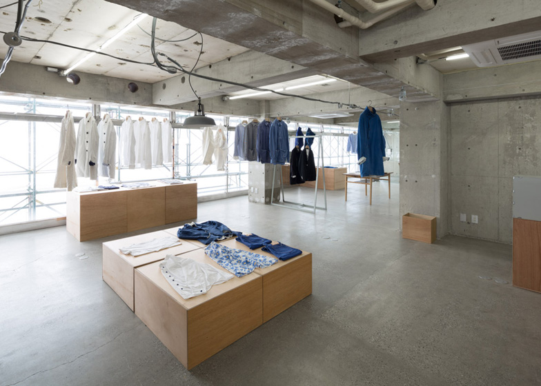
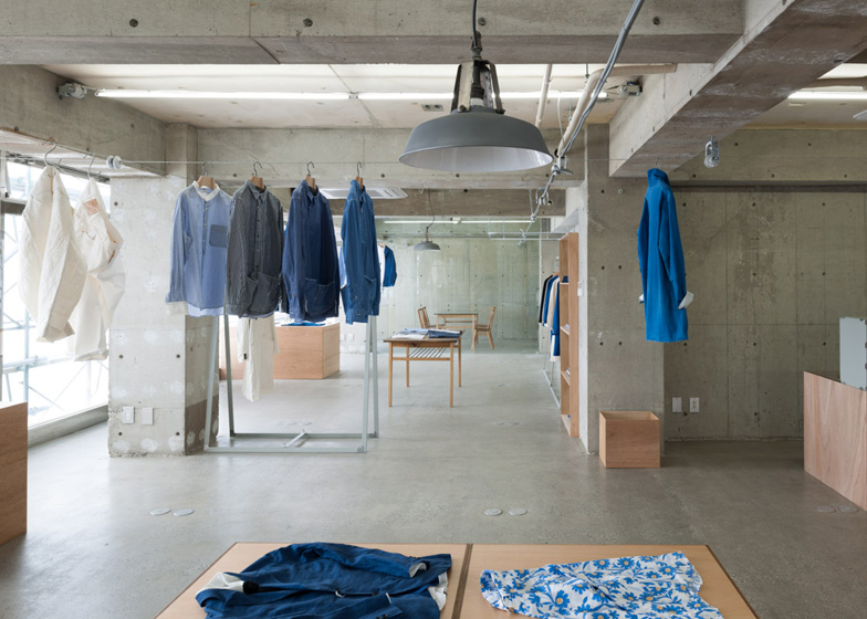
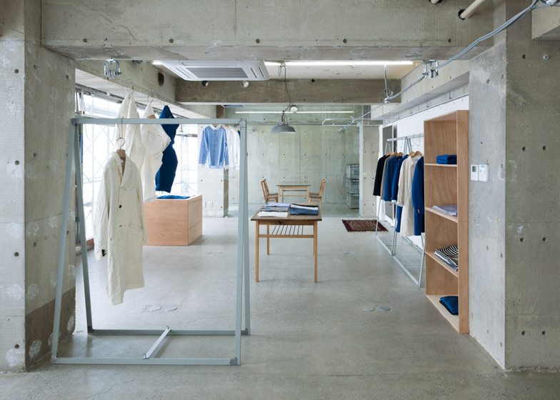
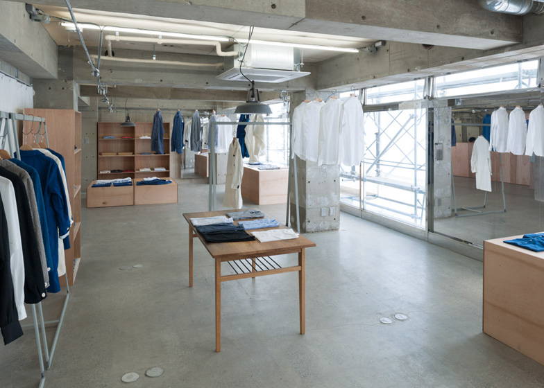
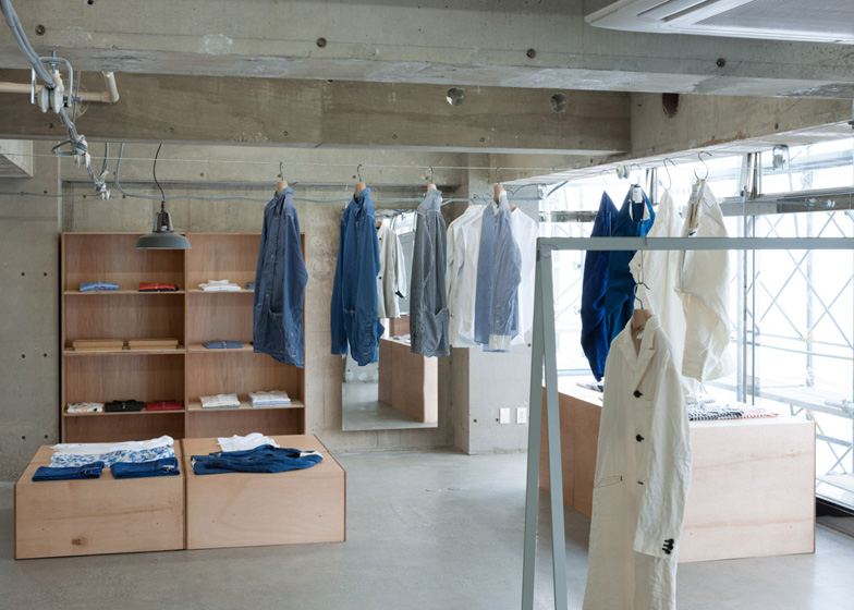
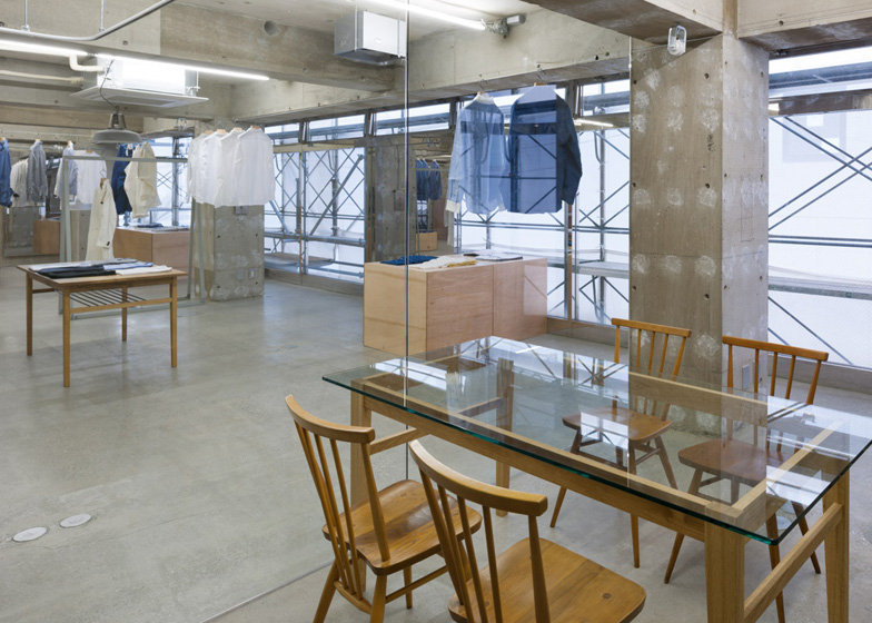
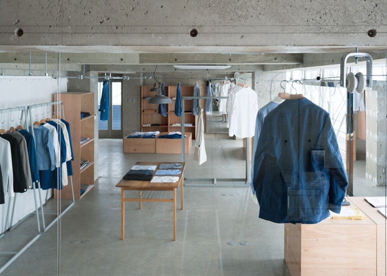
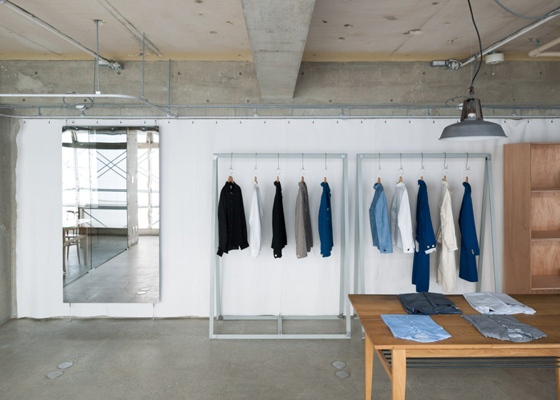
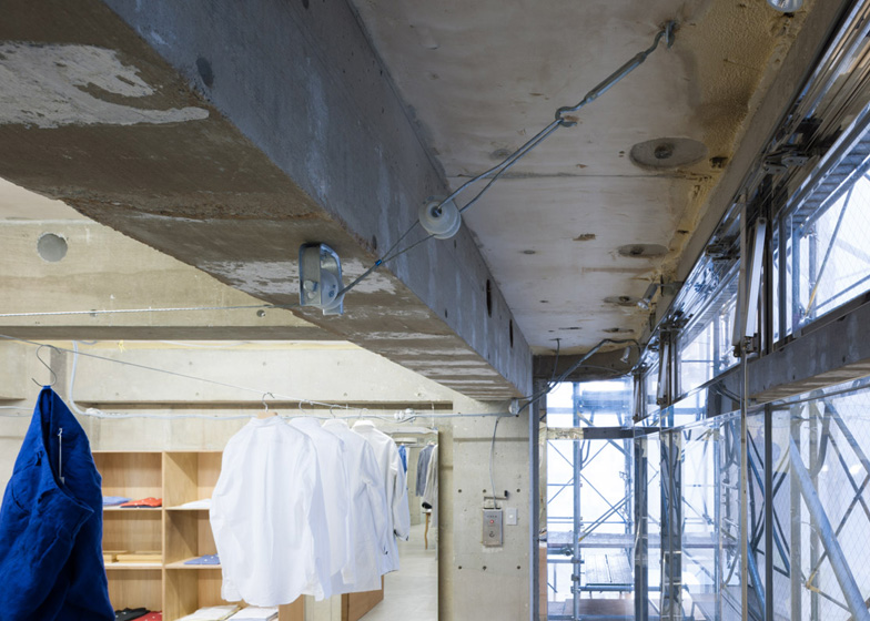
Japanese architect Jo Nagasaka has stripped an office in south-west Tokyo back to the concrete to create a fashion boutique that looks more like an abandoned warehouse for Japanese brand EEL (+ slideshow).
Nagasaka, of Schemata Architecture Office, explains that he associates garments with uncomfortable warmth, so wanted to design a cool interior that counteracts this feeling. "I wanted to make the background as calm as possible," he explains.
Rather than adding new elements to the space, most of the renovation involved peeling away unnecessary layers and sanding down rough surfaces.
"Our construction process was mostly subtraction," he says. "We intend to leave this space somewhat incomplete and when clothes are set in place it will be complete."
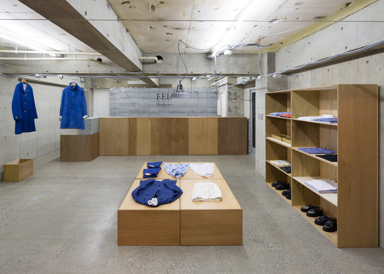
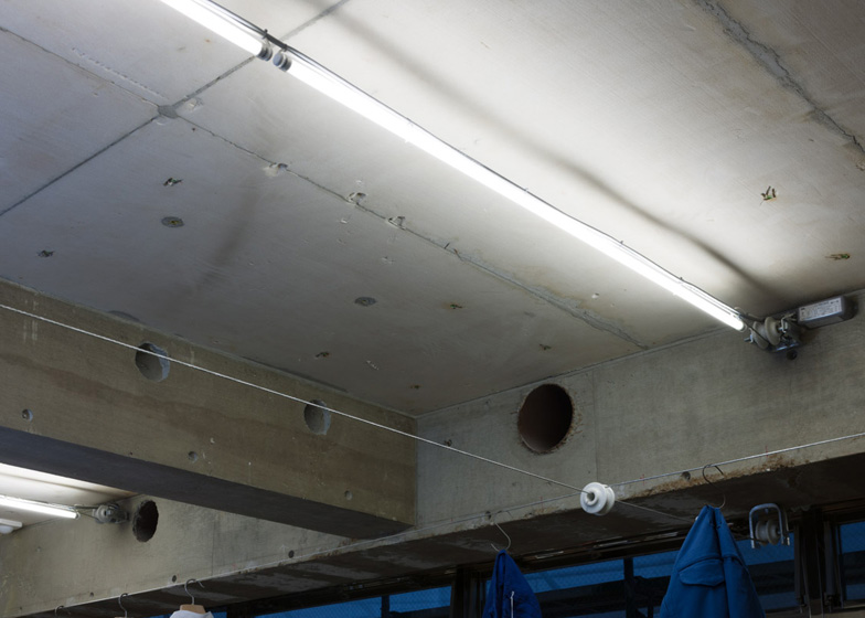
The architects removed the carpet of the old office and sanded down the exposed floor to create a smooth surface. They also pulled down a suspended ceiling to reveal lighting fixtures, electric cables and ventilation pipes.
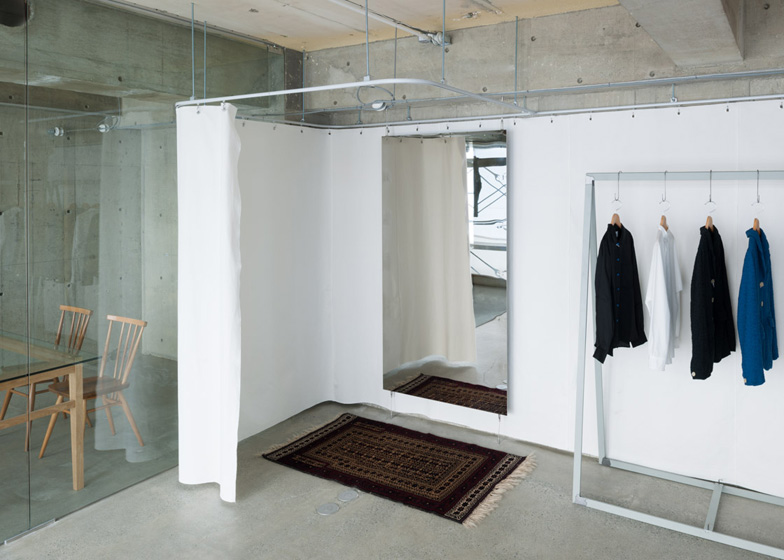
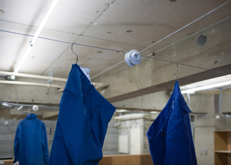
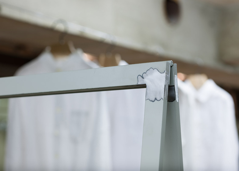
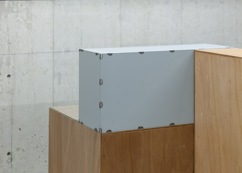
Bookshelves and large boxes made from lauan plywood are scattered around the room as display areas for folded garments and accessories. Other hang from welded stainless-steel racks or from cables strung across the ceiling.
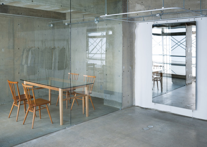
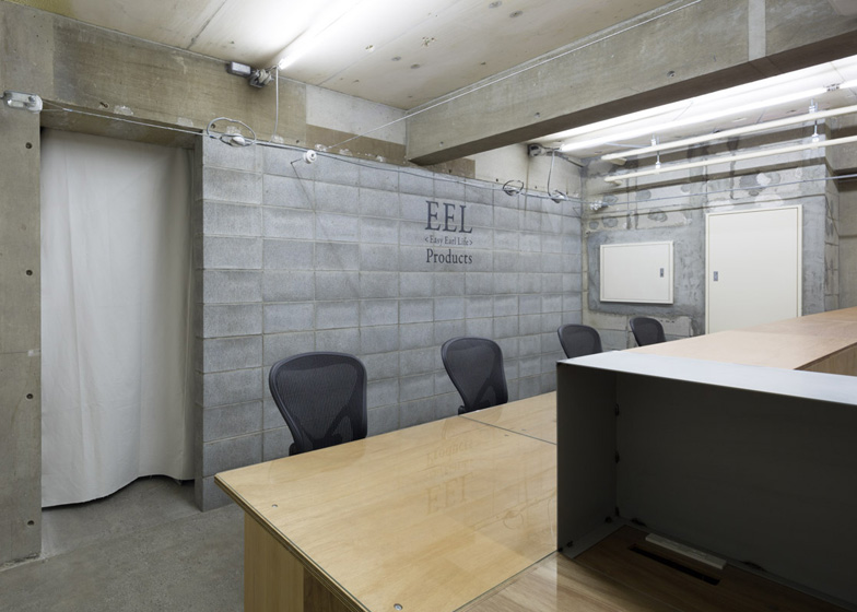
A wall of concrete blocks separates the shop floor from storage areas at the back, while a glass partition creates a small meeting room to one side.
Jo Nagasaka launched Schemata Architecture Office in 1998 and has since worked on a number of shop interiors, as well as residential projects, office interiors and furniture design. Past projects include Paco, a house contained in a three metre cube, and the Tokyo flagship for fashion brand Takeo Kikuchi. See more design by Schemata Architecture Office on Dezeen.
Photography is by Takumi Ota.
Here's a project description from Jo Nagasaka:
EEL Nakameguro
Creating a sense of 'incompleteness' was the key to our design. In my mind clothes are associated with warmth of human body, sometimes that feeling gets too intense and uncomfortably hot. This is why I wanted to make the background as calm as possible.
We intend to leave this space somewhat incomplete and when clothes are set in place it will be complete. So our construction process was mostly 'subtraction', that is, dismantling, peeling, and scraping unnecessary layers, except for a few 'additional' elements.
The site was formerly used as office space. For the floor, we peeled off the existing carpet and sanded exposed mortar undercoat thoroughly to make it perfectly horizontal and 'super-flat'.
As a result we created unique random mosaic pattern. In some places aggregates are revealed, and in other places finer particles cover up the surface.
We also removed all the finishing materials - paint, baseboard, insulation etc. - from walls and ceiling, and hidden surface of concrete that is unfinished and not ready for public viewing is now exposed. By reversing the construction process, a state of 'incompleteness' reappears.
Display fixtures are also constructed halfway and left at a state of 'incompleteness'. Stainless steel mirror and frame are welded for assembly and we left the weld joint unpolished, so it creates interesting patterns on the surface.
Hanging racks are made of anti-corrosive coated steel pipes. Surface coating is removed at joints then they are welded together. And we erase burnt traces of welding but leave steel surface unpainted.
Wooden boxes, used as display base, are made of lauan wood. It is a kind wood usually used for underlay, but we leave it unpainted. These unfinished elements reinforce our design concept of 'incompleteness'.
Other elements are added to this space: glass partition wall, fitting room, concrete block masonry wall separating shop and back room, and a thick steel tension cable that is used to hang clothes, lighting fixtures and electrical wiring for lighting. When the final design element clothes are displayed, the space is complete.
Title: EEL Nakameguro
Architects: Jo Nagasaka/Schemata Architects
Address: Higashiyama Meguro, Tokyo
Usage: Apparel shop
Construction: TANK
Floor area: 123m²
Structure: RC
Completion: 02/2013
Above: floor plan - click for larger image
Above: ceiling plan - click for larger image
Above: section A-A' - click for larger image
Above: section B-B' - click for larger image

