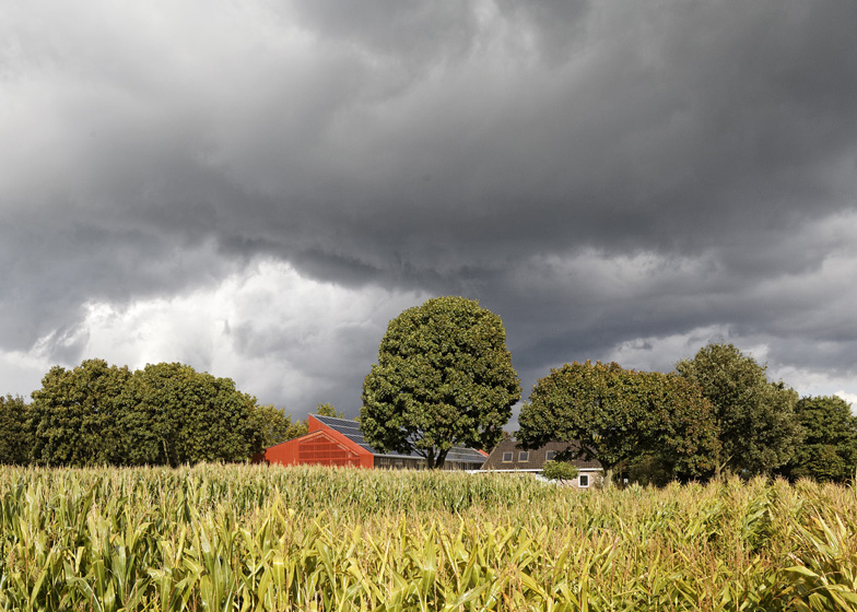
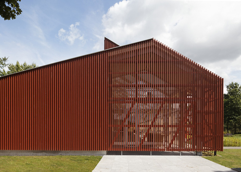
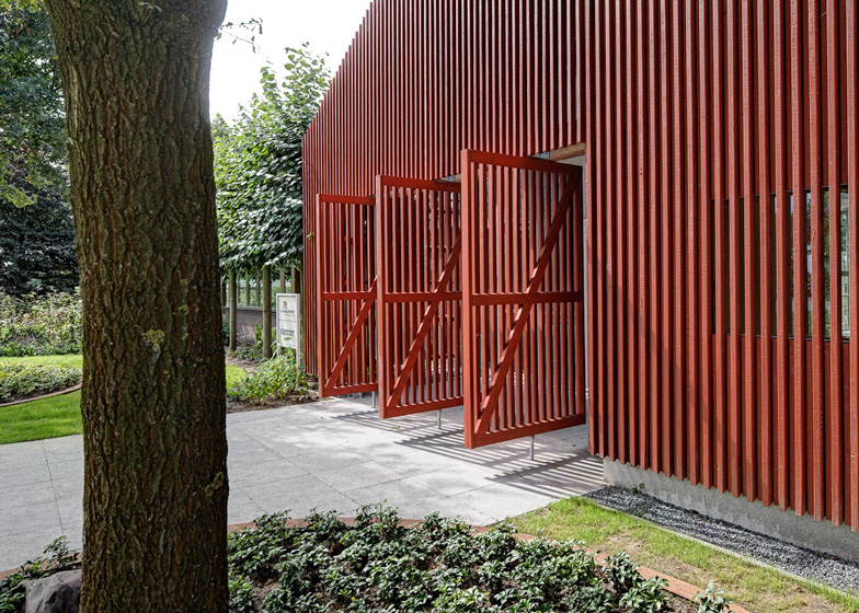
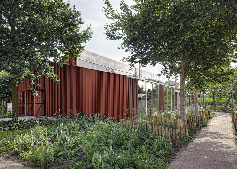
Bright red louvres screen the gabled walls of this office building in Tilburg, the Netherlands, by Dutch architects Équipe (+ slideshow).
Proyecto Roble is the headquarters of landscape firm Van Helvoirt Groenprojecten, who asked Équipe to upgrade an existing building that had become too small.
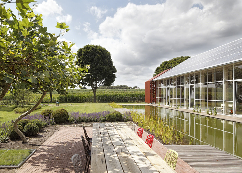
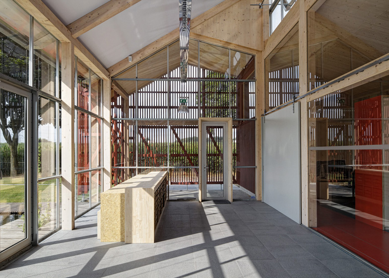
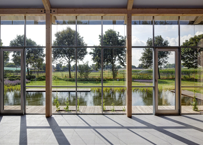
The architects demolished the canteen of the old office, then added a new structure stretching out in its place. Constructed around a chunky timber frame, the building has an asymmetric shape with floor-to-ceiling glazing along its sides and the red slatted timber across its ends.
"The original building wasn't that old so we tried to reuse it," architect Daniëlle Segers told Dezeen. "We demolished half of the structure then reused as much of the materials as we could, for example the old brickwork was used in the foundations."
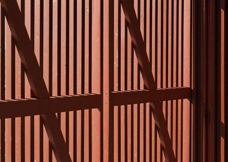
Describing their decision to use red paint, Segers explained: "We had a discussion about leaving the wood in a natural colour, but it wouldn't stay beautiful in the future. Now, when you approach the building you notice the colour stand out against the green, but it's still a natural pigment."
The roof of the building is covered with a mixture of sedum grass and photovoltaic solar panels.
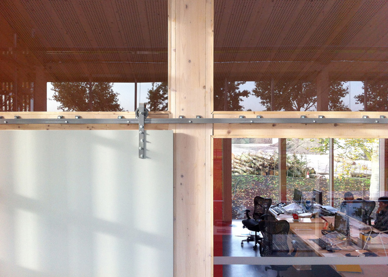
Meeting rooms are located in the old building, while all the offices occupy the new building and are lined up beside a spacious corridor.
The architects designed custom furniture for use throughout the building, then added reclaimed chairs and LED lighting.
This is the second bright red building we've featured in the last week, following a temporary theatre that recently opened in London. See more red buildings on Dezeen.
Photography is by René de Wit and Équipe.
Here's a project description from Équipe:
"Proyecto Roble" extension of Van Helvoirt Groenprojecten in Berkel-Enschot
"Proyecto Roble" by young office Équipe is a grass roots project, a building embedded in the local context in the rural south of the Netherlands. The client, owner of landscaping firm Van Helvoirt Groenprojecten, had a vision for his headquarters to be a flagship model of sustainability. This was to be a key project where sustainable innovations replace money-issues as the bottom line.
The building is a custom designed environment with no standard details. The project was undertaken as a research into the potentials for creating a positive workplace. Key themes were broken down into components and expressed in the design. "Feel Good!" was the catchphrase coined that encompassed the different themes as renewable energy, passive climate control, abundance of natural light and the relationship to the external landscape, which was to be a showpiece of healing environment garden.
Sustainability was thus been payed attention to in all stages and all scales. From a period of studying what 'sustainability' actually means to making sure everyone on the building site understands and embraces these principals.
A.o. a new way of tendering was used, called the Building-team Plus and a new formula was invented to document decisions on materiality and techniques.
The new extension immediately catches the passing motorist's eye, a sleek red form in the agrarian landscape, replete with a fully integrated photo-voltaic-panel roof and a green roof. The green roof transcends its cosmetic role, and is a testing ground for emerging water filtration technology. In the beginning of the 20th century Tilburg was re-known for its textile industry, collecting the workers pee in pitchers for using it as a bleach. Now this project goes back to this tradition inventing worlds first sloped constructed wetlands.
Urine is separated from the black water using it a as a nutrition ingredient for making fertiliser in the clients landscaping activities. Further the grey water runs through the grass roof leaving it as clean water that can be used in the building again. This is only one of the multiple innovations in this project that has been designed to the smallest detail: from building to garden, from the bicycle shed to the bespoke interior and signposting.
The building consists of two parts, connected by the clay stove. Heated with prune wasted from the greenery's own business, this element brings together the office-employees and the outdoor workers. Thus connecting the new extension to the traditions of the family business. Besides the pleasant indoor atmosphere the clay stove also brings technical advantages. The air heating pump could have less capacity and in addition the heater is used as a hot water boiler.
The north part of the building consists of offices. The linearity of the building is emphasised by the interior elements, that are placed on the coloured pathways. By using red linoleum on different areas of the floor and furniture the interior keeps a coherency to the exterior looks of the building.
The southern part of the building is a oversized foyer that connects all spaces. This multipurpose lobby, used for bigger and smaller, organised and spontaneous meetings, provides a green and transparent link to the outdoor world. The play of lines has been made expressive by folded raw aluminium lighting trays that float the length of the building.
Above: site plan
The facades are made of open detailed, wooden slats painted red with water based 'nature paint' thus creating different transparencies between inside and outside. The structure of prefabricated cross laminated timber elements is left unfinished, the imperfections of the timber adding to the natural serenity of the interior. The timber imbues the internal spaces with a positive connection to nature, something which contributes to the landscaping firms green image. All interior elements, apart from second-hand chairs and desk LED lamps, were custom designed. They are specifically designed in consultation with the personnel. Chairs and table carriages are second hand, like all kinds of smaller parts in the interior design: the door handle of the employees entrance (a re-used banister), the magazine stand (heating pipe) and the fruit boxes in the sample cabinet. Also in the furniture low environmental impact products were used. Special research was done to investigate what material could be best used in what elements and how should these materials be connected. Just like for the exterior the 'decision document' was used to explore the considerations in the building team plus and to be able to document conclusions. This proved to be a very useful tool that helps making choices that exceed standards or norms. During the whole process norms were never leading anyhow. Choosing consciously prevailed following scores. (Nevertheless all calculated scores are excellent) F.e. were passive house theories and Dutch energy performance norms may lead to small windows in the north facade, this building has high windows from floor to ceiling that provide the employees with a view to the landscape and lots of northern light.
Above: floor plan
Project title: Proyecto Roble
Address: Oisterwijksebaan 8a 5056 RD Berkel-Enschot, Gem. Tilburg the Netherlands
Client: Van Helvoirt Pensioen BV
Architect: Équipe voor architectuur en urbanisme
Project architects: Huib van Zeijl, Daniëlle Segers
Employees: Adam Murray
Interior design: Equipe voor architectuur en urbanisme
Garden Design: Studio Van Helvoirt
Function: office
Original building year: 1996
Research & design: 2006-2011
Start building: May 2011
Deliverance I employment: June 2012

