Coach Omotesando by OMA
OMA's new Tokyo store for American accessories brand Coach is a glazed cube with a herringbone-patterned display system (+ slideshow).
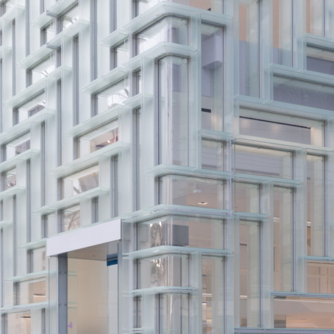
Inspired by the categorised wooden storage systems of Coach's original 1940s stores, Coach Omotesando features a modular shelving system that Rem Koolhaas' OMA has developed for all of the brand's new stores.
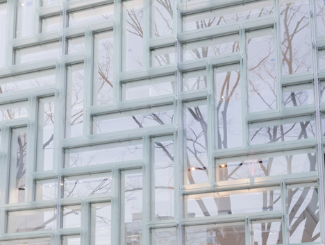
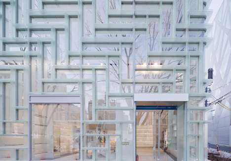
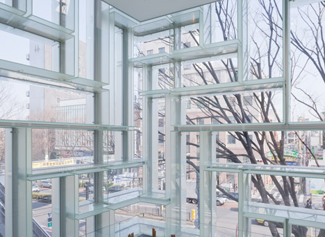
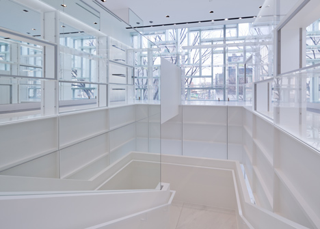
Here, the shelves form a herringbone pattern that covers the glazed facade of the two-storey shop. Frosted glass panels were used to build the boxy shelves on the inside of the walls, while on the outside they form a system of horizontal louvres.
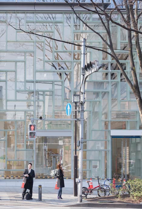
Once the store is open each box will be filled with an item from Coach's latest collections, which include outerwear, footwear, jewellery, handbags and other accessories.
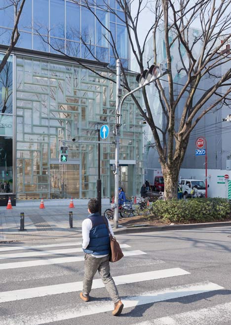
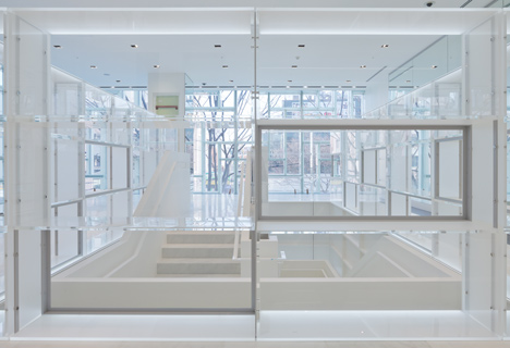
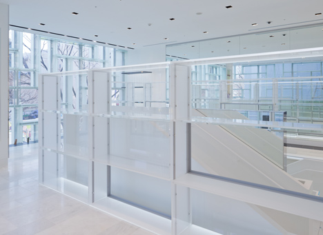
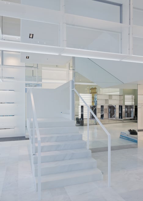
A staircase is positioned at the centre of the store, connecting womenswear on the ground floor with menswear on the first floor. This area also features a modular shelving system, although here it is broken up into a rectilinear grid.
Lighting is installed within the staircase tower, intended to create a central beacon that illuminates the store 24 hours a day.
OMA first revealed designs for the display system during the summer. Since then the studio has installed a smaller version at a Coach kiosk within Macy's flagship Herald Square store in New York.
This week Dutch firm OMA has also revealed a collection of furniture for US furniture brand Knoll. See more architecture and design by OMA.
Other notable shop designs on Dezeen include Peter Marino's Louis Vuitton Maison on London's Bond Street and Schemata's flagship for Japanese fashion brand Takeo Kikuchi. See more shops on Dezeen.
Photography is by Iwan Baan.
Here's some more information from OMA:
Coach Flagship, Omotesando
Founded in 1941, Coach began as a leather goods retailer, displaying their products in a single row of library-like, wooden shelving that categorized their handbags and wallets. The brand's repertoire has since expanded to include a full range of lifestyle merchandise including outerwear, footwear, jewelry, watches and sunwear, which are now sold in a variety of retail environments from specialty boutique to department store.
Inspired by the clarity of Coach's original, systematic filing retail strategy, OMA designed a modular display unit that is flexible enough to accommodate the specific needs of each product and retail environment. The spatial possibilities of this highly functional system reinforce Coach's mission to represent 'logic and magic.' For the first iteration at a kiosk within Macy's department store at Herald Square, acrylic display units were assembled into a floor-to-ceiling high, "V" shaped wall. Products appear to float amidst maintained views to the accessories floor beyond.
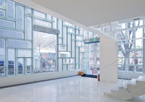
Coach's ninth Japan flagship is a two-story, corner site on Omotesando, a prominent retail corridor in Tokyo. In comparison to the increasingly decorative elevations that characterize Omotesando, OMA's design integrates display into the façade, seamlessly communicating the brand's presence from the inside out.
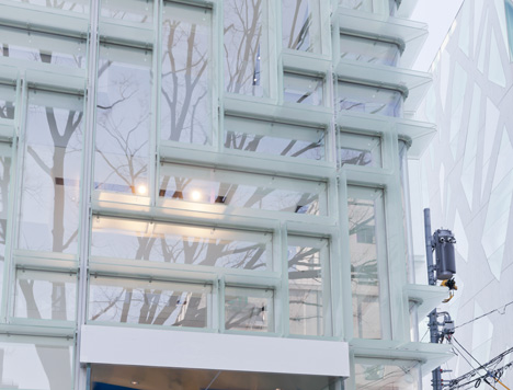
The display units are stacked in a herringbone pattern of vertical and horizontal orientation to facilitate a range of curation scenarios. Dimensioned to accommodate Coach's standard merchandising elements (ex. mannequins, busts, bags), the unit measures 1800 mm x 520 mm. Frosted glass that provides shelving within the store is further articulated to the façade as louvers.
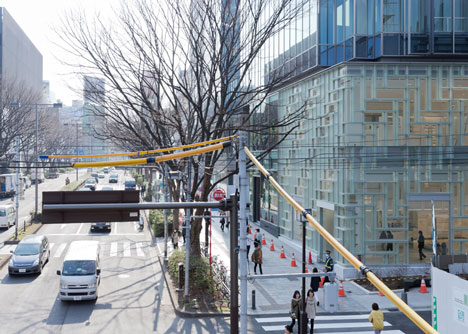
Viewed from the exterior, the double-height storefront presents an uninterrupted survey of Coach's full collection in a single view, with a dedicated frame for each product. Viewed from the interior, the display unit's translucency creates an active backdrop for merchandise, filtering Omotesando's streetscape into the shopping experience.
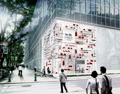
Above: display concept
In addition to the façade, OMA designed a floating tower of illuminated units that encase the store's central stair, seamlessly connecting the women's first floor and men's second level. Consolidating the display on the facade and circulation creates a condition in which the shopper is continuously surrounded by product, while simultaneously liberating floorspace. In the evenings, the circulation tower illuminates the façade as a dynamic, 24-hour window display from within.
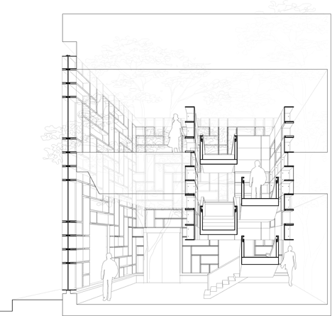
Above: cross section
Status: Commission January 2012; Completion April 2013
Client: Coach, Inc.
Location: Tokyo, Japan
Site: Ground and second floor of new construction on Omotesando, Tokyo, Japan Program: 444.75 m2 / 4787.25 sf
Façade: 210 glass units Circulation Tower: 105 acrylic units
Partner-in-Charge: Shohei Shigematsu
Project Architect: Rami Abou Khalil
Team: Yolanda do Campo, Benedict Clouette with Jackie Woon Bae, Cass Nakashima, Phillip Poon, David Theisz
Local Architect and Engineer: Obayashi Corporation Façade Consultancy: Michael Ludvik
Interior Architecture: Nomura, Co., Ltd.