UK government website wins Designs of the Year 2013
News: the UK government's redesigned website has been named the Design of the Year in a ceremony at the Design Museum in London this evening (+ movie).
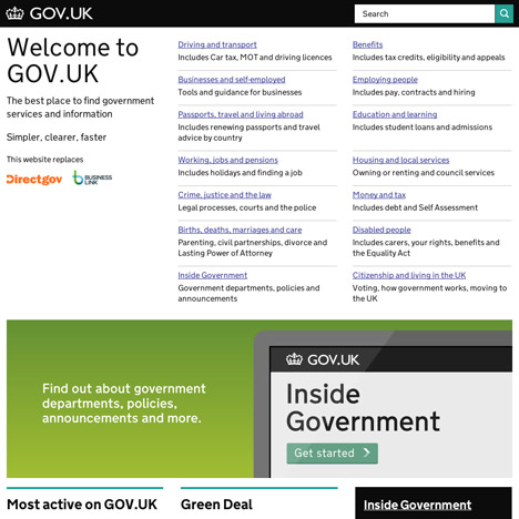
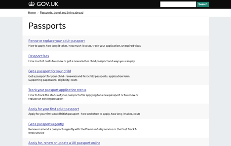
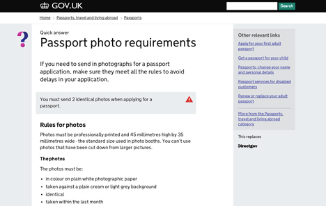
Gov.uk was designed by Government Digital Service, a team within the Cabinet Office led by designer Ben Terrett (see our movie above), to fold the government's thousands of existing websites into just one.
Deyan Sudjic, director of the award-giving Design Museum, said the new website "makes life better for millions of people".

"Gov.uk looks elegant, and subtly British thanks to a revised version of a classic typeface designed by Margaret Calvert back in the 1960s. It is the Paul Smith of websites," said Sudjic.
"The rest of the world is deeply impressed, and because it has rationalised multiple official websites, it saves the taxpayer millions – what's not to like?"
Prime minister David Cameron also said he was "delighted" about the win, adding: "For the first time, people can find out what's happening inside government, all in one place, and in a clear and consistent format."

The core idea behind Gov.uk is to make it as simple and intuitive as possible for the user, Terrett told Dezeen in a movie filmed at Design Indaba in Cape Town as part of our Dezeen and MINI World Tour.
"People only go onto government websites once or twice a year to find out a particular thing," he said. "So people shouldn't spend time relearning how to use it. The core of all our work is focusing on user need."

Terrett's team devised 10 principles of good design to guide their work and chose to make them public in the hope they would be useful to other designers, as he explained at the Global Design Forum in London last September. "We believe that if you share work it makes it better," explained Terrett.
The principles are:
1. Start with needs
2. Do less
3. Design with data
4. Do the hard work to make it simple
5. Iterate. Then iterate again
6. Build for inclusion
7. Understand context
8. Build digital services, not websites
9. Be consistent, not uniform
10. Make things open: it makes things better
Terrett also won the graphics category of the 2010 awards with his print-on-demand publishing service Newspaper Club.
The other category winners included the Morph folding wheel in the transport category, the Kit Yamoyo medicine kit in the product category and the brand identity of the Venice Architecture Biennale in the graphics category.
The architecture category was won by a refurbished 1960s tower block in Paris, fashion was won by a film about writer and editor Diana Vreeland and industrial designer Konstantin Grcic won the furniture category for his Medici Chair, after launching a complementary stool and table in Milan last week.
Gov.uk and the other shortlisted designs are on show at the Designs of the Year exhibition at the Design Museum until 7 July.
Last year the award was won by east London designers BarberOsgerby for their London 2012 Olympic Torch – see all news about Designs of the Year.