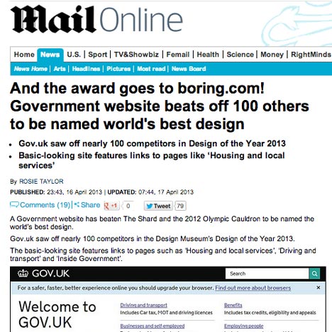
News: Mail Online - the world's most popular news website and the winner of a design effectiveness award - has described the gov.uk site that yesterday won the Design Museum's Design of the Year award as "boring" and "basic-looking".
Mail Online journalist Rosie Taylor scoffed at the plain and simple look of the Gov.uk website in an article published after the ceremony in London last night, complaining that "it has only two small pictures" and "features links to pages like ‘Housing and local services’".
"And the award goes to boring.com!" ran the headline on the news site, which earlier this year won the Design Effectiveness Award's Grand Prix for its huge growth in traffic and advertising revenue since its 2008 redesign.
Gov.uk was designed by Government Digital Service, a team within the cabinet office led by designer Ben Terrett, to combine the UK government's thousands of online services in a single website that's meant to be simple and intuitive to use and which uses just one font and dispenses with visual clutter such as images and coloured panels.
The redesign beat over 90 other shortlisted projects and was praised for its elegance and simplicity by Deyan Sudjic, director of the Design Museum that organises the annual awards to recognise "the most innovative and imaginative designs" from the past year.
Watch our movie interview with Ben Terrett filmed in Cape Town as part of our Dezeen and MINI World Tour or read more about the Designs of the Year.

