Birth certificates by IWANT for Icon magazine
East London studio IWANT has overhauled the birth certificate to bring it into the digital age and make it more personal.
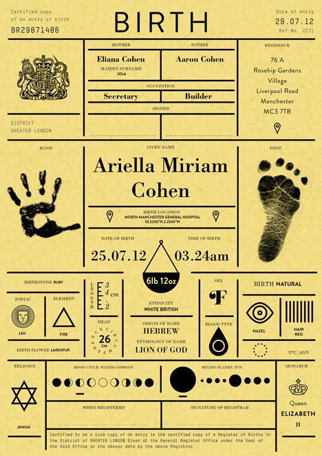
Commissioned by Icon magazine for the Rethink feature of its April edition, designers at IWANT set out to create a birth certificate worth cherishing, which aims to paint a more personal picture of our first moments.
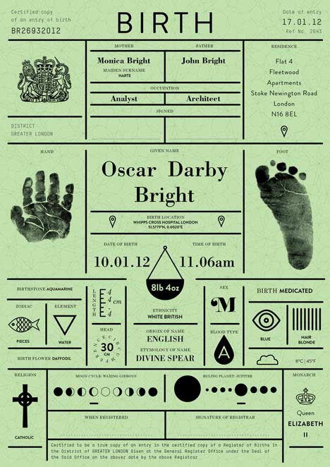
The designers toyed with the idea of replacing the traditional printed certificate with a digital document, but decided against it, believing a combination of the two would be better.
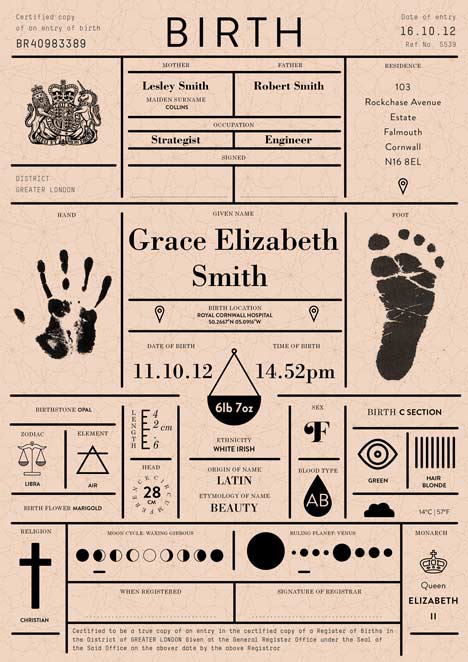
"In a digital age it makes sense that such a document would have a digital form. But we felt it would lose the sentimental value of something that could be touched, loved and displayed," they explain. "We agreed on a traditional hard copy, but one that paints a bigger picture of a person and when they were born. This could be accompanied by a dynamic digital file that could expand on this content."
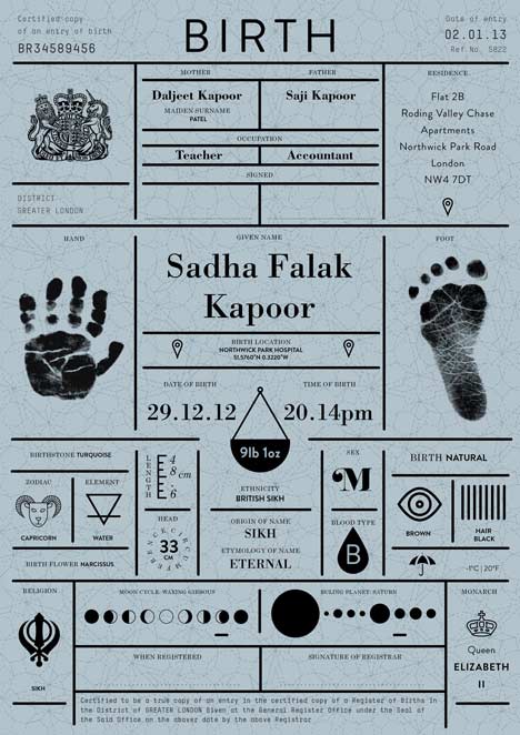
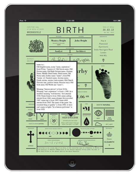
All the information on the existing birth certificate is kept – mother, father, name, registrar - but more information is added. Physical attributes such as weight, length and head circumference are represented with graphic symbols while prints are taken of tiny hands and feet.
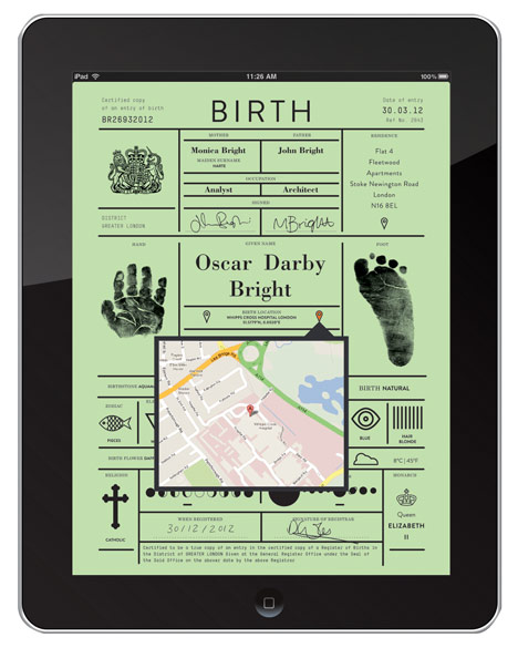
Other details including astrological, astronomical and etymological facts are also included, plus mapping coordinates for location of birth are added to the digital version.
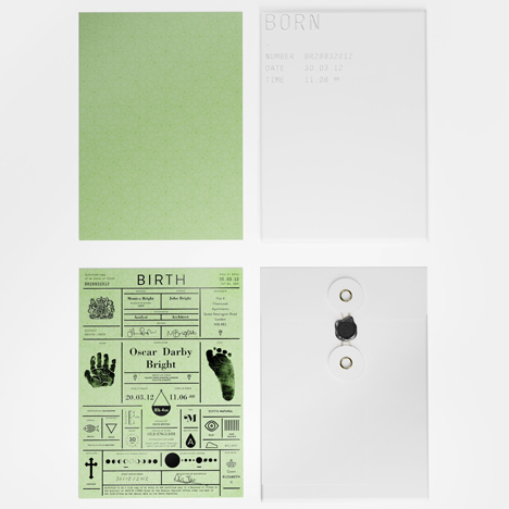
The information is displayed in a grid and is printed in black foil blocked onto watermarked heavyweight card, which comes in four colours representing the seasons.
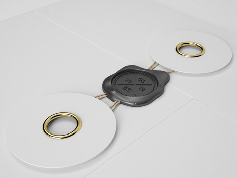
The certificate is housed in a heavy, glossy, white envelope with the baby's basic information embossed on the front and then secured with a wax seal.
Rethink is a regular feature of Icon magazine in which designers are invited to reconsider ordinary things in extraordinary ways. Read about the redesign of a shop receipt by BERG here.