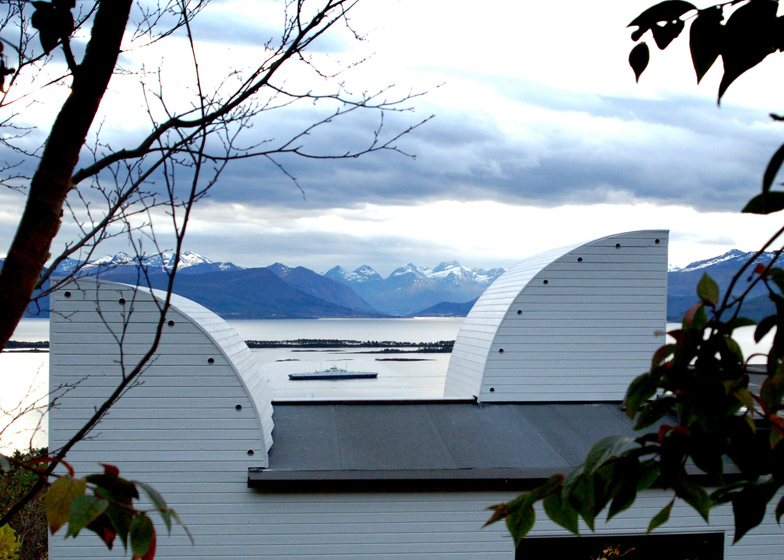
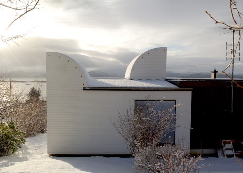
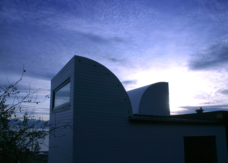
This timber-clad house extension in Norway by Oslo studio Rever & Drage features curvy towers that point outwards like periscopes (+ slideshow).
Located on a hillside in the outskirts of Molde, the single-storey house had only a small bedroom and bathroom on its western side, so Rever og Drage Arkitekter was asked to increase the size of both of these rooms.
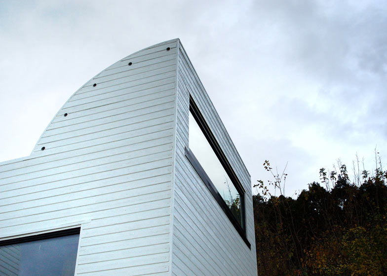
Two towers with quarter-circle profiles were installed on the roof of the extension to function as lightwells. The first curves west to bring evening sun into the bathroom, while the second is pointed east to let morning sun into the bedroom.
The bedroom extends outwards by just over a metre while the bedroom is now more than three metres wider. Together, the rooms frame a small terrace in the south-east corner of the plot.
The clients asked for views across the water towards a mountain range, so the architect added generous windows to the southern elevations of both rooms.
The exterior of the building is clad with white-painted timber boards to reference both the white-painted brick and brown timber panels of the existing house.
"We initially wanted to make a clear distinction between the extension and the original building," explain architects Tom Auger, Martin Beverfjord and Eirik Skogen Lilledrange. "At the same time we did not want to create too much contrast in terms of materials and formal means."
The architects carried out all the construction themselves.
The small city of Molde is best known as the home of an annual jazz festival and Danish architects 3XN recently completed a cultural centre to be used there during the festivities.
See more architecture in Norway, including a wooden house overlooking the sea and a small gabled summerhouse.
Photography is by Tom Auger.
Here's a project description from Rever og Drage Arkitekter:
Extension of single-family house, Pedervegen 8, Molde
The new owner of a detached house in Molde wanted an extension of an existing bath- and bedroom. The house was still in more or less its original 1962-condition and appeared as a time-typical house from this period. That is Scandinavian functionalism with a flat roof and brown exterior panels contrasted with white brick walls. Furthermore the house had an elegant and somewhat closed composition.
Above: floor plan - click for larger image
The owner wanted to get the evening sun in the bathroom (which was on the east side of the building) and to keep the morning sun in the expansion of the bedroom without being exposed to neighbours. Views of the spectacular mountain range to the south were required from both rooms.
We initially wanted to make a clear distinction between the extension and the original building. At the same time we did not want to create too much contrast in terms of materials and formal means. We chose to use wood cladding, as the existing building, while the colour of the new cladding was taken from the original bright brick walls. We also changed the orientation of the panels. In order to solve the requested light preferences we brought in a new form, the quarter circle, which we held for a type of basic shape that could easily relate to architecture of the early sixties.
Above: cross section through bedroom - click for larger image
The bathroom has a clear everyday zone in the innermost part with shower, toilet and sink, while the outer section provides the more time-spending bathroom artifacts; a bathtub, a wide window sill with a view and a door to the garden. The latter part has a skylight in the shape of a curve facing west. The room bathes in the late evening sun when the west-coast weather allows it. Tiles are sober in the inner part, whilst the outer part has a more festive consortium. The contrast between the inner and outer zones of the bathroom was in danger of being too hard. The relaxing ambiguity is that the outer zone suggests peace of mind in its use, yet at the same the form here is intense. While the inner zone, which reflects more efficiency, has a calmer expression in terms of colours and patterns.
The bedroom is long and has three different zones. First, a dressing-section with a large mirror and a backstage-like atmosphere. In the middle a lounge area with a fireplace and a generous window facing the green to the north. At the end of the bedroom is the bed with a large window and its view to the south. Over the bed a vaulted ceiling with a window heralding the morning sun as well as giving a view of the stars at night.
Above: cross section through bathroom - click for larger image
In retrospect, we were surprised at the modest exterior contrast between the extension and the original building. To a large extent we believe this is due to the fact that the selected wood panels have about the same size as the bonds in the original brick wall, so that these two surfaces relate. This is particularly evident in the north facade. Also, the quarter circles seem to work as form and at the same time they provide the building with a touch of relieving humour.
Architects: Rever og Drage
Location: Bjorset, Molde, Norway
Design Team: Eirik Lilledrange, Martin Beverfjord, Tom Auger
Area: 20 sqm


