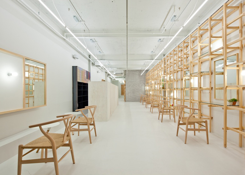
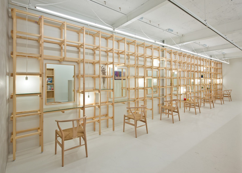
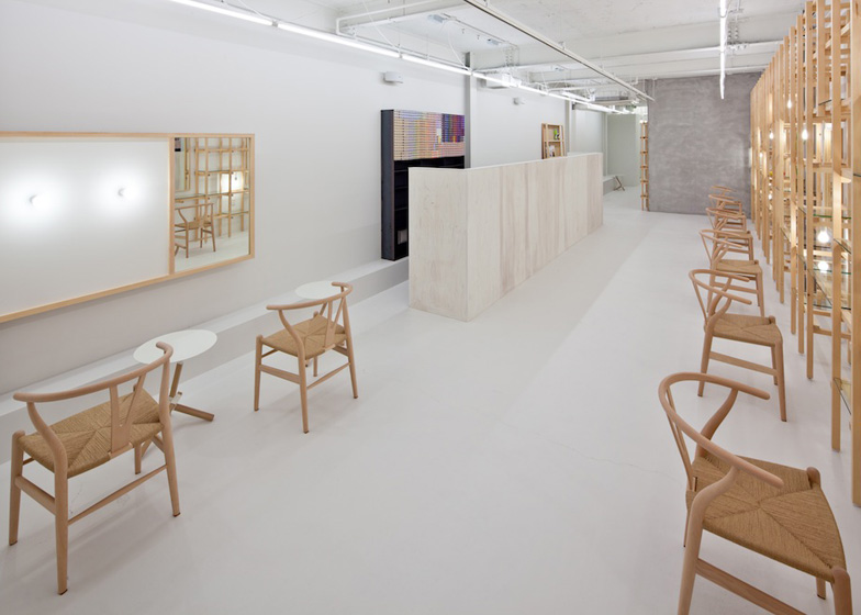
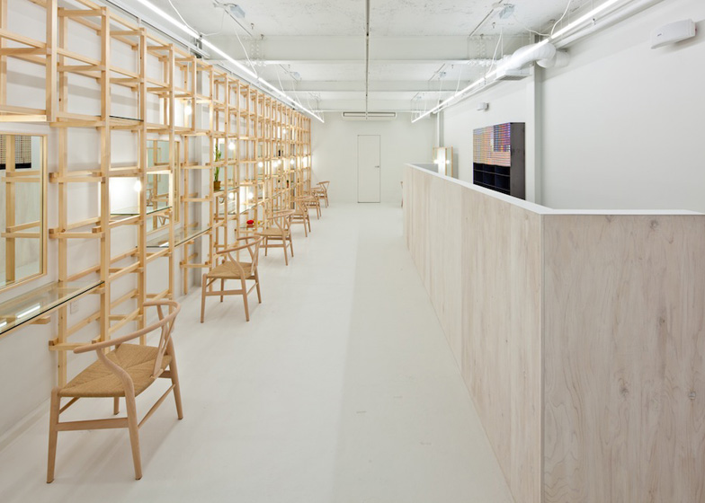
A timber lattice supports shelves, worktops, lighting and mirrors down one side of this beauty salon in Osaka by Japanese designer Yasunari Tsukada (+ slideshow).
Located in the Kitahorie neighbourhood, the salon occupies a long and narrow building, so Yasunari Tsukada designed a clean white interior with few partitons to keep the space as open as possible.
The gridded wall of timber runs along the right-hand side of the space to create workstations for seven stylists, each with a number of possible shelving configurations.
"We wondered if we could create flexible, extensible walls without imposing any limitations on their functionality," explains Tsukada. "In concrete terms, our solution involved building three-dimensional lattice screens resembling parts of a jungle gym that function as architectural pieces of furniture."
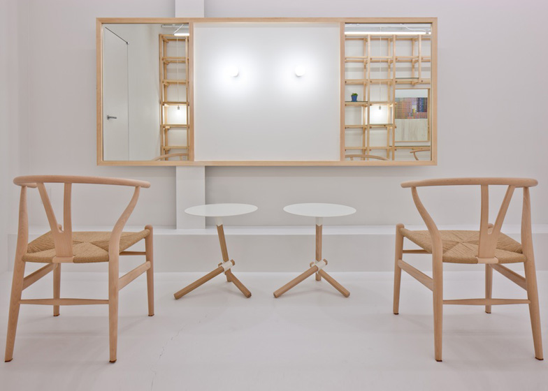
Openings in the grid create spaces for mirrors, while pendant lights hang through from above and glass panels can be slotted in and out to rearrange the shelving layout.
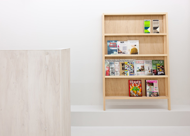
Two extra seats face a large mirror on the opposite wall, while a plywood screen accommodates a reception desk.
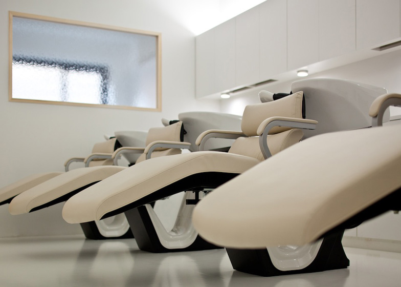
A narrower wooden framework provides additional shelves towards the rear of the 28-metre-long room, plus a hair-washing area is tucked away at the back.
Named end...Link, the salon is one of the first completed projects by Yasunari Tsukada, who launched his studio in 2012.
Other recently completed salons in Japan include one lined with ceramic tiles and another with birch trees wedged between the floor and ceiling. See more salon interiors.
Photography is by Stirling Elmendorf.
Here's some more information from Yasunari Tsukada:
end...Link / beauty salon
The name of this beauty salon was inspired by the owner's passionate desire to turn it into a destination for "the last word in beauty". Although the design was first completed about five years ago, the previous premises soon grew to feel a little cramped due to the rapidly expanding size of the team, which prompted the owner to move to a new and larger location.
The rented unit that the owner had prepared as the new platform for his venture was a slender, elongated space measuring 28m deep, with a frontage of 4.4m. Taking advantage of this narrow frontage, we configured each of the spaces in a straightforward manner by taking cues from the existing frame and contours of the property. In addition, by making efficient use of the length of the unit, we were able to maintain a certain distance between each space while connecting them seamlessly to each other. Keeping the number of partitions to an absolute minimum and painting the entire space white achieved a feeling of abstraction, as well as a sense of giving equal importance to both the new and old materials that comprise the walls, ceilings, and floors. The result was an interior that gave pride of place to the people and objects within it.
The styling space is where the owner's particular obsessions and passions came to the fore. He requested that we incorporate various functional elements into the mirrored surfaces (for storing or hanging objects). In response, we wondered if we could create flexible, extensible walls without imposing any limitations on their functionality. In concrete terms, our solution involved building three-dimensional lattice screens resembling parts of a jungle gym that function as architectural pieces of furniture. These screens were created using only a structural framework, with no particular significance attached to the form of the lattice itself. When lighting fixtures, glass panels, hooks and other objects are attached, however, the lattice begins to take on a new dimension. Affixing glass panels turns them into display shelves, or tables for the use of customers. Just imagine the transformations that these lattice screens will undergo, thanks to the multiple efforts and innovations of the staff.
Our heated, passionate discussions with the owner gave us real food for thought. Over the course of many meetings, our plans and designs continued to evolve and change repeatedly. Before long, we found ourselves starting to enjoy the progress of these changes. Thus was born a space that would serve as a base for the owner and his team to communicate their ideas and thoughts to their clients, promising the start of a new phase in its evolution and growth.
Project information
Project Name: end...Link
Location: Kitahorie Nishi-ku, Osaka, Japan
Use: Beauty Salon
Built area: 114.56m2
Completion : 2012 November
Design: Yasunari Tsukada design
Contractor: Infinity

