Tax Forms by FormNation
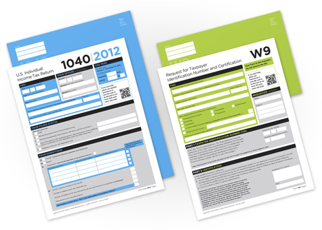
New York design studio FormNation has proposed a redesign for two US income tax forms to make them clearer and easier to use (+ slideshow).
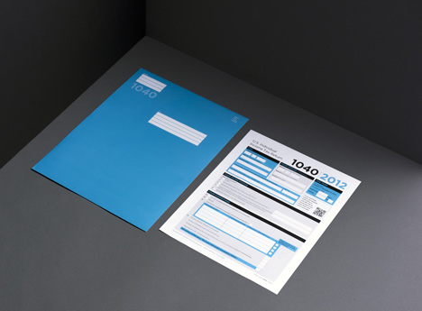
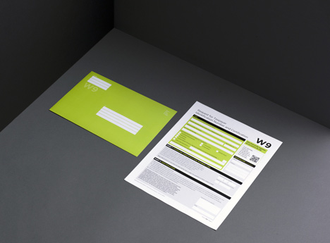
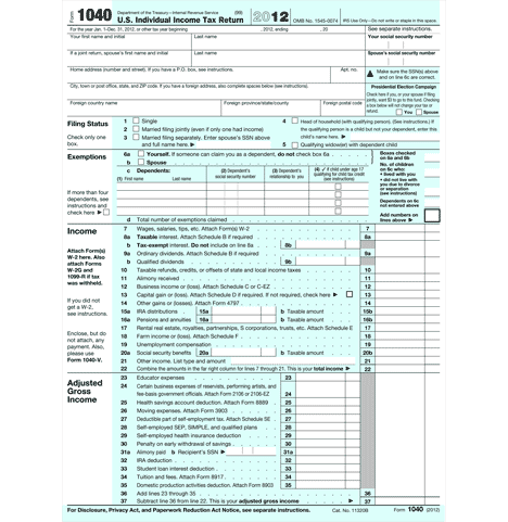
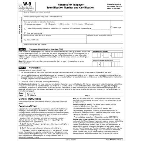
FormNation, launched in 2012 by Dutch designer Jan Habraken, decided to revamp the 1040 and W-9 forms to show how good design can make a complicated task much simpler.
"I've had this idea for quite a while," explains Habraken. "I thought there was an obvious need out there for a simple tax form that people could complete themselves without getting an instant headache. This is the direction that people want, but instead they often find themselves with added stress at tax time because they feel overwhelmed at decoding the forms."
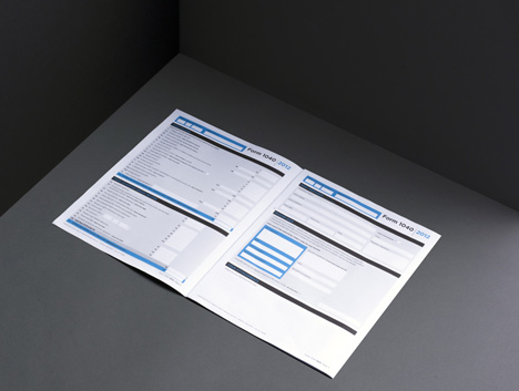
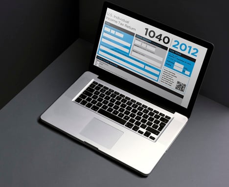
The existing black and white 1040 and W-9 forms, which take up just a few sides each, have been expanded to create a less cluttered appearance, while blocks of colour help users prioritise the most important sections.
Though the project was self-initiated, FormNation hopes to discuss the redesigned forms with the US Internal Revenue Service in the future.
The redesigned UK government website was recently named overall winner of the Designs of the Year Awards given by London's Design Museum – watch our movie interview with lead designer Ben Terrett and find out about his team's 10 principles for good design.
We also recently featured a redesigned birth certificate featuring space for a baby's footprint, religion and star sign – see all graphic design on Dezeen.
Here's some more information from FormNation:
Since their inception, taxes have proved something of a confusing and downright unpleasant phenomenon, leading them to be listed alongside inevitabilities like death. A look at the current tax forms suggest that now more than ever, design can really help to innovate, promote ease of use, and add value to business and society.
This year when designer Jan Habraken sat down to tackle his taxes, he encountered the regular black and white cluttered paper with a mish mash of fonts and a maze of boxes. Instead of waiting for a change of heart by the IRS, Jan and his team at FormNation set out to create a user-friendly solution themselves.
"I've had this idea for quite a while," says Jan. "I brought it up with my team at FormNation about it because I thought there was an obvious need out there for a simple tax form that people could complete themselves without getting an instant headache. This is the direction that people want, but instead they often find themselves with added stress at tax time because they feel overwhelmed at decoding the forms."
FormNation set out to design a clear and easy to use form. The clever inclusion of color that allows users to prioritise parts of the form, streamlined fonts, and uncluttered space are indicative of genuine efforts by FormNation to minimise the confusion associated completing paperwork at tax time. "It's about positive change where we can," says Jan. "Change in the broad sense can be transitional, revolutionary, and transformative. It's about making life easier, and making things more possible."
This tax form is just one way in which FormNation is encouraging collaboration in fields where design hasn't been seen as necessary, or an afterthought. Once viewed as something purely aesthetic, the design industry has grown cognisant of the fact that design shouldn't be confined to their peer groups. "People care about design, it really can improve their lives," says Jan.