De Rietlanden Sports Hall by Slangen + Koenis Architects
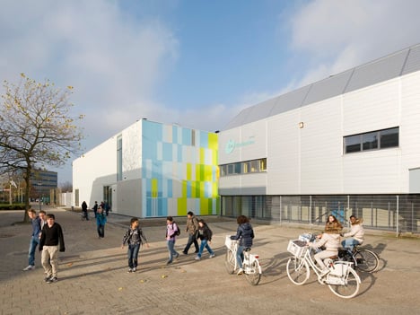
This sports hall in Lelystad, the Netherlands, by Dutch firm Slangen + Koenis Architects is coloured in fluorescent shades of green, yellow and blue (+ slideshow).
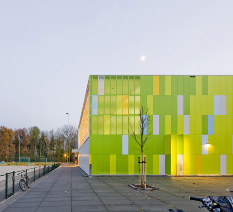
The De Rietlanden Sports Hall was designed by Slangen + Koenis Architects to extend and combine two existing sports buildings located beside a secondary school in the small Dutch city.
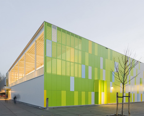
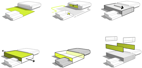
The architects sandwiched the new building between the two existing structures in a space formally occupied by a bicycle stand, then added the brightly coloured cladding to create a welcoming atmosphere for students staying after school for sports.
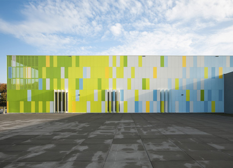
"The starting point of the design was to not only create a friendly volume that combines the two existing buildings into one centre, but also to create a fresh and bright impulse for the drab and grey surroundings," say the architects.
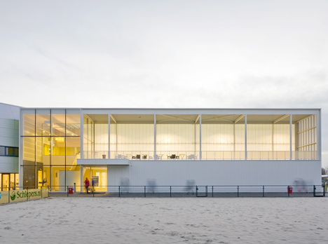
"To accentuate the placement of the new structure, we created very colourful facades at the two sides that intersect the existing buildings, accentuating the contrast between old and new."
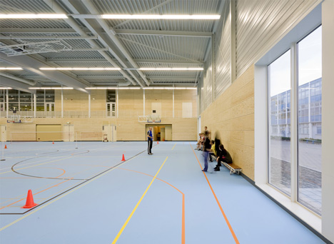
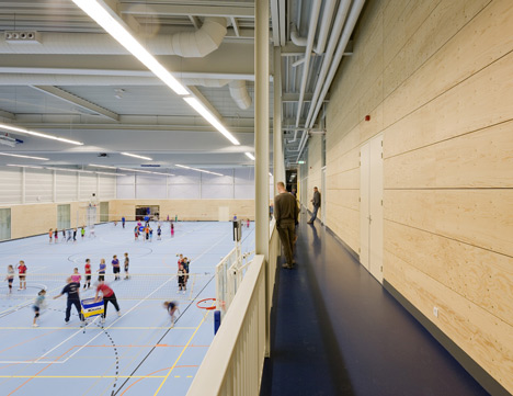
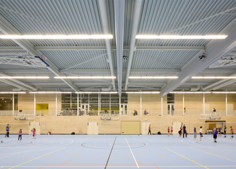
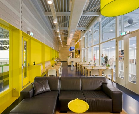
The hall itself is the size of three basketball courts. Changing rooms stretch along the length of the courts on one side, while a spectator balcony and restaurant are located on a mezzanine floor above.
A glazed entrance is positioned opposite an outdoor sports pitch at one end of the hall, plus extra routes lead through from both of the old buildings on either side.
Slangen + Koenis Architects, formally known as Koppert + Koenis Architects, has previously designed another sports hall in the Netherlands, featuring a timber-framed structure.
Other sports centres on Dezeen include a gymnasium that swells outwards to let the light in and a football ground in a converted warehouse. See more stories about sports centres.
Photography is by Marcel van der Burg, apart from where otherwise indicated.
Here's a project description from Slangen + Koenis Architects:
Sports hall 'De Rietlanden'
The new sports hall 'De Rietlanden' will, together with its existing neighbouring sport facilities, form a new important in- and outdoor sports centre in Lelystad. The existing situation already had two sports halls, though separated by a bike stand from the local secondary school. This unusual separation made it very hard to combine the different sport and social activities. Also the site has a very grey and pale colour pallet with an unwelcoming atmosphere, especially after school hours. The starting point of the design therefore was to not only create a friendly volume that combines the two existing buildings into one centre, but also to create a fresh and bright impulse for the drab and grey surroundings. By moving the entrance to the other side of the building we created a centre that is more accessible from a spacious and more inviting entrance square that welcomes the visitors.
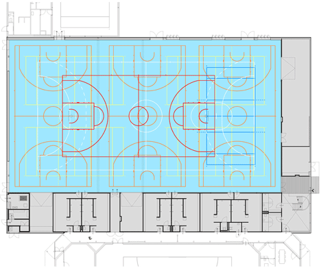
Since both of the neighbouring buildings had to remain, the new sports hall had to fit into the relatively narrow empty spot, where the bike stand used to be. To accentuate the placement of the new structure, we created very colourful facades at the two sides that intersect the existing buildings, accentuating the contrast between old and new. The two front facades are very crisp and light with white colours in varying materials. The new entrance faces towards the outdoor sport fields through large glass windows, as well as the covered terrace on the upper floor, that can function as a grandstand. In order to create an optimal sports and teaching environment, windows allows light and views into the sports hall. But they can also be closed if it is convenient for the activities. To create extra relief and agility to the entrance square the shutters can be adjusted to the needs of the users, causing the building to open or close towards the square.
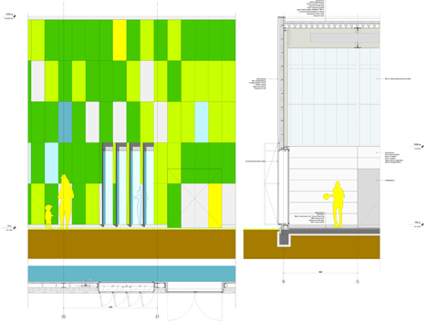
The floor plan clearly shows how the new structure is implemented on the site and in between the other buildings. There's a hallway connecting the sports halls on ground level and the 6 changing rooms. These spaces are optimized to leave maximum space for the optimal layout. On the upper floor a spectator zone is situated along the length of the field with a restaurant. The restaurant is an important connection between the old and the new building on grandstand level.
Project size: 2.500 sqm
Duration: Sept 2010 – Aug 2012
Architect: Slangen + Koenis Architects
Chief Designers: Erik Slangen, Jakko Koenis
Team: Jetske Bömer, Bart Solinger, Vincent van Draanen