Voodoo Ray's by Gundry & Ducker
Patterns of colourful tiles line the walls and counters of this north-east London pizza bar by architects Gundry & Ducker (+ slideshow).
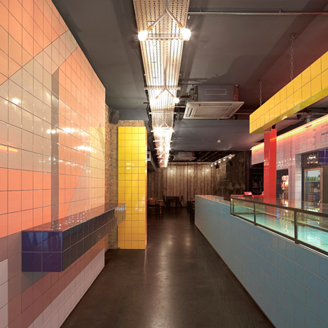
"We wanted to see what we could do with the 150-millimetre square-format tiles" Christian Ducker told Dezeen. "Our medley of references included graphics from New York in the 1950s and 1980s."
The tiles spell out "pizza" in large letters along the wall running from outside the restaurant parallel to the serving counter, though the top of the word is cut off by the ceiling.
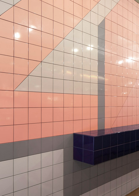
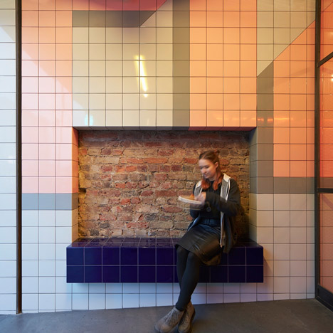
Dark blue tiles cover the surfaces and seats along the same wall, while columns and beams are wrapped in yellow and red.
The late night pizza slice bar was converted from a nightclub so the architects had to start from scratch in the space.
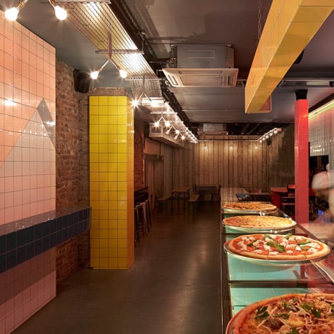
"We completely gutted the whole place, took out all the flooring and built in a slope at the entrance," said Ducker. "The space is all tiled at the front, and they gradually fade towards the back where there are just a few clusters left."
"We left some exposed brickwork because we wanted the one-tile-thick insertion to be noticeable," he added.
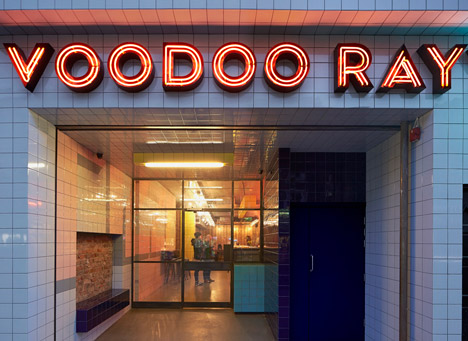
The tiles extend out and around the building's entrance, branded with a red neon sign by graphic designers Studio Partyline.
Voodoo Ray's is named after a 1988 acid house track by UK artist A Guy Called Gerald, who switched on the sign at the restaurant's opening party.
Gundry & Ducker's other projects in London include a sushi restaurant in Soho and a blackened larch house extension south of the city.
Photography is by Hufton + Crow.
See more architecture and design by Gundry & Ducker »
See more restaurant interiors »
See all our stories in London »
Here some further details from the architects:
Voodoo Rays is a late night pizza slice shop and restaurant in Dalston East London.
The design is intended to sit within, and celebrate its location on Kingsland High Street, a typical inner London high street strip with its ad-hoc signs and frontages. Its neon signage and brightly light interior is intended to be part of the nighttime street scene.
The design of all surfaces is formed predominately from coloured 6" ceramic tiles. We wanted to form the interior as a sequence of volumes, reducing in scale and density to reveal the original building interior as you move towards the back of the shop. Each element is expressed in a different colour, the larger elements incorporating giant abstracted text.
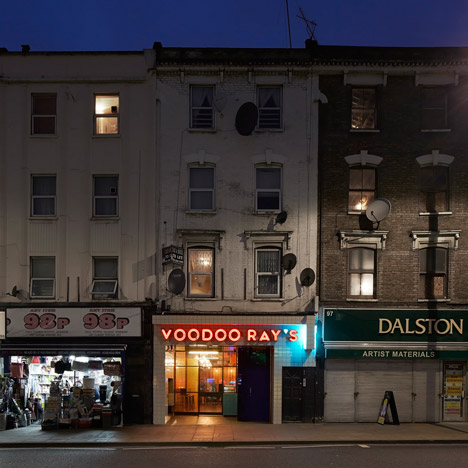
A long pizza counter runs the length of the shop and projects beyond the shop frontage, which is recessed, so that the counter feels like part of the street. A hidden door leads to a basement club.
The design is intended to have multiple references taken from both East London and New York, and from between the 1950s -1980s. The references range from launderettes to pie shops, to seaside amusement arcades all of which are reinterpreted with a cartoon sensibility.