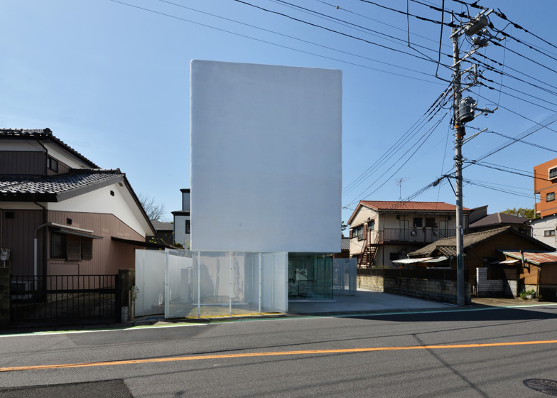
An opaque box appears to balance over see-through walls of glass and perforated steel at this house and pet shop in Saitama, Japan, by architecture studio Norisada Maeda Atelier (+ slideshow).
The pet shop occupies the ground floor of the building, while a two-storey house is contained in the precarious-looking upper volume and overhangs the glass facade to create a sheltered entrance to the shop.
"The upper unit presents a sharp contrast to the open, transparent lower layer, with its weighty, massive appearance almost like a heavily-armed tank defending the rather indoorsy life of the client's family," says Norisada Maeda Atelier.
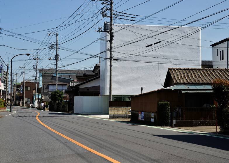
The plaster-covered walls of the house have a textured surface that the architects based on an image of a cloudy sky, with the same variations of light and dark. There are no sharp edges, as all four corners are chamfered.
"On a cloudy day, the floating mass looks as if it blends in with the sky, while its edges lose their individual materiality as they melt into the gradational clouds in the background," says the studio.
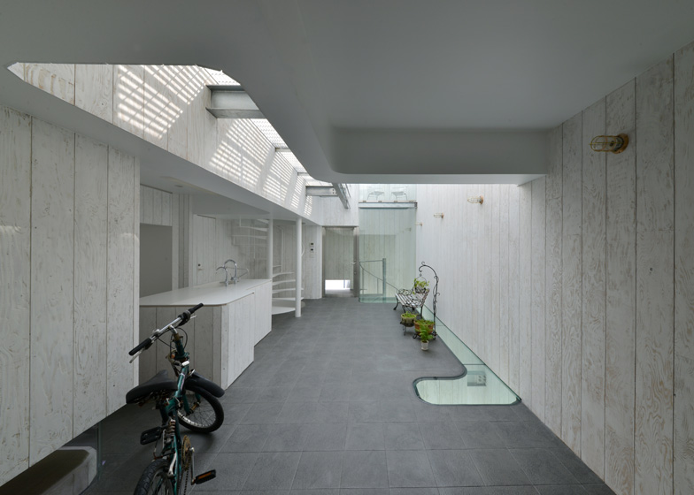
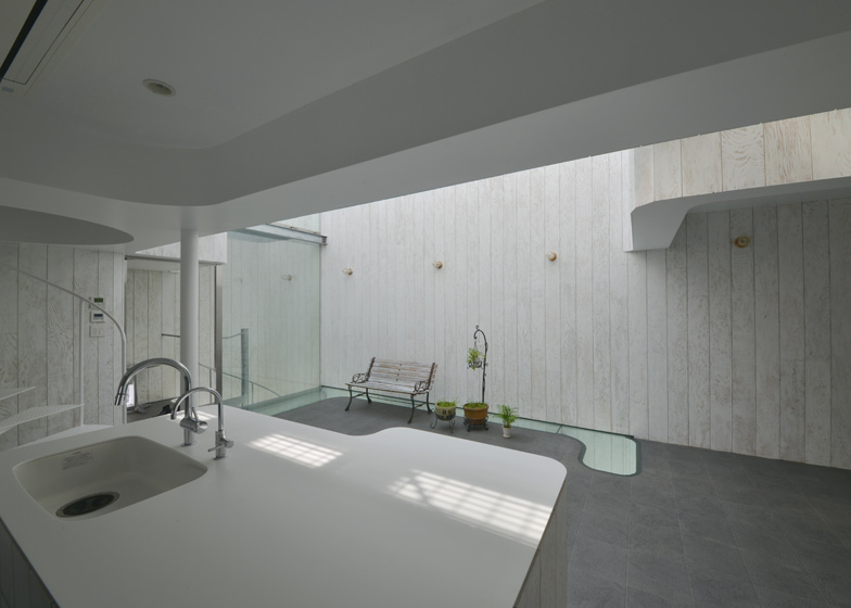
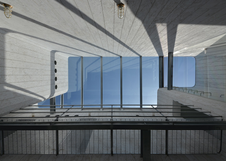
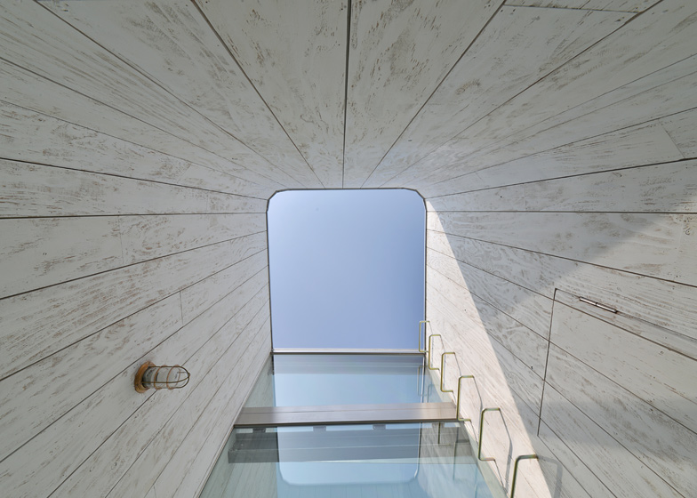
Natural light floods into the house through a skylight that stretches across most of the roof. Rooms are arranged around a double-height atrium, allowing light to permeate most of the interior.
A kitchen, lounge and traditional Japanese room occupy the lowest level of the residence, while a spiral staircase leads up to a gridded metal mezzanine with a bedroom and bathroom beyond.
In contrast with the austere facade, the interior walls are lined with plywood, which the architects have sliced up into boards and coated with a thin layer of white paint.
The owner of the residence also runs the pet shop downstairs, so a second spiral staircase leads down from to the "dog-run" yard at the back of the building.
Other seemingly windowless houses featured recently from Japan include a monolithic white home in Miyazaki and a residence in Tochigi with a six-metre high living room. See more Japanese houses on Dezeen.
Photography is by Studio Dio.
Here's more information from Norisada Maeda:
TORUS: Transcribing the Sky onto the Façade
Composition: First Floor
Basic composition of TORUS is a bilayer structure consisted of a white, half-amorphous box floating on the lower layer softly surrounded by glass and perforated aluminum panels.
The transparency and the openness of this layer is a natural solution for the functional requirement to expose the presence of the salon to prospective customers and other passer-bys, as well as to open up the ground outside the shop area surrounded by the curved perforated partitions as "dog-run" field where dogs can freely run around.
The apparently free line of the curved wall is actually based on our careful recognition of what we call the "welcoming zones", i.e., the pocket areas required to open up to the urban context outside the building site. The cutting-outs of such zones as parking, entrance and spaces for outdoor equipment have resulted in the irregular curve of the wall as the output of such operations.
Composition: Second and Third Floors
The upper unit containing two floors within presents a sharp contrast to the open, transparent lower layer with its weighty, massive appearance almost like a heavily-armed tank defending the rather indoorsy life of the client's family. With a closer look, the surface of the wall shows a texture similar to a handmade pottery instead of that of a flat, uniform industrial product.
Texture: Exterior Wall
The pottery-like texture is the result of painstaking manual operation of repeatedly applying and spreading the waterproof material onto the wall. Beside such a consideration to the close-up texture, the exterior of this second layer also involves our sensitivity to the longer-distance outlook of the building, which is realized by an operation of transcribing the sky onto the wall.
The transcription process is as following: first, we took a picture of the sky right above the site on the day of framework completion (phase 1); the picture was then abstracted into a gray-scale gradation graphic (phase 2), which we applied as the contour map of the undulating surface by carefully duplicating it on the four sides of the wall; finally, we covered the surface with finishing mortar while controlling its thickness (varied from 0 to 30mm) based on the contour lines – and thus emerged the ambiguous cloudy sky texture. The finished wall naturally takes on a feature of the sky with wispy clouds.
The treatment of the exterior wall has allowed us to produce quirky and blurry edges on the corners of the floating box, which is obviously different from the familiar sight of sharp edges of building corners fashioned with usual industrial materials, and thus make this architecture stand out in the ordinary cityscape.
On a cloudy day, the floating mass looks as if it blends in with the sky, while its edges lose their individual materiality as they melt into the gradational clouds in the background. TORUS is probably a rare architecture that looks much better under clouds than clear sky.
Interior composition: Internal Void (through second and third floors)
Let us move up into the massive floating box, which appears extremely exclusive of the surrounding urban context. Beside the entrance door is a small pocket space: although it is still an open-air space, it somehow bears an indoor atmosphere due to the careful treatment of proportions and openings. Right inside the entrance door is a huge void within the massive box.
This is the particular atmosphere inside TORUS, a doughnut-like geometry with one big opening within. While the outlook of the building implies ultimate closure, it embraces a surprisingly voluminous space or "The Outside" almost mistakable for a street or a patio – which is actually a glass-covered interior void.
Interior Texture: Internal Void
The prior factor of this "outside effect" is obviously the gigantic top light on the roof, but there is another, rather obscure one: the rugged interior wall finish.
The material itself is actually an ordinary, cheap plywood panel available in any hardware store in Japan. To give the particular tactile quality to this daily material, we cut the panels into narrow boards of 200mm width each and then manually removed the soft parts from each and every board to let the hard grains stand out on the surface.
With the finishing white paint (which needed a special preparation to evenly paint over the water-absorbing and non-absorbing portions of the surface), the ordinary material has been turned into a unique finishing material like this.
This extremely labor- and time-consuming work was all done by our staff and the students of the private school led by the chief architect Norisada Maeda, and it took about two months to finish all the boards necessary to fill up the interior wall of the building (it is unimaginable how much it would have costed if the work has been committed to professional carpenters and the painters…). The resulted difference may appear rather slight and obscure from a distance, but a closer look will show the rough, but also tasteful texture of the artificially aged wall.
General-purpose industrial materials like plywood panels usually require - or even boast of - ultimate evenness of their qualities, although they can never get rid of slight differences in, for example, their wood grains. It echoes with the contemporary consumers' taste for orderly outlook of such evenly processed materials. We consider, however, such myopic taste for apparent cleanliness and/or orderliness as one of the big reasons for the qualitative poverty of today's architecture.
Even the plywood boards have individual characteristics, like each and every human individual has different face and life history. The artificial aging treatment to expose the individual "wood" nature within each and every industrially-processed plywood is a sort of a manifestation of our homage to the wooden materials that make up the actual architectural space.
Summary
As described above, the particular focus in TORUS can be summarized as following: clear-cut segmentation of lower and upper layers; "cutting-outs" of spaces from the surrounding urban context; unique treatment of inside/outside; invention of new texture treatment. TORUS has come to life with these considerations blended in together to realize the true richness of a residential space in the given context.


