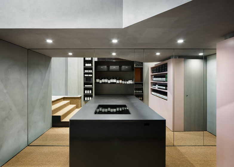
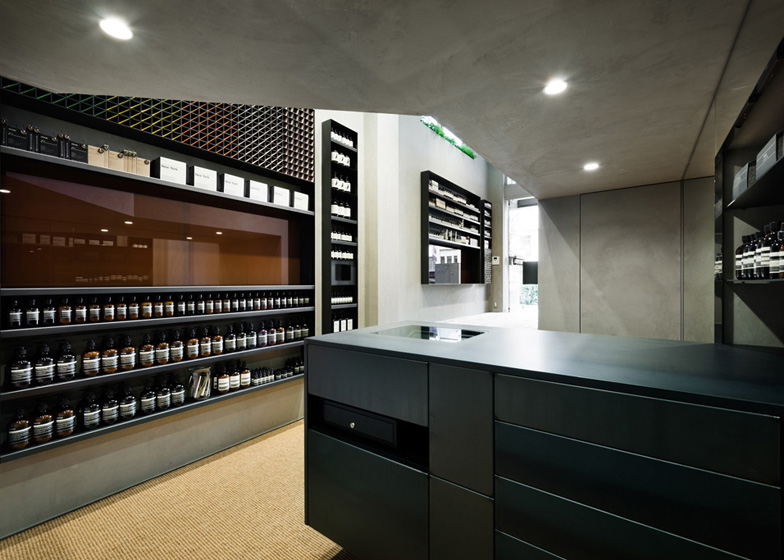
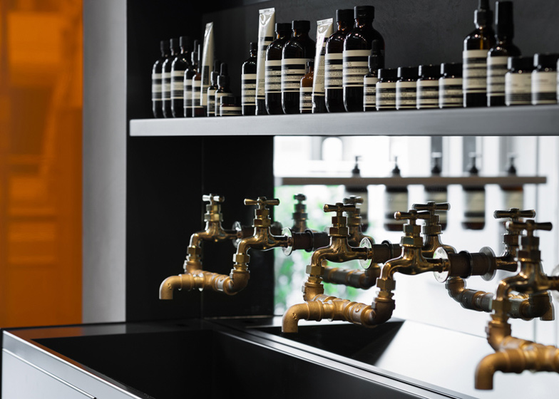
A blackened steel counter continues into a mirrored wall in this Aesop skincare shop by Japanese studio Torafu Architects (+ slideshow).
Torafu Architects installed a mirrored wall with a protruding counter in the long narrow shop for hair and skincare brand Aesop in Shibuya, Tokyo.
The dark counter appears to extend into the reflected space, whilst a cubbyhole of products interrupts the mirrored wall.
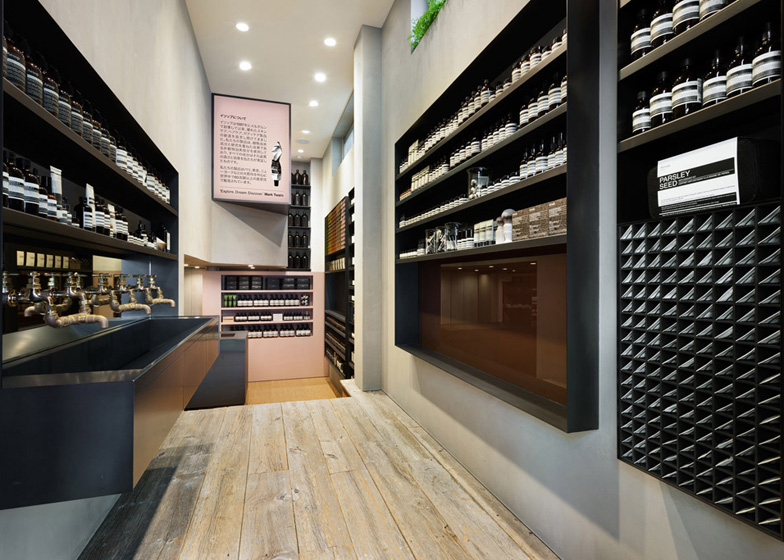
Narrow windows along the top of the opposite wall were revealed during the renovation process, allowing light to filter down into the slender interior.
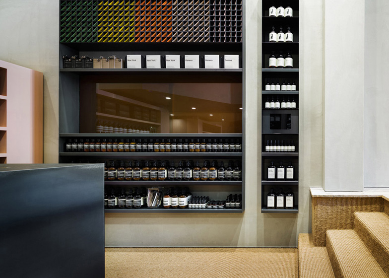
Rectangles of brown glass surround the doorway, referencing the trademark brown bottles that line the walls of the store housed in blackened steel shelves.
An elongated demonstration sink sits just inside the entrance, also made from blackened steel, with a mirrored splashback from which simple garden taps protrude.
Reclaimed timber flooring marks the entrance to the shop and the remainder of the space is finished with sisal carpet.
Torafu Architects also designed Aesop's Shin-Marunouchi store, in which chunky chipboard surfaces have been sanded and stained to look like marble.
Earlier this month we featured Aesop's East Hampton store which has shelves supported by dowels slotted into pegboard walls.
We also previously interviewed the founder of Aesop, who explained why no two Aesop stores are the same. Read the interview »
See all our stories about Aesop interiors »
See all our stories about shops »
Here's more information from Torafu:
For Australian skin care brand Aesop, we planned the interior and exterior of the new store on Meiji Street in Shibuya. The store is located on the first floor of a three-storey building situated between two taller buildings; the space is long and slender – 2.6m in width, 7.8m in depth and 3.9m in maximum height. We aimed to work with these proportions to provide a welcoming and intimate space for communication with customers.
The windows on one side wall, which appeared after demolishing of the former store’s interior, were the key for the design. On the wall opposite, we mounted a mirror to enhance scenery, extensity and light. The window located at the front of the store below has brown glass to represent Aesop's traditional containers, and is incorporated in the shelves. In this way, the window is extended and the shelves are considered as a frame.
In order to limit the variety of the materials used, the shelves and counter are finished in blackened steel, which is also the basis for storage doors assimilated into the mortar wall or mirror wall; the basin that is Aesop's feature is set near the entrance to effect a good view from the passage.
The door of the entrance and the facade sign are created from glass. The latter is composed of brown glass and corrugated glass, like patchwork – its colour and transparent appearance evoking Aesop's brand image. A luminous sign on the wall and a selection of plants lend an outdoor atmosphere. As you move further into the interior, the floor texture changes from old wood to sisal carpet, subtly emphasising the transition from the busy street to the quietude of the store.

