Fan outcry prompts Everton FC to ditch new badge design
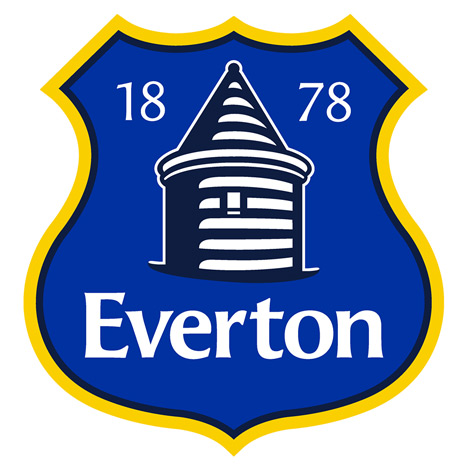
News: English football club Everton FC has promised to consult fans on a new version of its crest after the latest redesign prompted a furious backlash.
Over 23,000 supporters have signed an online petition calling for the recently unveiled badge to be scrapped, slamming it as "amateurish" and "embarrassing".
Responding to the outcry on the Everton FC website, the club apologised and said: "We regret we didn't ask every Evertonian about something that matters so much to every one of you."
CEO Robert Elstone explained that it was too late to remove the badge from next season's kits, but added that fans would be consulted on a redesign.
"We are turning to you to help us shape and refine the badge we'll adopt in the future. Evertonians from all sections of the fan base will be pulled together in a fully transparent way," he said.

The badge was designed in response to club officials' request for a simpler crest that could be "reproduced more effectively in the digital and retail arenas".
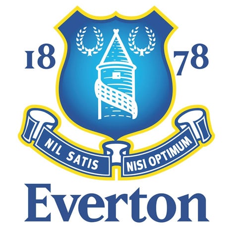
Designed by the club's in-house graphics team, it depicts a more accurate version of the Everton landmark St Rupert's Tower, as well as the club's name and the year of its formation, 1878.
However, the badge omits Everton's traditional laurel wreaths and the club's Latin motto "nil satis nisi optimum", which means "nothing but the best is good enough".
Despite the angry reaction, the club said it remained committed to modernising the logo: "Effective logos are simple and streamlined. Simplicity achieves stand-out recognition. This was our starting point for our new crest."
We previously reported on Nike's redesigned away kit for France's national football team, based on the Breton stripe, and a warehouse in Portugal converted into an indoor football ground – see all football design.
Other redesigned logos we've featured lately include a new identity for the Whitney Museum of American Art in New York and a revamped livery for American Airlines – see all logos.