Pakta restaurant by El Equipo Creativo
Colourful strings are threaded around looms to envelop this Barcelona restaurant headed by Catalan chef Ferran Adrià (+ slideshow).
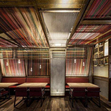
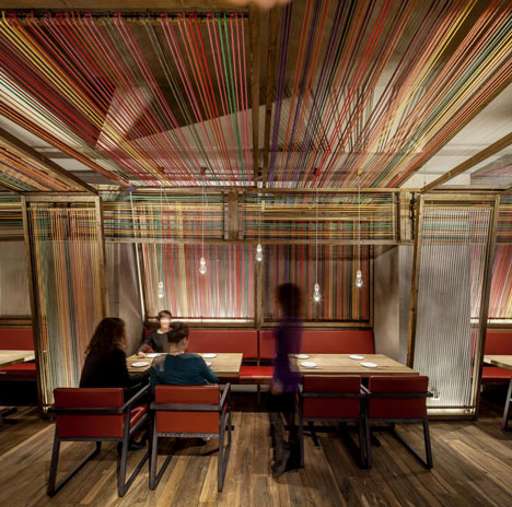
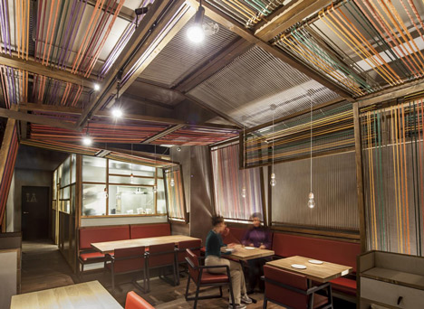
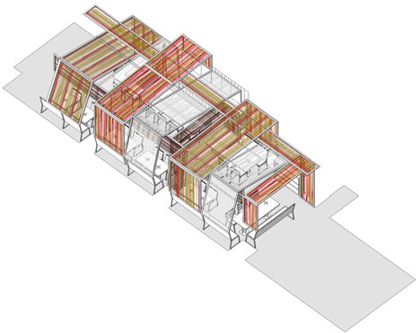
Local studio El Equipo Creativo reinterpreted traditional wooden Peruvian cloth-weaving equipment to create angled panels from thick threads stretched across wooden frames. Some of the frames are twined with white cords to contrast with the colourful sections.
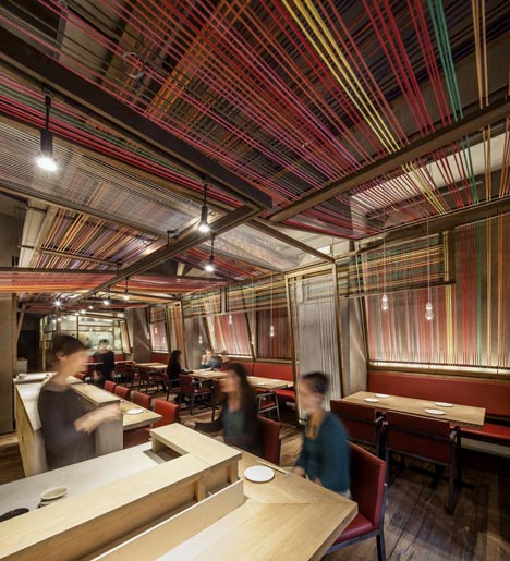
The panels pass over the heads of diners who are served a fusion of Peruvian and Japanese cuisine at Pakta, which means "union" in Peru.
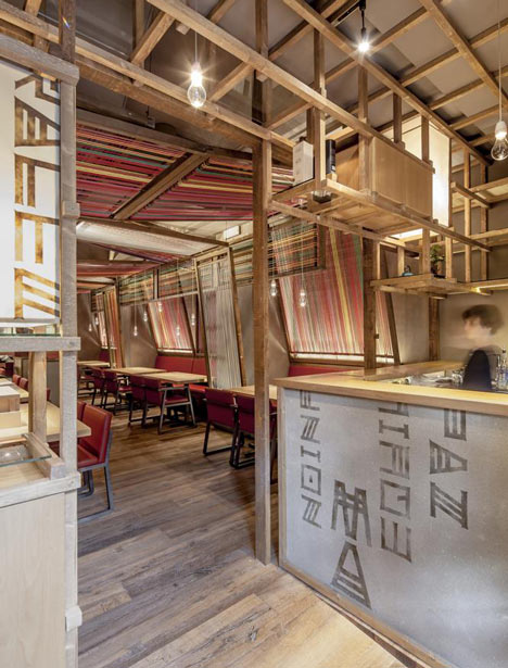
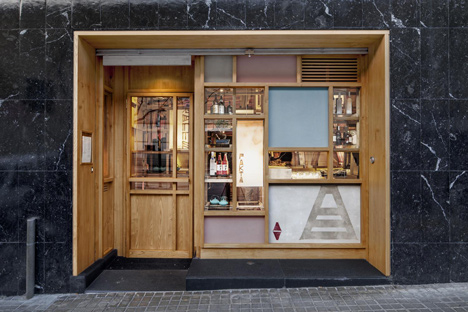
A grid of wooden batons creates shelves above a bar at the front of the space, which serves sake and pisco - local tipples in Japan and Peru respectively.
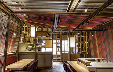
This grid sits against the window at the front of the long narrow building, allowing bottles and crockery to be displayed.
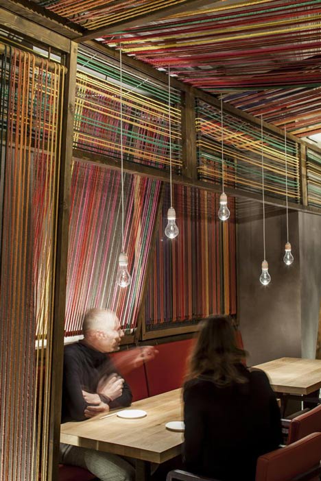
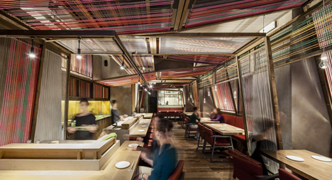
In the main restaurant, a sushi bar separated into chunky units is surrounded by wooden dining surfaces lit with spotlights, while light bulbs dangle above more tables flanked by red seats.
Located just off the Avinguda Parallel, close to Montjuic Park, the restaurant opened as joint venture between chefs Ferran Adrià and his brother Albert, and owners the Iglesias brothers.
Dezeen published a travelling pavilion designed for Adrià's gastronomic research initiative elBulli Foundation last year.
We've featured a couple of restaurant interiors recently, such as a London pizza bar decorated with colourful tiles and an eatery in a converted car park near Stockholm.
More designs in the Catalan capital include a renovated apartment with restored mosaic floors and a laundrette that looks like a nightclub.
See more restaurant interiors »
See more architecture and design in Barcelona »
El Equipo Creativo sent us the following information:
Design of Pakta Restaurant, Calle Lleida, Barcelona
After the success of the restaurant Tickets and the cocktail lounge 41º, the tandem formed by Albert and Ferran Adria and the Iglesias bothers has once again counted on El Equipo Creativo to design their latest gastronomic project: Pakta Restaurant. A small locale was chosen in the same area close to the Avenida Paralelo in Barcelona, on the slope going up towards the Mercat de la Flors and Montjuic Park. The novelty is in the gastronomic offer, based on the nikkei Peruvian - Japanese cuisine and, of course, the design of the space, which, as in previous projects by Oliver Franz Schmidt and Natali Canas del Pozo, is a reflection of the gastronomic concept.
Concept
In the Quechua language of Peru Pakta means “union”; in this case the union of two cultures and their respective cuisines . The interior design created by El Equipo Creativo emerges from this same idea, considering that Japanese cuisine is the basis of the nikkei gastronomy but wrapped in Peruvian tastes, colours, traditions and ingredients. With this in mind, the basic elements of the restaurant such as the bars, the kitchen and the furniture are designed with a clear reference to the architecture of the traditional Japanese taverns.
An explosion of colours evocative of Peru envelopes the space. This chromatic “second skin” is achieved by use of a direct reference to the Peruvian loom, offering a surprising combination of colours which contrast with the austere Japanese design, and underlining the deep-rootedness of this artefact in Peruvian arts and crafts.
However, the re-interpretation of the Peruvian loom goes further, sequencing its own elaboration process on the walls of Pakta, transforming this flat surface to offer a tridimensional character to the space, adding vitality and movement and blurring the limits which mark the locale. The traditional Peruvian weaving looms are wooden mechanisms where colored threads intertwine in various directions, forming a suggestive tridimensional space which generates an attractive atmosphere transformed and reinterpreted in Pakta.
The final result unites the re-interpretation of these two cultures--Peruvian and Japanese-- by means of some of their most emblematic traditional elements, creating a visually potent but balanced solution, at once spontaneous and rational, hilarious and silent, surprising but strangely familiar, as is the nikkei cuisine itself.

Space and Distribution
As the small locale is long and narrow with a tiny facade, from the beginning of the project it is clear that maximum advantage must be taken of the space. The work areas are divided into three zones:
In the entrance, the sake and pisco bar also acts as a filter between the interior and exterior of the locale. It is a three dimensional framework which serves as a shelf, visual filter and product display stand. Facing outside, the bar becomes the facade and welcomes guests with a composition of faded colours, Japanese lamps, graphics elements and a small selection of products on display. In order to enter the restaurant, the guest passes through the wooden framework, as an introduction to the dining space.
Presiding the dining area is the sushi bar. Structurally speaking, it is completely antagonistic to the sake and pisco bar as it is composed of three heavy, luminous stone pieces, upon which the sushimen work slowly but surely serving directly to the clients who sit around them. The idea of dividing the bar into three separate and elevated “stones” helps to contain the reduced scale of the locale and create a sense of strange levity among the heavy pieces.
Closing the space at the end of the dining area is the kitchen, conceived as a luminous box which allows the cooks inside to be observed through a layer of glass panels with different degrees of transparency.
Technical details
Lighting
The lighting is achieved in collaboration with the BMLD Lighting Design. The main objective is to create an atmosphere which will put the focus on the served dish and the food. The cultural impact of the Peruvian - Japanese restaurant is what determines the lighting concept: fusion of light and dark, simplicity and colour.
The concept is evident by using dim light in some of the looms, thereby creating rhythm and dynamism. It is a game of rationalism, shine and transparency, important concepts in the Japanese culture, as reflected in the sensual lamps on each table and the lanterns which mingle with the three dimensional framework at the entrance. The result reveals a balance between light and atmosphere, where the client is submerged in a new gastronomic experience.
The Looms
The looms envelope the entire dining area by means of three different transversal sections which repeat themselves, varying their tonality and creating a rhythm of variable colour. A few longitudinal pieces placed in different positions and at varying heights help to weave the space and create a sense of enclosure.
The colored looms are designed one by one, intercalating full spaces and empty ones, areas of great chromatic intensity with other more neutral shades, warm colores (reds, golds) with cooler tones (greens and browns). The cloth used on the looms is cotton of hand-made appearance, rough touch and dull finish. In contrast to the profusion of colour, the loom is white and is constructed in a fine, shiny material, thereby becoming a light-reflector.
The structure of the looms is a double wooden frame. The woven cloth revolves around the interior frame, which is joined to the exterior frame by a tensor which permits the threads on the loom to be tensed whenever necessary.
The Finishes
For Pakta, El Equipo Creativo considered it essential to maintain the purity of nature so present in both the Japanese and Peruvian cultures. Therefore, only natural finishes with a minimal transformation from their original state were used.
The wood used in the bars and tables is American oak in which small imperfections and knots are left untouched converting them in differentiating elements which add personality to the pieces. Likewise, the sushi bars built in marble from Novelda, intentionally have a crude, unpolished finish with cracks and streaks that are reminiscent of those pieces taken from a quarry.