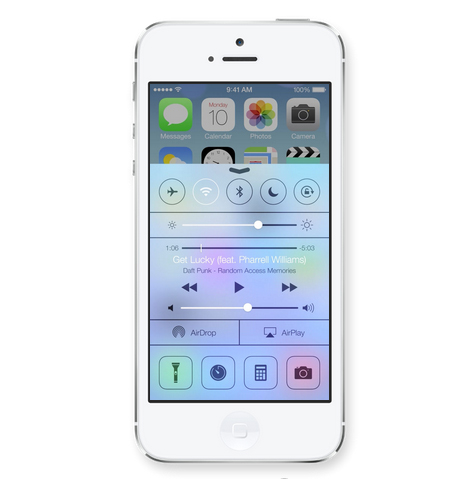
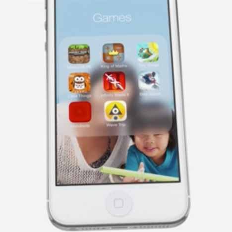
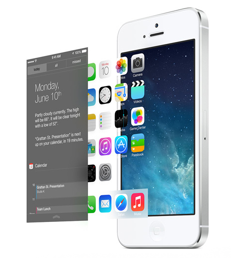
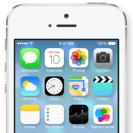
News: Apple has revealed the design of iOS 7 - the highly anticipated first major user interface redesign since industrial designer Jonathan Ive was put in charge of both hardware and software design across the company.

As expected, the new operating system unveiled today at Apple's Worldwide Developers Conference in San Francisco features uncluttered interfaces and marks a distinct shift away from imitating physical materials like leather and wood, bringing the brand's software more in line with the pure and minimal style that Ive famously developed for its hardware. "We see iOS 7 as defining a important new direction, and in a way a new beginning," said Ive in a movie shown at the launch.
"I think there is a profound and enduring beauty in simplicity, in clarity, in efficiency," he continued. "True simplicity is derived from so much more than just the absence of clutter and ornamentation; it's about bringing order to complexity."

Distinct translucent layers of content are meant to help users maintain a sense of context while moving through the interface and a new "multitasking" feature means users can scroll between application windows without going back to the home screen.

"These planes combined with new approaches to animation and motion create a sense of depth and vitality," says Ive, adding that just changing the desktop picture affects the look and feel across the entire system.
The team has redesigned all the icons, refined and pared back the typography, and implemented a new colour palette. "In many ways we tried to create an interface that is unobtrusive and deferential, one where the design recedes and in doing so actually elevates your content," Ive concluded.
Anticipation over the visual overhaul has been mounting since Ive was appointed head of the new Human Interface team at Apple in October, and experts have been predicting a move towards cleaner edges and flat surfaces over the textures and faux materials that came to characterise Apple's software design.
In recent years Apple has been ridiculed for its skeuomorphic approach to software design - where digital applications are made to mimic real-world objects such as leather-effect diaries and timber-style bookshelves - and at Dezeen Live last September designer Yves Behar discussed the gulf between Apple's hardware and software design.
"Obviously they didn’t go there with the hardware so why did they go there with the software? It’s a really good question," he said. "There's now many companies looking at it in a way that's quite interesting and Apple actually is a little bit behind in that area."
A month later Apple brought its hardware and software design teams closer together under the leadership of British designer Jonathan Ive - who was already responsible for the minimal engineering of its product design - as part of a management shakeup that also saw the departure of Scott Forstall, the senior vice president of iOS software and a strong proponent of skeuomorphism.
Apple was named best design studio and best brand of the past 50 years by D&AD last year and is due to move to a new Foster + Partners-designed campus in 2016, though the project was recently reported to be $2 billion over budget.
Dezeen also briefly featured in the demo today, and last year Dezeen featured in the launch of the iPhone 5 and the new MacBook Pro.
See all our stories about Apple design »

