Chinese studio Neri&Hu has unmasked the I-beams structure of the oldest steel-framed building in Shanghai to create an Italian restaurant with a raw industrial interior (+ slideshow).
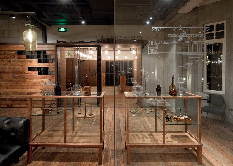
Neri&Hu stripped the inside of the space, leaving exposed brickwork, peeling plaster and Victorian ceilings mouldings intact. The architects then added steel-framed partitions to create a drinks bar, a pizza bar and a series of private dining rooms.
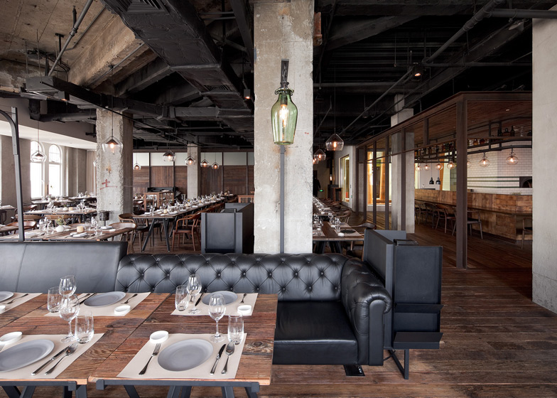
"Stripping back the strata of finishes that have built up after years of renovations, the design concept celebrates the beauty of the bare structural elements," say the architects.
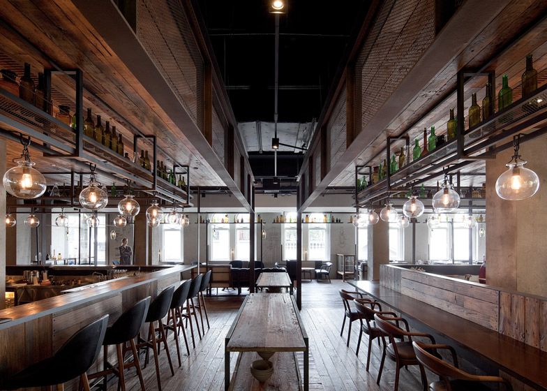
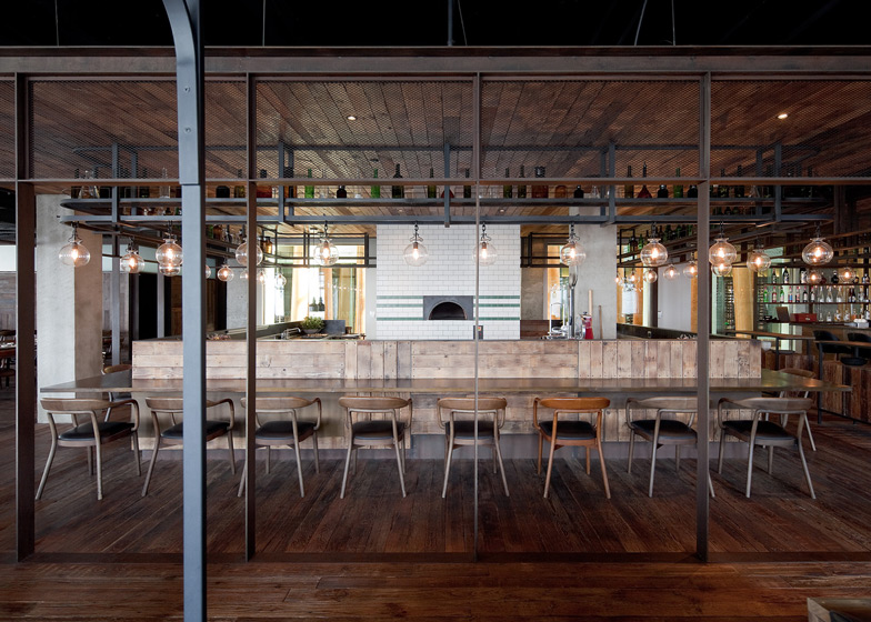
The main dining area is loosely modelled on a traditional marketplace, which inspired the name Mercato. The two bars are located at the centre and feature industrial steel shelving and reclaimed timber canopies, while glass lamps hang over tables like street lights.
Banquette seating runs through one section of the restaurant, which the architects built using wood found onsite and tubular steel frames.
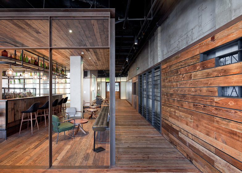
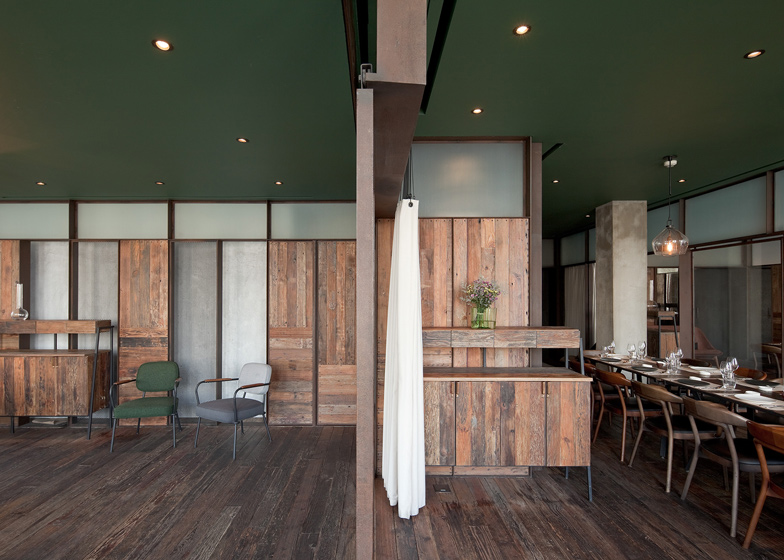
The three private dining rooms are surrounded by an amalgamation of materials that includes antique mirrors, blackboards, metal mesh, recycled wood, raw steel and textured glass.
"Constantly playing the new against the old, [our] design is a reflection of the complex identity of not only the historical Bund, but of Shanghai at large," says the studio.
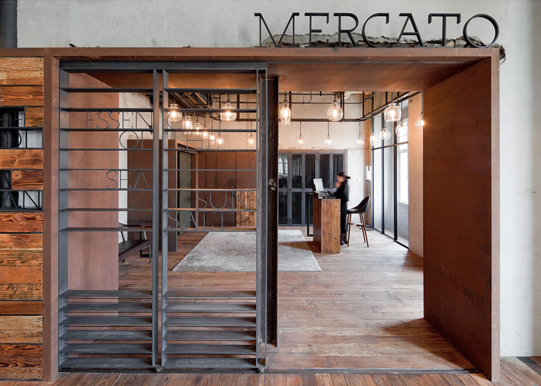
The entrance to the restaurant is a sliding metal gate with words spelled out between its horizontal bars.
Mercato is one of six restaurants at Three on the Bund, a department store along the river in central Shanghai, and it is run by French chef Jean-Georges Vongerichten.
Architects Lyndon Neri and Rossana Hu have worked on several renovation projects in Shanghai, including a design gallery in a former colonial police station and the reworking of a 1930s townhouse. Speaking to Dezeen last year, the pair explained that interest in conservation and small scale development is growing in China.
The studio also won World Interior of the Year in 2011 for transforming a disused Japanese army headquarters into a hotel in the same neighbourhood.
See more design by Neri&Hu »
See more architecture in Shanghai »
See more architecture in China »
Photography is by Pedro Pegenaute.
Here's some more text from Neri&Hu
Mercato at Three on the Bund
Neri&Hu puts the "industrial" back in three Michelin star dining and refined interior at Mercato.
Situated within the prestigious Three on the Bund, Mercato is renowned chef Jean-Georges Vongerichten's newest culinary destination in Shanghai, the first of which to serve up an upscale yet rustic Italian fare. Neri&Hu's design for the 1,000 square metre restaurant draws not only from the chef's culinary vision but also from the rich historical context of its locale, harkening to early 1900s Shanghai, when the Bund was a bustling industrial hub.
Stripping back the strata of finishes that have built up after years of renovations, the design concept celebrates the beauty of the bare structural elements. Three on the Bund was the first building in Shanghai to be built out of steel, and the architects' decision to reveal the original steel columns pays homage to this extraordinary feat. Against the textured backdrop of the existing brickwork, concrete, plaster and mouldings, new insertions are clearly demarcated. Constantly playing the new against the old, Neri&Hu's design is a reflection of the complex identity of not only the historical Bund, but of Shanghai at large.
Coming off the lift, one notices immediately the Victorian plaster ceilings above, its gorgeous aged patina juxtaposed against raw steel insertions: a series of lockers along the wall, a sliding metal gate threshold, and the suspended rail from which a collection of eclectic glass bulbs hang—the opulence of old Shanghai coinciding with a grittier side.
Making reference to the restaurant's name, the vibrant atmosphere inside the main dining space recalls a street side marketplace, featuring at its centre the Bar and the Pizza Bar, both encased in steel mesh and wire glass boxes with recycled wood canopies. Above, a network of tube steel members, inspired by old-time butcher's rails, intertwine with the exposed ductwork and form a system for hanging both shelving and lighting. Like a deconstructed sofa, the banquettes along the edge of the dining area are made from wood salvaged on site and embedded into a metal frame.
The private dining rooms are also featured in the space as metal-framed enclosures, infilled with panels of varying materials: reclaimed wood, natural steel, antique mirror, metal mesh and chalk board. A band of textured glass along the top edge of each PDR affords some transparency, while sliding doors between each room provide maximum flexibility. This language continues into the corridor between the kitchen and dining area, where a back lit wall of textured glass panels - inspired by old warehouse windows - encourages interaction between the chef and his patrons.
Diners seated along the edges of the room experience a different sort of ambiance. To bring lightness into the space, the perimeter represents an in-between zone: between interior and exterior, between architecture and landscape, between the domestic and the urban. Clad in white travertine, the walls here act as a temporary departure from the other rich textures and palettes. The focus here is simply the breathtaking views of the Bund beyond, drawing the far reaches of the city into the dining space itself.

