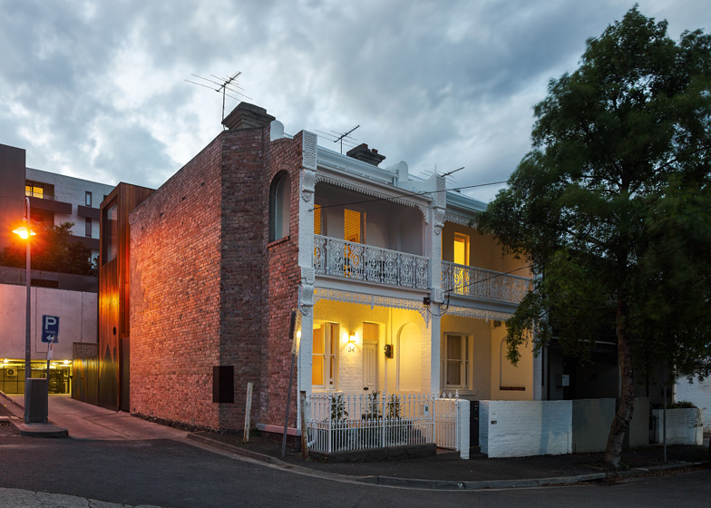
Andrew Maynard Architects has linked two terraced homes in the Richmond suburb of Melbourne, Australia, by adding a periscope-shaped extension with a special area for graffiti artists (+ slideshow).
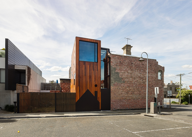
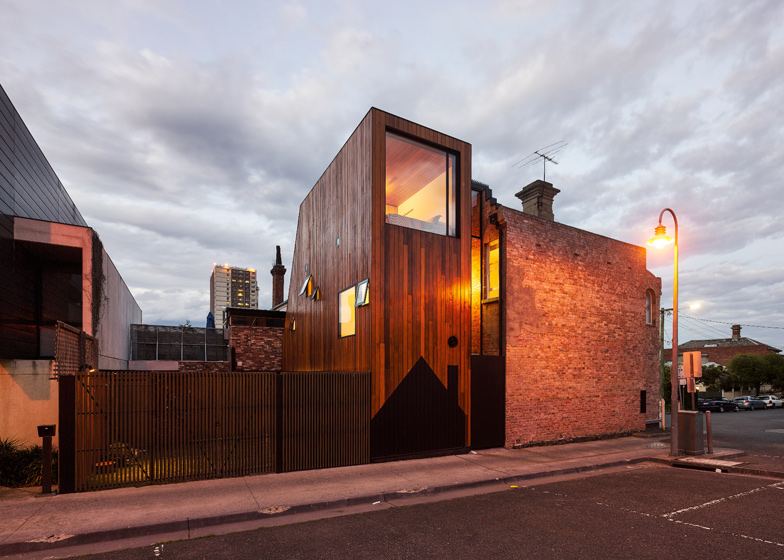
Andrew Maynard Architects designed the extension, called HOUSE House, for two generations of the same family who live next door to each other. The red cedar-clad extension sits at 90 degrees to the original Victorian terrace and includes a house-shaped graphic at street level to encourage graffiti artists to leave the timber alone. See also: a house in Melbourne with built-in graffiti.
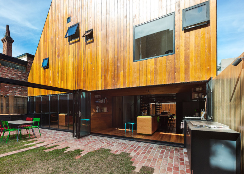
The architects demolished the existing two-storey extensions and replaced them with a single, three-storey addition, which they slotted into the back yard to create a light well between the new and old elements.
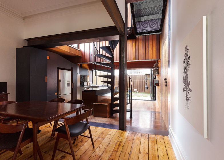
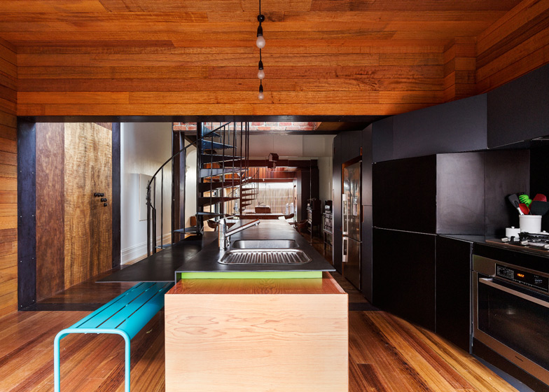
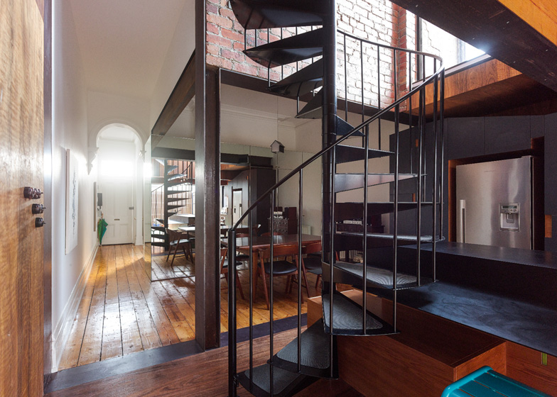
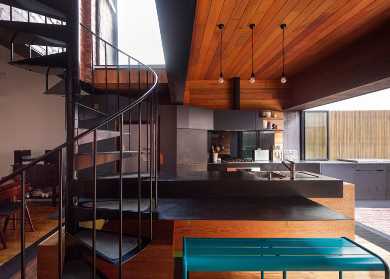
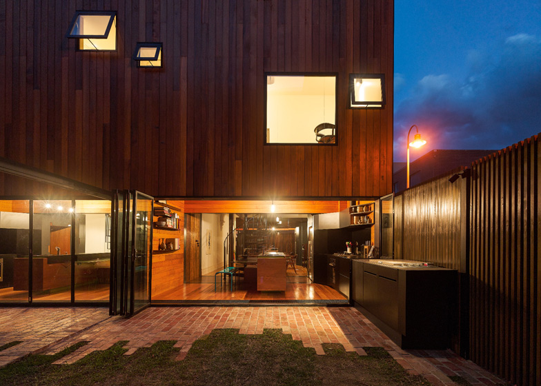
The extensions, which are linked at ground level, each contain a kitchen, study and bedroom, and feature spiral staircases that rise up through the light well.
The architects created a black graphic in the shape of a house as an attempt to control graffiti, which is rife in Melbourne. "Tagging is to be expected on almost any exposed wall," they explain.
"Most tagging is drawn with black spray paint. To combat this we introduced a black graphic to the facade that either makes the tag invisible or alternatively can be quickly painted over to discourage additional tagging."
They add: "Will this tactic work or will it simply offer a greater incentive? We don’t know."
Australia has the largest average house size in the world and many Australian cities are characterised by sprawling, low-rise residential areas. In this case Andrew Maynard Architects have attempted to densify the plot without building over the backyard, instead opting for a narrow, tall extension.
"We deliberately went vertical," says the architects.
HOUSE House is one of 16 houses shortlisted for the World Architecture Festival's 2013 awards, alongside a trio of seafront residences in Kuwait and a house covered in plants in Vietnam.
See more Australian houses on Dezeen, including a house on a vineyard in Mornington Peninsula.
Photography is by Peter Bennetts.
Here's the full information from Andrew Maynard Architects:
HOUSE House
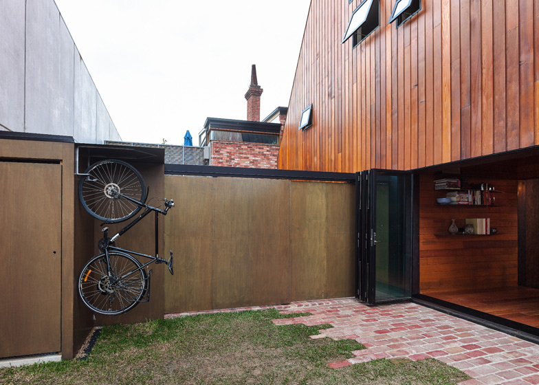
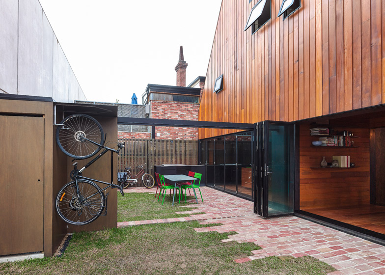
These neighbouring terrace homes are owned by two generations of one family. Both houses were in need of repair and update. HOUSE House is a single building that extends both homes. They are separate homes within one architecture. The new structure runs north/south while the original houses run east/west. The fence between each terrace slides away to create one large backyard.
Australia has the largest houses in the world. Melbourne is flat, with very low density. There are few topographical constraints to force homes to have a small footprint. This is unfortunate as many of the best homes around the world are modest in size and maximise what precious outdoor space there is.
In Australia we go wide and low. We pancake our homes. We eat up our outdoor space.
Often people move to the suburbs under the false logic that they will have an abundance of open space and room for kids to play; however the enormous size of houses now makes this a convenient myth rather than a true outcome. This results in car dependence and children’s isolation from a rich and diverse urban community (as kids don’t tend to drive that much).
With HOUSE House we deliberately went vertical. We stacked spaces 3 levels high. We maximised the backyard on a small site.
In cities like Tokyo, London, Amsterdam and many more, living vertically is a way of life that generates unique housing while also making the most of a densely packed urban condition. It creates a vibrant way of life that sprawl and car dependence could never achieve.
But what if we introduce a footprint restriction beyond what is required? What if we build a tall thin structure that maximises the modest backyard? We produce spaces that, though familiar in many parts of the world, are unfamiliar in Australia; tall, cavernous spaces with light cascading from above. Each space different in personality and function so that the modest home can adapt to the various complex moods of its occupants.
Andrew Maynard Architects generally attempt to avoid crashing new structures into old. With HOUSE House we deliberately created two separate forms. We respect the twin Victorian terraces. We repair and restore them. We do not extrude or copy the original as this only ends in an odd tumor.
The new structure is built across the rear of the terraces. A clear gap remains between the two. Weather is kept out of this cavernous space by glass infills. This is where you rise and spin up the spiral stair, interacting with both the aged brick of the terrace and the cedar of the new. We’ve avoided using new synthetic, shiny or plastic materials. The materials have had a past life.
The new form is clad entirely in cedar. Raw steel plate and detailing describes the openings between structures and the threshold between old and new. Dark plywood paneling rises through the light-filled void between the structures.
We strategically use mirror on the cabinetry in the dining area to make the space feel large while giving the illusion that light is coming from both sides and that we are surrounded by garden.
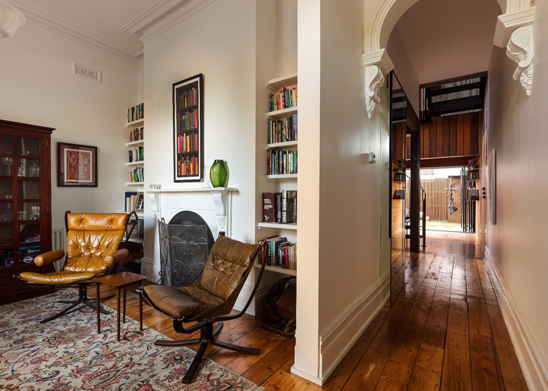
The key to making a modest-sized home flourish is to provide a number of spaces with various personalities. The active family and living spaces don’t need to be large, yet they must have loose boundaries. The original front sitting room is retained. After this the living spaces can open from the dining room to the rear fence.
The side fences can both be opened to let outdoor activity spill beyond the living area. The kitchen bench continues through the rear glass wall. The inbuilt barbecue sits on the end of the bench.The levels above the living areas provide quiet contemplative spaces. Each space is connected with both the rear yard and the internal light well.
Like all of our buildings sustainability is not the narrative, it is a core responsibility in the same way that lighting and plumbing are. All new windows are double glazed. Glass roofs can be thermally challenging therefore we have used high performance glass with automated louvres over so that sunlight stops before it hits the glass, not after. There’s no green house effect here.
The owners can adjust the louvres at anytime between full sunlight and complete block out. Louvres to the south of the lightwell are automated to allow the space to quickly vent should heat build up. High performance insulation has been used in the new walls and roof. The existing terrace roofs have also had an insulation upgrade. Solar panels cover the roof.
On the cedar boundary wall we’ve painted a graphic. Melbourne has some of the best street artists in the world and thankfully they donate their work to the city within its numerous laneways. Though street art is welcome throughout Melbourne tagging is also prevalent and it tends to be more destructive. Tagging is to be expected on almost any exposed wall.
Most tagging is drawn with black spray paint. To combat this we introduced a black graphic to the facade that either makes the tag invisible or alternatively can be quickly painted over to discourage additional tagging. Will this tactic work or will it simply offer a greater incentive? We don’t know?
Most importantly we engage with tagging, one of the ubiquitous parts of the city, rather than fortifying ourselves from it. The graphic used is the child-like image of a suburban home. Here we see the overlap of two distinct approaches to the single family house; the stereotypical home overlaid on the import.
If you look closely elsewhere in the house you will find numerous “Easter Eggs” following the same theme.

