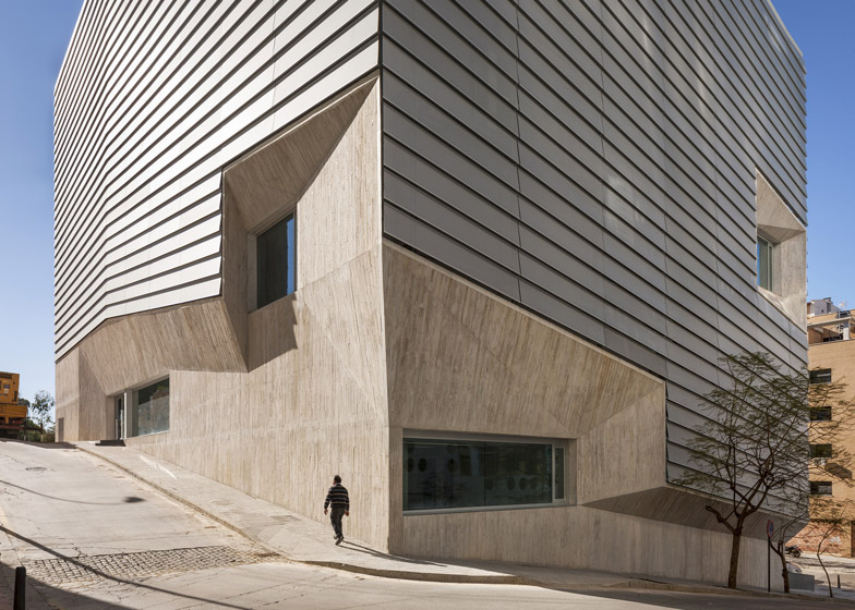
An ancient archeological excavation determined the layout of this public library in the Spanish exclave of Ceuta by Madrid architects Paredes Pedrosa.
Paredes Pedrosa designed the education facility and visitor centre around the fourteenth century Marinid dynasty ruins discovered up a sloping site on the Spanish-owned peninsula, which juts out into the Mediterranean sea from Morocco's north coast.
The former settlement sits at an angle to the current urban grid, and the external walls are angled to merge both geometries.
Seven triangular pillars strategically situated among the ruins support the high ceiling over the exposed remains.
Faceted concrete surfaces encompass the lower floors, joining up the edges of recessed windows.
Upper storeys are wrapped in a horizontal cladding system of aluminium mesh louvres, which blocks the heat and controls the level of light entering the glazed walls behind.
Entered from the lower street level, the exhibition area is contained in a wing packed with research labs, audiovisual learning tools and facilities for children.
Visitors can look down on the archeology from the terraced upper floors, which house the book collection, study, lecture and event spaces in a mix of single- and double-height rooms.
A shaded reading terrace on the roof provides views out over the sea and across to Europe on a clear day.
Paredes Pedrosa have also designed a four-armed police station in Seville, with cells hidden underground.
A couple of new libraries have been announced recently, including OMA's X-shaped proposal for Caen in northern France and a twisted timber building for Helsinki by ALA Architects.
Photography is by Fernando Alda, unless where otherwise stated. See more of images of this project on his website.
See more library design »
See more architecture by Paredes Pedrosa »
The architects sent us the following text:
Public Library in Ceuta
Programme: public library, exhibition area, press area, children area, teen library, audiovisual area, research labs, manuscripts and archives. An archaeological centre exhibits a Marinid excavation of the XIV century.
The new Library in Ceuta is conditioned by the steep topography of the plot and by the Arab Marinid archaeological excavation of the XIV century that determine all interior spaces of the Library. Also the lack of space and the compactness of Ceuta, an autonomous Spanish city located on the north coast of Africa on the border of the Mediterranean Sea and the Atlantic Ocean, condition the proposal.
The orthogonal geometry of this ancient settlement is turned from that of the actual urban grid. This fact establishes a triangular geometry for the structure over the archaeological site and the urban value of the Arab city is included in the geometry of new building.
The Library is conceived as a compact volume that preserves the archaeological area as the core of the public spaces, creating a sense of openness and transparency between reading spaces and visitors to the Marinid centre. The library is organised in terraces placed on the slope that embrace the remains of the past. The lecture rooms are stacked in several levels overlooking the void where groups of hanging triangular lamps with peaks in both geometries are set over the archaeological centre. Two different entrances in two levels, one to the Library and other to the visitors centre, are placed linking the inside to the nearby streets.
Seven triangular concrete pillars support the building with a program organised vertically. The third floor with the general book display is placed over the concrete structure that covers the archaeological site. Over it a light steel structure in six levels stacks the program being the highest one the book depot, archives and offices.
The compact folded volume is entirely wrapped up in an aluminium-perforated skin that reduces glare and solar gain and maximises the use of natural daylight reducing long-term energy costs. The mesh mitigates the sometimes-harsh qualities of daylight thus minimising the use of artificial light to avoid contrast and helping to illuminate the depth of the space.
The final façade includes different glass-metal layers, energy efficient: an interior glass one and an outer metal one, as a veil, that interplay with the changing light conditions protecting the inside from the sun and heat. Slight variations in the make up of the panels, for different orientations, provide the library with a differentiated yet uniform skin, emphasising the faceted shape of the building. Between them a gallery permits easy maintenance of glass openings and simple installations.
A concrete plied basement runs along the steep streets and several concrete structural voids are cut up in the double façade of the Library as viewpoints towards the city. On the terrace in the roof level an open reading room is placed, shaded by the aluminium-perforated skin that wraps up the building that filters sun and open views towards both seas, Europe and Africa.
Location: Calle Manuel Olivencia/Calle Duarte, Ceuta
Architects: Ángela García de Paredes. Ignacio Pedrosa
Project team:
Lucía Guadalajara, Álvaro Rábano, Clemens Eichner, Álvaro Oliver, Guiomar Martín, Eva Urquijo, Ángel Camacho, Ignacio Cordero, Blanca Leal, Roberto Lebrero, Luis Calvo
Technical control: Juan Antonio Zoido
Consultants:
Structure: Alfonso Gómez Gaite. GOGAITE, S.L.
Installations: JG Ingenieros
Façade: Jofebar
Client: Ministry for Culture
Archaeologist: Fernando Villada
Contractor: Acciona Infraestructuras
Photographs: Fernando Alda, Manuel García de Paredes
Area: 6.159 sqm.

