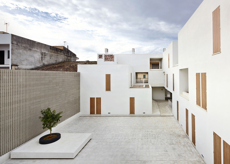
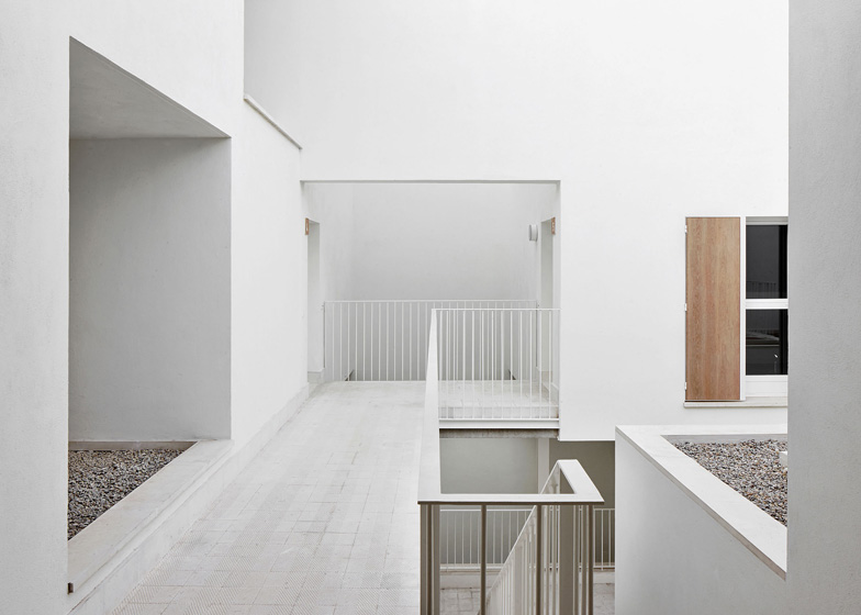
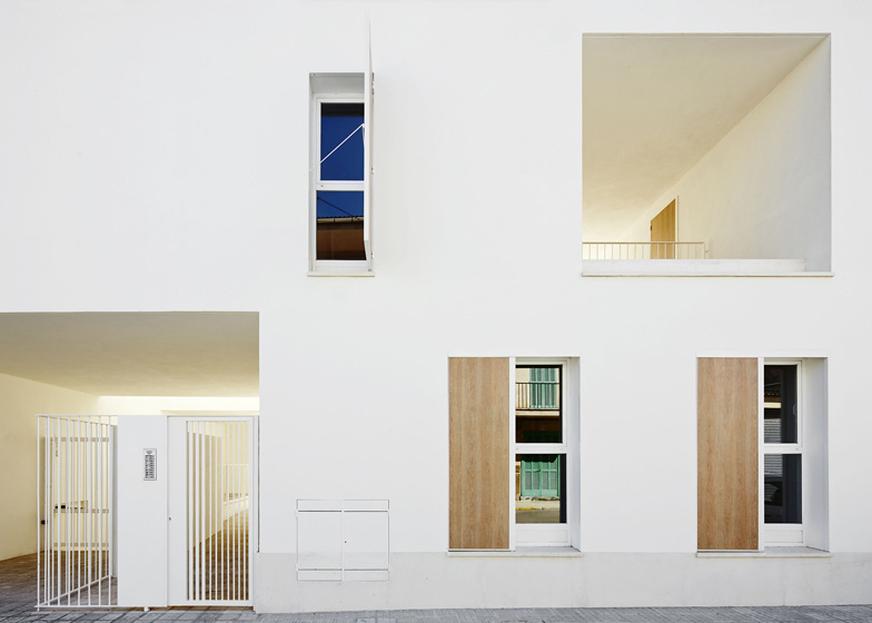
Clean white buildings with identical doors and windows are arranged around a courtyard at this social housing complex in Mallorca by Spanish architects RipollTizon (+ slideshow).
Located on the outskirts of a small town, the three storey development was designed by RipollTizon with 19 units, comprising a mixture of apartments and maisonettes with either two or three bedrooms.
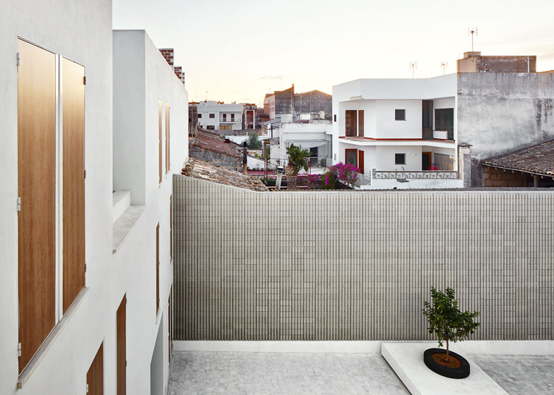
Both shutters and doors have the same wooden finish, intended as a reinterpretation of the fenestration found on other local buildings. "The layout and movement of these shutters by the users creates a changing and vibrant image that reflects the use of the building," architect Pablo Garcia told Dezeen.
Elsewhere, materials have been kept simple and understated with white plastered walls and exposed concrete finishes. "The white coated surface of the facade provides unity and coherence to the complex," Garcia continues.
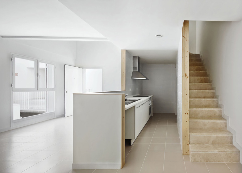
The layout of the development is determined via a modular system, where smaller units for bedrooms, bathrooms and storage areas are added to larger units comprising living, dining and kitchen spaces.
"[The modular arrangement] allows us to create a varied landscape, rich in shades and tailored to its physical context without losing the quality, rigour and standardisation that the social housing development requires." explain the architects.
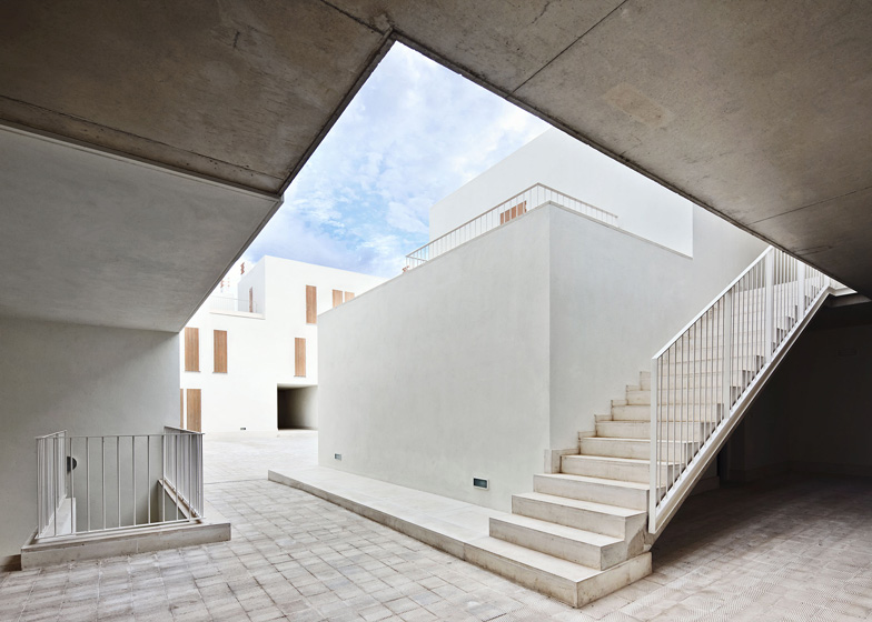
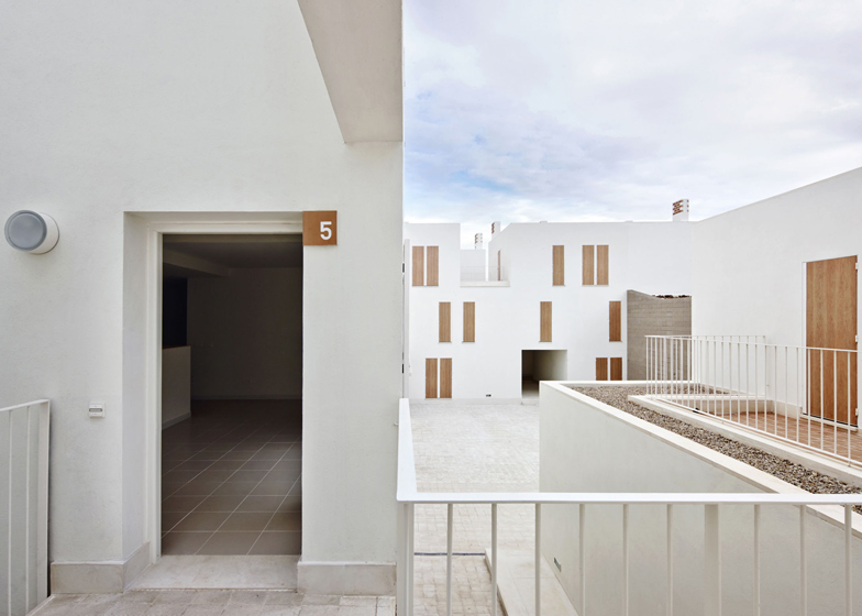
Each unit is organised around a central courtyard and connected via a network of ground-level pathways and elevated walkways.
Square openings punch through the walls of the development, framing views both in and out of the complex.
Earlier this year RipollTizon completed a school in Mallorca featuring bold blocks of colour. See more architecture by RipollTizon »
Other social housing schemes we've published include a complex in Ibiza comprising two jagged blocks and another in France with a camouflage print on the walls. See more housing on Dezeen »
Photography is by José Hevia.
Here's some more information from RipollTizon:
Context
The elements with which to develop the project are not far away. They are features that tell us about the climate, the context and the way we live. Simply walking around the place and looking at the courtyards, the filters, the light, the plots configuration, the small scale of the buildings, the singularity of each of the houses and the amazing configurations that emerge when they are grouped, not really knowing where one house ends and the next one begins. The aim is to give significance to the nuances and tangible scale of the domesticity and the details. Search the surprise.
Housing clusters - aggregation rules
We developed a catalogue of houses that were grouped three-dimensionally (aggregation) following rules that were precise and simple, but also open enough to solve a housing complex adapted to the diversity of situations that the programme and the context required.
From an urban point of view, the proposal complies with the street alignment and puts in value the depth of the plot exploiting its land use possibilities. The volume of the housing complex is stretched between the boundaries, playing with the party walls that limit the plot (obliterating some and putting others in value) and wrapping an interior courtyard that organizes the circulations and public areas, like a square.
Housing Catalogue
The housing units are generated from base module of single or double height (module living-dining-kitchen) to which other smaller spaces are added (modules bedroom-bathroom / bedroom-storage). The different possibilities of aggregation result either in different spatial configurations for a similar group of modules or in different house sizes depending on the number of modules added.
This spatial aggregation logic allows a flexible design process in which each house is considered simultaneously as a unit and in relation to the whole group. It allows to create a varied landscape, rich in shades and tailored to its physical context without losing the quality, rigor and standardization that the social housing development requires.
Use of materials in respect of the context
One of the main strategies of the project is to establish a careful dialogue with its context. The mentioned spatial values of the project are implemented throughout the use of raw materials that contribute to anchor the project to its surroundings. The white coated surface of the facade provides unity and coherence to the complex throughout a modest material that puts in value the space.
In contrast, the exposed materials balance these spaces (exposed concrete structure/slotted concrete blocks/perforated ceramic bricks/hydraulic concrete tile paving) creating textures and material qualities that relate he project to the context.
The use of window shutters in the houses, so characteristic in the area, is reinterpreted in the project using high-pressure compact laminate panels with colourful wooden finish. The layout and movement of these shutters by the users creates an changing and vibrant image that reflects the use of the building.


