D Labo by Takeshi Hamada
This shimmering metal-clad factory in Osaka was designed by Japanese architect Takeshi Hamada to echo the clean and fashionable style of the company's employees (+ slideshow)
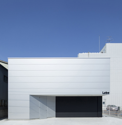
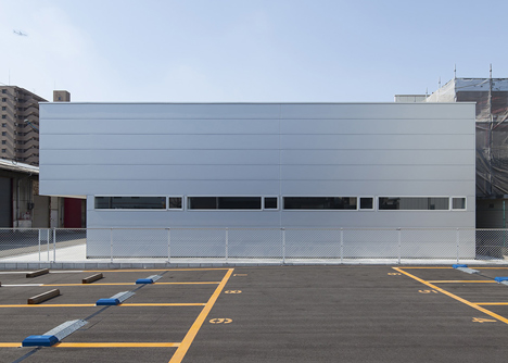
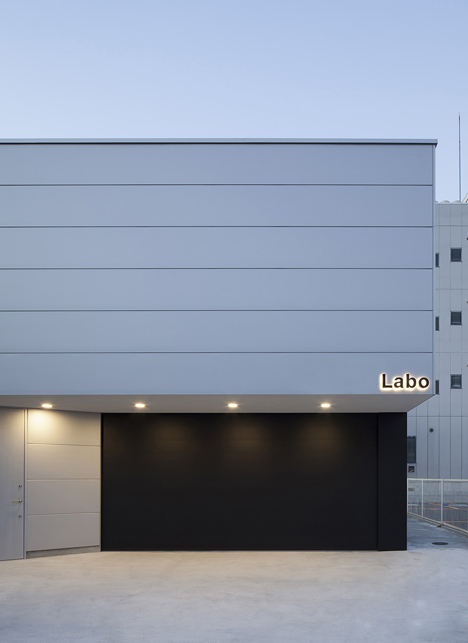
The D Labo factory houses a printing company, whose products include manuals for electronic products and brochures for construction material manufacturers. Takeshi Hamada was asked to create a building that would suit the company image, but also fit in with the the surrounding residential neighbourhood.
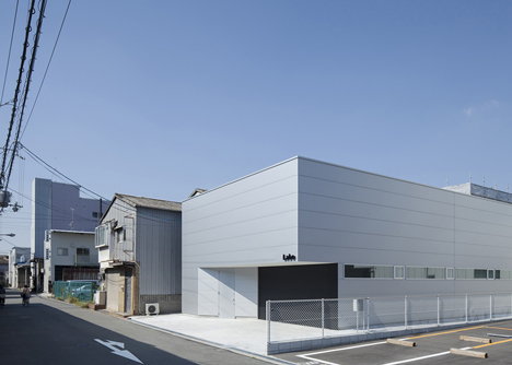
"The client's company [...] has an image quite different to the usual image of a printing factory", said Hamada. "When I visited their main factory, I saw fashionably dressed company employees at Macintosh computers working on graphic design. I decided that a simple, sharp design would be best suited to their corporate image."
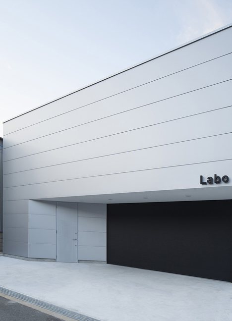
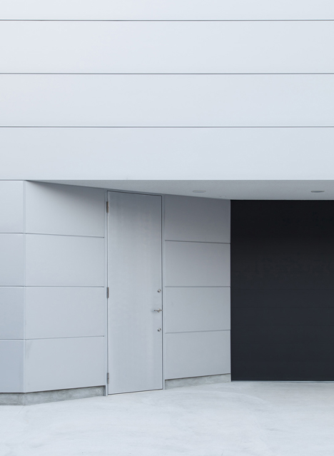
The architect clad the exterior with white metal panels. The only embellishments are the black letters that spell out the company name.
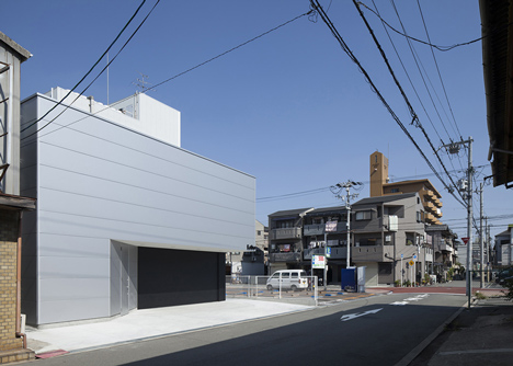
Unlike its neighbours, the building has a flat roof, intended to maximise space inside for storage and unpacking.
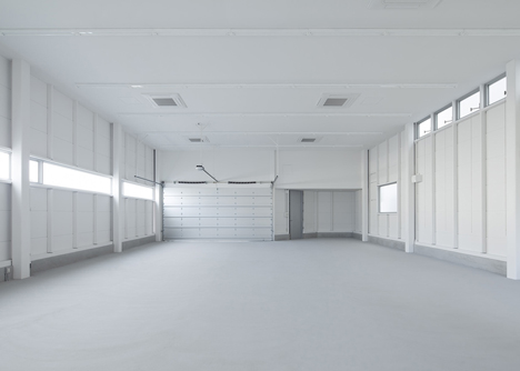
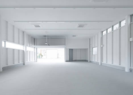
The interior is completely white, with a large entrance at one end and a small office in the rear corner.
Strip windows run along the front and rear elevations to reduce the reliance on artificial light. "The design focuses on the lines formed by the wall panels and the position of lighting to create an orderly interior," added Hamada.
Other architectural projects by Takeshi Hamada include a house designed to look as simple as a block of tofu and a residence with an arched entrance.
See more architecture by Takeshi Hamada »
See more architecture in Japan »
Photography is by Yohei Sasakura.
Here's a brief project description by Takeshi Hamada:
D Labo
The property is in Tsurumi Ward in Osaka City, a zone for industrial use. One road over to the east is zoned for light industry, and the tone of the area is quite different. There are rows of houses from where one can hear the sounds of children playing innocently. Although the land to be constructed on is zoned exclusively for industry, the design needed to be adapted as much as possible to fit the residential environment.
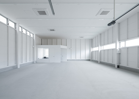
The client company is a printing company engaged in work such as planning instruction manuals for major electronics manufacturers and construction materials manufacturers. They have an image quite different to the usual image of a printing factory.
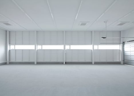
When I visited their main factory, I saw fashionably-dressed company employees at Macintosh computers working on graphic design. The overall impression was that of a modern IT corporation.
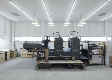
I decided that a simple, sharp design would be best suited to the corporate image of this printing company and the sophisticated precision work they perform, such as fine-tuning the design of instruction manuals and other documentation for precise electronic devices. This decision was reflected in the choice of metal sandwich panels (Isoband) surrounding a cuboid space, the desired space for storage and unpacking of materials was achieved. A minimum of signage on the front completes the design.
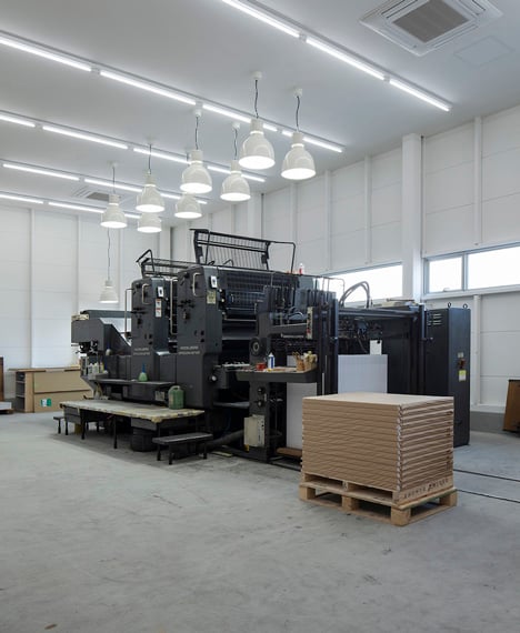
The interior is entirely, including the panel framework, painted pure white. The space is stark, containing nothing other than printing machinery, so the design focuses on the lines formed by the wall panels and the position of lighting to create an orderly interior.
Name of construction: D Labo
Location: Osaka City, Tsurumi Ward
Period of construction: April, 2012 to September, 2012
Extent of structure: steel-frame construction, single-storey
Purpose of use: printing factory
Land area: 284.46 sqm
Building area: 170.00 sqm
Total floor area: 157.55 sqm