"The Pompidou captured the revolutionary spirit of 1968" says Richard Rogers
In our second exclusive video interview in our series of movies about Richard Rogers, the British architect reveals that key elements of the Centre Pompidou in Paris, which he designed together with Italian architect Renzo Piano, were strongly influenced by the radical thinking of the 1960s.

The Centre Pompidou was born out of a competition launched by the French government in 1970 and was completed in 1977. However, Rogers cites the political unrest in Paris in the previous decade, when protesting students and workers came close to overthrowing the government in 1968, as a key influence.
"That moment nearly changed history, certainly for Europe," Rogers says. "It looked as though there would be a revolution. In fact, it didn’t happen. But we captured some of it in the building."
He adds: "It was a highly active period of politics, and you could argue that it was a part of the concept [for the building]. This was a dynamic period, a period of change, but we wanted to catch what was going on at the moment."
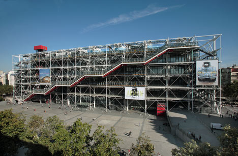
The Centre Pompidou is also linked to 1968 by its name. Originally called the Centre Beaubourg, the building was renamed when Georges Pompidou, who was prime minister of France when the protests kicked off and became president after Charles de Gaulle was forced to resign, died during construction of the building.
"It is said in France that Pompidou had a plane revving up because he thought he would lose the war against the students, the intellectuals, and the workers," Rogers says.
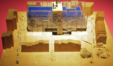
In Roger's and Piano's original design, the main facade of the building featured a large screen, which would have displayed information from other arts and cultural institutions around the world. But this was scrapped after Pompidou's death for political reasons.
"The facade on the building, if you look more carefully, was very much about the riots and very much about Vietnam," Rogers says. "We had it all going very well until Pompidou died and Giscard [the subsequent president of France] came in and sunk it with no hands. He said: 'It is a political weapon, I don’t want it.' So that died."
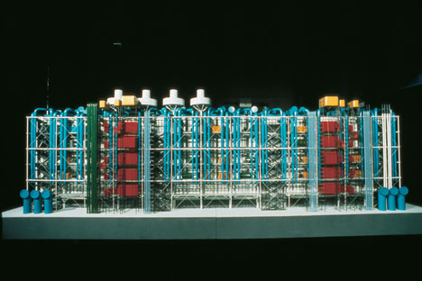
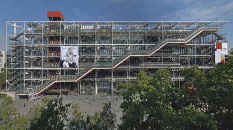
Rogers says that the idea of the putting all the structure and services on the outside of the building to maximise the flexibility of the internal space also has its roots in the volatility of this period of history.
"We wanted to make a building that was clearly of our period, which caught the zeitgeist of the now," he says.
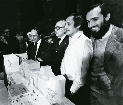
"The one thing we knew about this age is it's all about change, if there’s one constant, it’s change. So we said that we’d make massive floors, which were the size of two football pitches with no vertical interruptions, structure on the outside, mechanical service on the outside, people's movement on the outside and theoretically you can do anything you want on those floors."
"We didn’t say where the museum should go, where the library should go, and of course, the library changed radically because when we started there were books and by the time we finished it books were almost finished because of I.T. So again that’s about change."
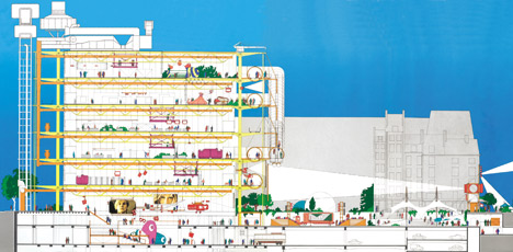
The radical design of the building was initially met with hostility, Rogers claims.
"It was vilified whilst we were designing it from the first day onwards," he says. "Nobody said one kind word until it opened and when people started to queue up."
He reflects: "I remember once standing outside on a rainy day and there was a small woman with an umbrella who offered me shelter. We started talking, as one does in the rain, and she asked: 'what do you think of this building?'"
"Stupidly, I said that I designed it and she hit me on the head with her umbrella. That was just typical of the general reaction of the people, especially during the design and construction stage. [People thought we were] destroying their beautiful Paris.'"
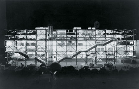
However, Rogers believes that shock-factor is a mark of good architecture.
"All good architecture is modern in its time," he says. "Gothic was a fantastic shock; the Renaissance was another shock to all the little medieval buildings.The shock of the new is always rather difficult to get over."
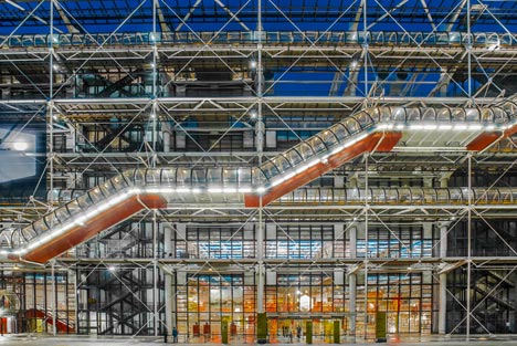
Despite the initial reaction, Rogers says that the French public warmed to the building over time and maintains that the project as a whole was always designed "for the people."
"When we did our first studies, it showed that there was no public space nearby," he says. "So we created this big piazza. There were, I think, 681 entries [to the original design competition] and strangely enough there were no others with a big piazza. That is really critical to the workings of the Pompidou."
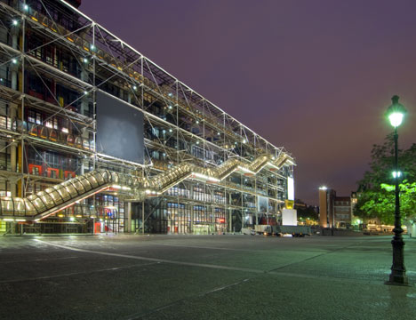
"We said that we will put the building not in the middle of the piazza, but actually on one side because that will give people a place to meet," he continues. "The idea was that you had a public space, and you’d go up the facade of the of the building in streets in the air with escalators floating across it, so the whole thing became very dynamic. People come to see people as well as to see art; people come to meet people. So we wanted to practice that as theatre."
Rogers concludes: "The whole idea of Pompidou was that it is a place for the meeting of all people. And the success of it was that the French took it over and it became the most visited building in Europe."
Rogers was speaking to Dezeen to mark the opening of an exhibition called Richard Rogers RA: Inside Out at the Royal Academy of Arts in London. The movie contains rare archive material provided by Rogers Stirk Harbour + Partners to coincide with the show.
Watch our previous interview with Rogers about the exhibition »
See our earlier story about the exhibition »
The London home designed by Rogers for his parents, and which influenced his later design for the Pompidou Centre, was recently put on the market for the first time since it was built in 1968.
Read the full story about Rogers House »
See all our stories about Richard Rogers »