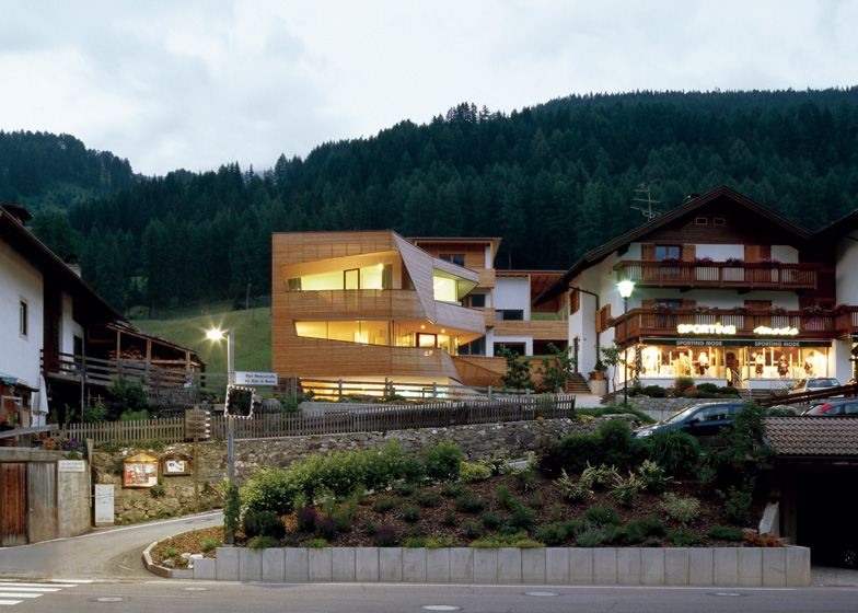
Since publishing a residential extension in Italy by architects Plasma Studio earlier this month, we've picked another faceted house from the studio's archives located in the same South Tyrollean village.
Plasma Studio designed the Cube House on a steep site between two existing properties in the village of Sesto, high in the Dolomite mountains.
Triangular sections of the facade jut out to meet the slope, fusing the building with the site.
Main access to the house is past two parking spaces on the lower level dug into the hillside.
The staircase dog-legs up through the centre of the house, surrounded by the living, dining and kitchen area on the first floor. Bedrooms occupy the top storey.
Generous south and east-facing balconies and terraces double the amount of useable floor space. "We opened the facade as much as possible in order to widen up the tight interior," said the architects.
The house is wrapped in slanted wooden slats, which help to screen balconies and terraces from the main road while still offering views to the mountains through angled openings.
Facing the hill behind, the back corner of the property is rendered white like the surrounding buildings and punctured with small rectangular windows.
Plasma Studio have designed another project in the area - a hotel clad with similar angled wood panels just down the valley.
See more Italian houses »
See more architecture by Plasma Studio »
See more design in Italy »
Photography is by Cristobal Palma.
Here's the project description from Plasma Studio:
The major constraints of this project, its steep site, compressed between existing buildings and very limited allowance of development volume have shaped the form of this house.
It is inserted into the earth with two covered parking spaces to the front from where a small stair case leads up to the main living zones in the first floor and further to the bedrooms in the second floor.
Compact circulation
Because of the limited available floor area the staircase and circulation had to be designed in a very space-saving way – this lead to the continuous organisation in the first floor: the single functions cooking, eating and living are positioned around the circulation core in order to give connectivity and privacy at the same time to the single activities.
The staircase and built-in furniture piece, which is storage, oven and service cavity at the same time, divides and connects as a short cut at the same time. On the second floor the single sleeping rooms are connected to each other in the shortest possible way.
View and shelter
Given prominent location of the site directed towards the south and the Dolomites we opened the facade as much as possible in order to widen up the tight interiors – on both main floors ample balconies and terraces double the available floor area and offer great places to play for the kids and rest for the parents.
In order to provide shelter from the views of the passing by road a layer of wooden sticks was wrapped around the big openings directed to the south – depending on the varying size of the openings they provide different degrees of shelter and intimacy.

