The owners of a house designed to showcase their collection of toy bears have brought Thai design studio Onion back to extend the display cases into the garage (+ slideshow).
Onion originally renovated the house at the Cha-Am Beach resort in Thailand to include cabinets for Be@rbrick ornamental bears and have now created a new exhibition area inside the garage for over seventy bears.
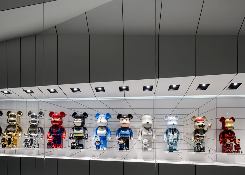
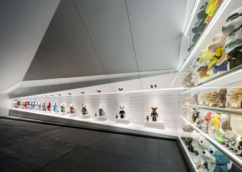
The studio designed an L-shaped cabinet that takes up two walls of the garage, made from matte white laminated plastic and fronted with glass. "Be@rbrick cabinet brings light to Bear Garage," Onion said. "It somehow transforms the entire space."
Faceted surfaces inside the cases extend outward to merge with the ceiling.
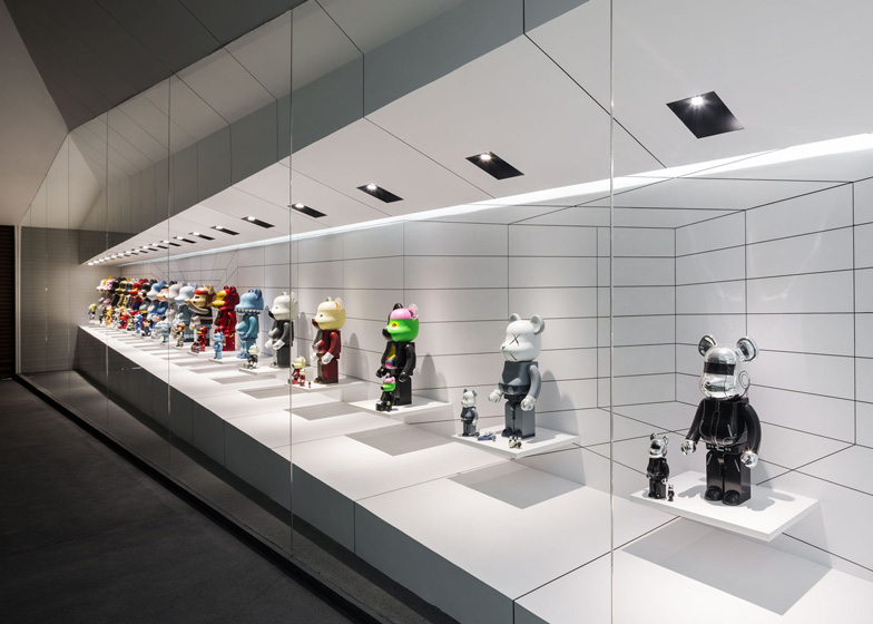
Down the longest side, the height of the display space decreases from the top and bottom, plus the figures are spaced closer together towards the garage door.
Paired with distorted black perspective lines across the sloping surfaces and progressively smaller shelves, the eye is tricked into thinking the bears increase in size.
Each bear design sits on its own shelf with room to be accompanied by smaller versions, individually illuminated by an LED spotlight.
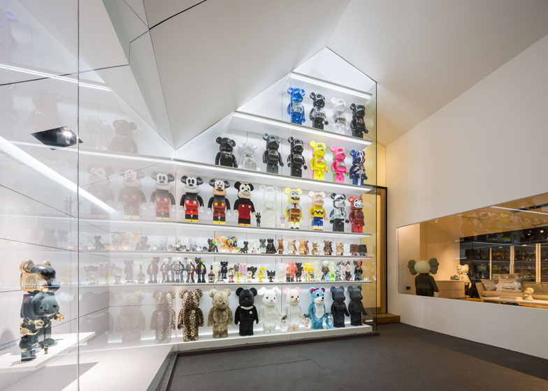
Along the shorter wall, the bears are packed in tightly and shelves are spaced to accommodate different sized figurines.
Additional strip LEDs are hidden in and behind the ledges. A large window allows the display to be viewed from the living room.
More stories we've featured from Thailand include aerial photos that reveal the angular geometries of a rooftop swimming pool and a stairwell resembling a giant wedge of Swiss cheese. See more architecture and design in Thailand »
Photography is by Wison Tungthunya.
Here is the project description from Onion:
Be@rbrick cabinet
In the longer part of the cabinet, Be@rbrick shelves are increasingly wider and further apart. Each shelf is individually customised. The first one, where Be@rbrick Detroit Metal City stands, has the same width as the 1000% Be@rbrick shoulder whereas the last shelf, where Daftpunk Be@rbrick is on display, is double that width. As an effect, the 1000% Be@rbricks queuing along on these shelves seem progressively smaller until its size is reduced by half at the corner of the space. The best viewpoint to perceive this is at the middle of the Garage where the cabinet elevation can be observed.
The shorter side of the L-shape cabinet is a much simpler shelving system. The objective is to display as many Be@rbrick figures as possible. They stand close to each other and in continuity along the racks. Seventy figures at least are on display in this limited space of 4.8 metres high. It works as a background when the cabinet is observed from the diagonal viewpoint.
What unites the two design solutions is the idea of shopfront. The entire Be@rbrick cabinet is bright and white as if the toy figures are in luxurious window displays. LED strip-down-lights and LED strip-up-lights illuminate the shorter part of the cabinet. If the shelves are for 1000% Be@rbrick the number of strip-down-light will be more than those for 100% Be@rbrick. This is to uniform the illumination. For the longer part, there are two lighting systems, namely LED strip-down-lights and LED spot-lights. The strip-lights are between the ceiling and the rear wall. They are partly hidden from sight and partly shown through the edge of ceiling slope. Spot-lights are placed in the black square boxes that are increasingly larger in scales and in gaps through out to the corner of the space. Each light bulb precisely spots on each 1000% Be@rbrick. Lighting systems emphasise the effect of perceptual distortion.
Materials play an important part in the design. They are the matte white laminated plastic sheet, black mortises and transparent glass. On the frontal plane, the vertical mortises of six-millimetre wide are gradually spread out. These lines are the foreground of the cabinet. On the rear wall, a perspective of a room is drawn by using three-millimetre wide mortises. These thin lines are the pattern of conceptual depth. They make the cabinet appears deeper much less than set a background for the distortion of Be@rbrick size. Glass walls that envelop the entire cabinet has no frame. They are perpendicular. Again, the perception of Be@rbrick reflections is distorted at the corner of the room. Be@rbrick toys seem to have their double images that are thiner or fatter than themselves.
Be@rbrick cabinet brings light to Bear Garage. It somehow transforms the entire space. Cabinet ceiling that folds in various angles give shades to the whole Garage ceiling. Its steep slope extends itself from the inside to the outside of the cabinet. This darker shade of grey leads the gaze to a brighter space, that is Be@rbrick window display. Bear Garage, in this light, is far from being a car storage.
Project: Be@rbrick cabinet at Bear garage
Designer: onion co, ltd
Location: Nonthaburi, Thailand
Area: 14sqm
Year: 2013
Architect of the garage: openbox co, ltd


