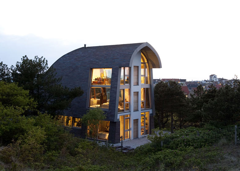
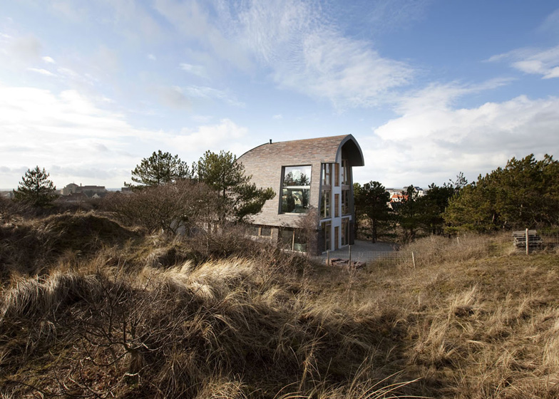
Dutch architects Jetty and Maarten Min have completed their own house and studio in North Holland with an arched rooftop, tiled walls and exposed tree-trunk columns (+ slideshow).
Jetty and Maarten Min, of Bergen office Min2, designed the three-storey Dune House on a coastal dune in Bergen and used unfinished timber, clay tiles and curved profiles to help the building fit in with its rural setting.
"An important design topic was to connect the form and the materialisation of the house with the place where it is situated," they explained. "The high tall form had to fit in the dune landscape. During the design process this form became one of a dune or of a windswept group of trees sloping along with the worn landscape near the sea."
Offering a twist on the traditional mansard roof, the house is wrapped on three sides by a skin of clay tiles, which were designed by Jetty Min with bespoke dimensions.
"These tiles give the impression of pot-lid shelves," said the architects. "The brown/purple appearance of the British clay with its rough finish has to visually match the bark of the surrounding firs."
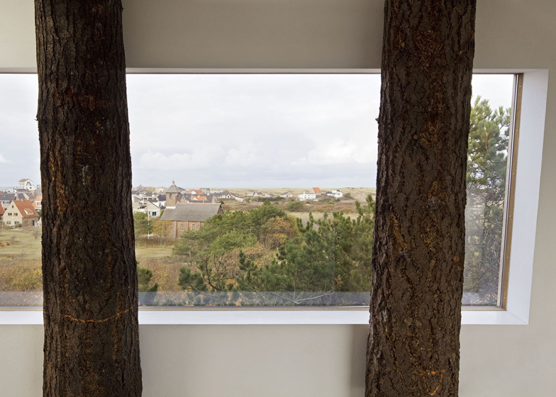
Horizontal slices through this skin create a series of sea-facing windows on the north elevation, while a double-height window frames a view of the dune landscape to the south.
Inside, the house contains studio spaces on its ground floor, while the living areas comprise a two-storey loft above.
"One of [our] wishes has always been to live on the upper storeys because of the marvellous views of the sea and the dune area," said the architects.
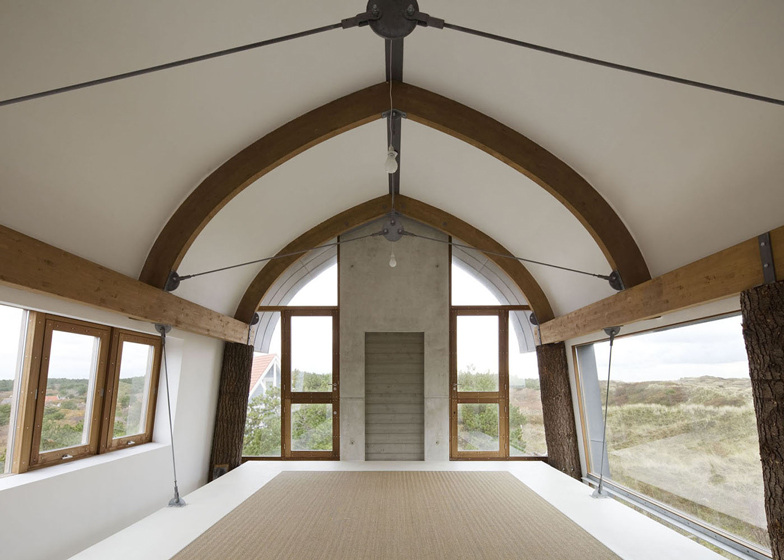
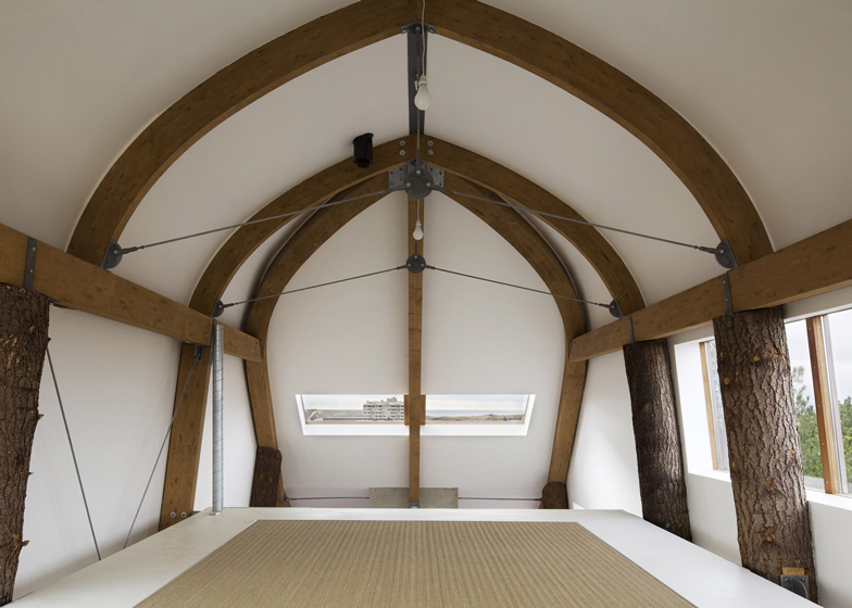
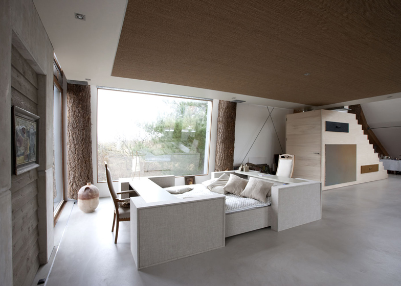
Kitchen, living and dining areas occupy a larger open-plan space on the first floor, surrounded by the chunky Douglas fir columns. Arched wooden joists are visible overhead, plus a boxy poplar staircase leads up to a mezzanine bedroom.
A similar staircase links the house with the studio below, which features a generous workspace, a meeting and conference room and a library. The houses's bathroom is also located on this floor.
Poured concrete was used for the flooring on the two main levels, while the uppermost floor is covered with a carpet made from seaweed.
Other Dutch houses completed recently include a residence with a thatched exterior and a renovated townhouse with a triple-height kitchen and a spiral staircase.
See more houses in the Netherlands »
See more residential architecture »
Here's a project description from Jetty and Maarten Min:
The Dune House of the architects Jetty and Maarten Min, Bergen aan Zee
Min2 bouw-kunst is a Dutch architecture office, located in Bergen, in the north of Holland, at the sea. The work of the office is a co-design between architecture and art.
The owners of the office designed their own house in the dune area of Bergen aan Zee (NH). An important design topic was to connect the form and the materialisation of the house with the place where it is situated.
Design
The building enjoys a dominant position on a dune crest, alongside a local road, but it is almost invisible because of altitude differences and of tall pine trees, guarding the house closely. The house faces on the other side of the dune a drinking water treatment area. From here it marks the landscape, even from a large distance. They therefore have chosen for a strong "object-quality".
Handling the building plan as a starting point within the zoning plan and the existing building regulations was also a challenge.The admissible constructing surface was 20 x 8 metres, with a gutter height of 3 metres. The ridge height was not indicated and therefore a ridge height of max. 15 metres was possible. These proportions made it possible to build the house vertically, an opportunity achieved by realising three high storey.
Because of the positive reactions from the local government they succeeded quite well in such vertical design. By solving this and other similar problems, the plan became more and more exciting.
One of the main concerns was that, in its appearance, the high tall form had to fit in the dune landscape. During the design process this form became one of a dune or of a windswept group of trees sloping along with the worn landscape near the sea.
The openings in the roof surface of the storey were designed from within: at the sea side as horizontal window strips and at the dune side as a huge window, where it is possible to imagine oneself in the midst of the dune landscape. The flat facade on the eastside eventually allows for a lift and balconies.
Materialisation
For quite some time they have been looking for the appropriate materials on the outside. Because the house is only 300 metres from the sea, they took the logical decision to choose for natural, sustainable and low maintenance materials. They called this approach a low-tech approach.
For the oblique facade and roof skin they thoroughly searched for an existing material that would fit into the rough romantic scenery. In the end, Jetty came up with the idea to design herself a tile that would fit the desired agenda. Following the remarkable Kolumba brick (Petersen Tegl) which was to be used for the dressing of concrete columns, a long ceramic flat tile was developed of 53 centimetres long, 17 centimetres high and 4 centimetres thick.
These tiles give the impression of pot lid shelves, but ones which are much more low maintenance. The brown/purple appearance of the British clay with its rough finish has to visually match the bark of the surrounding firs. Thanks to all these characteristics, the building perfectly fits into its surrounding environment.
This developing process took one and a half year. It has also been helped by the excellent cooperation of the professionals of Petersen. The roof tile, now called "Athene Noctua" (in German: Steinkauz), has now been included in the collection of Petersen.
The finishing of the eaves has been carried out in zinc and has been pre-treated against ionisation, which beautifully matches the tiles. The untreated wooden frames are made of Iroko, FSC approved and carefully handpicked to have the longest parts, in order to avoid gluing as much as possible. The reason to make use of untreated wood at this location stems from its low maintenance aspect, which also fits into the natural surroundings.
Where, if necessary, a lift can be build, the concrete stabilisation drives have been closed with untreated western red cedar parts.
The building facade has a timber frame with a high insulation value. Because of this starting point they could easily design the bent and beveled forms as a basis. The basis of these elements consists of whitewood collar beams with multiplex sheets. These are built in several prefab parts, made in the workshop, for a smooth progression of the building process and to generate as less disturbance in the protected green area as possible.
Interior
The low-tech approach continues also on the inside of the house. They wanted the two floors as one big, rudimentary finished space, which can then be used as a flexible living space, a new loft.
One of the wishes has always been to live on these upper storey because of the marvellous views of the sea and the dune area. In the penultimate version the starting point was a house with columns to be built above an existing bungalow: a second house above the first. After deliberation with the constructional engineer, it was finally decided to demolish the existing house because of the poor condition of its foundation. The carrying grid with its column structure emerged from this history.
They were also inspired by warehouses, by the farmhouses in the north of Holland, and by translating the Maison Domino by Le Corbusier into a handy craft level.
By applying Douglas firs with bark, they wanted to bring the effect of windswept trees around the house also into the interior, but in an abstract way. The floor of the first storey has been made as a wooden prefabricated element, hanging between the Douglas firs. Galvanised steel coupling agents have been designed. The concrete elements in sight are untreated.
On the ground floor are storage, studio, bathing room, library, working room and conference room. The inner walls and doors on the ground floor are non bearing, so to be as flexible as possible, and made of ecoplex and mdf. Sometimes a book cast is also acting as the separating wall between spaces.
The stairs have been placed into the space as loose elements. They are made of fast growing poplar, so as to be as environmentally friendly as possible. This kind of wood is soft but very dense, and has no knots. The beautiful light colour does not turn yellow, so it can remain untainted. Only the stair steps can use some extra protection.
The floor finishing consists of poured concrete and the hanging wooden floor slab between the trees has been covered with sea weed carpet.
High-tech and sustainability
They aimed to achieve as high as possible value of the materials and the goal was to reach a Rc of 5,0. The choice was made for superior insulating glass with as less as possible colour fading taken into account. For the studio we choose for colourless glass, in order not to have our work with colours influenced by the green radiation of glass.
The ventilation system is on demand controlled and offers smart solutions for the intake of fresh air. A vacuum cleaning system has been installed for a better interior environment. The domestic system is a basic one, but can be enlarged in future. The electricity supplies are provided in floor ducts.
In relation to the energy supply they do not make use of a natural gas installation. They use an air pump (because of the location on a dune), and glass vacuum tubes providing the heating – or cooling - of the floors and hot water. The next step which is in preparation is the installation of an Energy Ball (wind energy) for the generation of electrical power.
They very closely follow the evolution of sustainable power generation and very soon interesting products will emerge on the market which also will be aesthetically interesting. Those new products can be added in the present layout.
At this moment they monitor their power consumption to see which amendments will be necessary in order to reach the best values.
The designer as contractor
They carefully searched for the parties best suited to build specific parts. In this way is was quite natural to be working with wood and consult specialists as boat builders and woodworkers. They experienced that, with this attitude, they could inspire and stimulate other people. This is the basis for further developments.
They now live in the house and decisions concerning the interior, functions and forms are just starting to emerge. Piece by piece they handle the interior the same way as they handled the building process.

