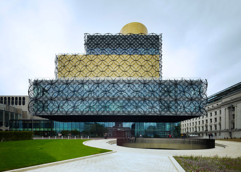
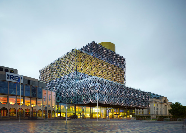
Dutch studio Mecanoo has completed Europe's largest public library in Birmingham, England, with a sunken amphitheatre, rooftop gardens and a shimmering facade clad with interlocking metal rings (+ slideshow).
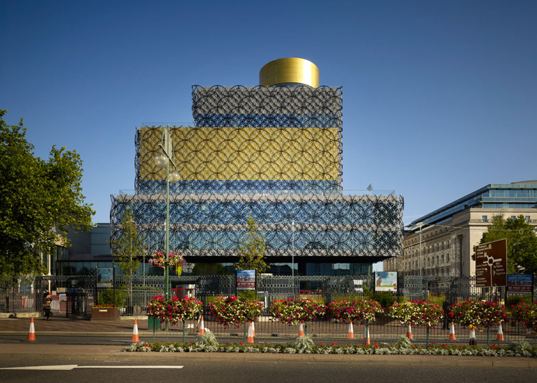
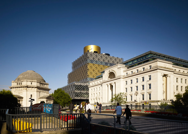
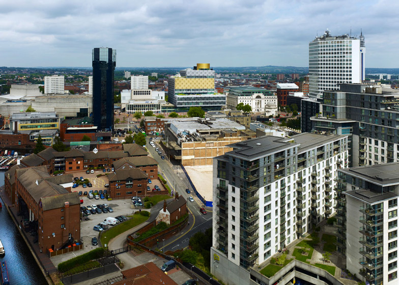
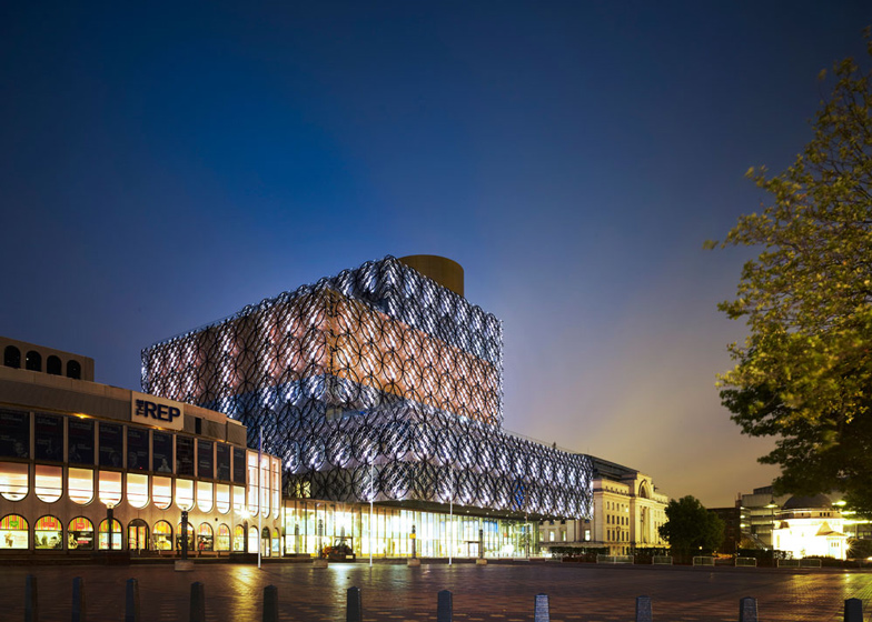
Sandwiched between a 1930s building and a 1960s theatre, the new Library of Birmingham fronts one of three piazzas that comprises Centenary Square. The building is made up of a stack of four rectangular volumes, which are staggered to create various canopies and terraces.
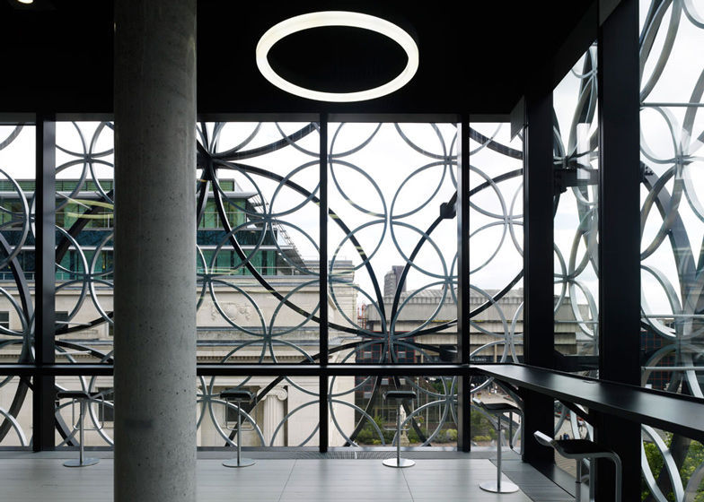
Mecanoo designed the exterior of the building to reference the city's jewellery quarter, adding a filigree pattern of metal rings over golden, silver and glass facades.
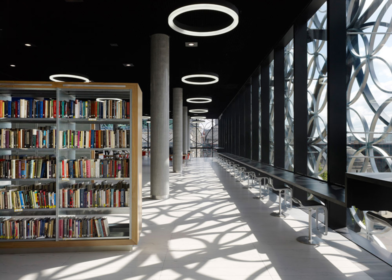
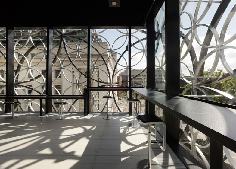
Inside, these rings cast patterns of shadows onto the floors of the reading rooms in the middle levels of the building.
"I didn't want to make a brick building, because we needed a lot of light, but I didn’t want to make a glass building either," architect Francine Houben told Dezeen. "It's so beautiful to sit inside because of the reflections and the shadows, and the changing of the weather. It's different from December to June."
A gently sloping floor allows the building to negotiate the level change from the front to the back of the site, but also leads visitors down to the fiction area at the back, then down to the children's library and music section at the base of the building.
"We needed many ground floors," said Houben, "so we introduced a ground floor, a mezzanine, a mid-lower ground floor and a mid-mid-lower ground floor in the form of gently descending terraces."
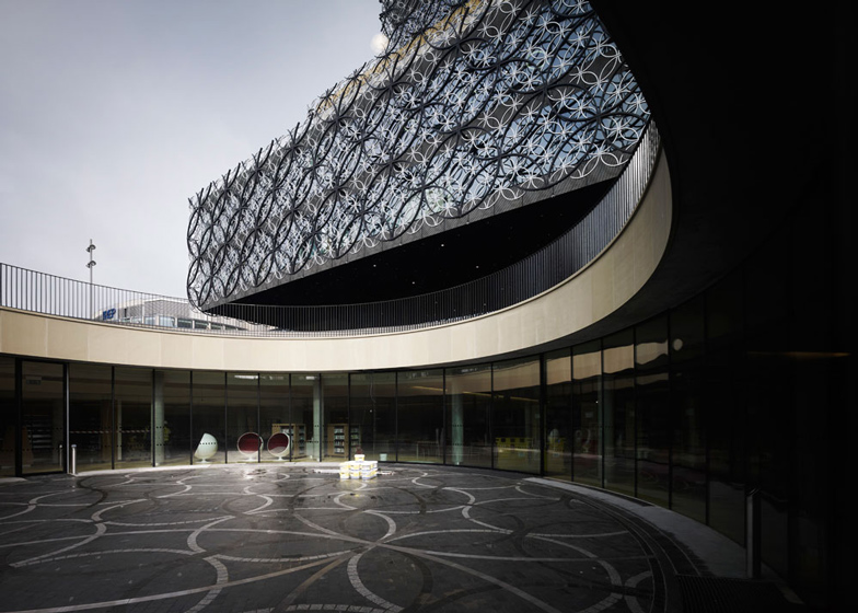
The lowest level extends out beneath Centenary Square, where the architects have created a sunken circular courtyard that functions as an informal amphitheatre.
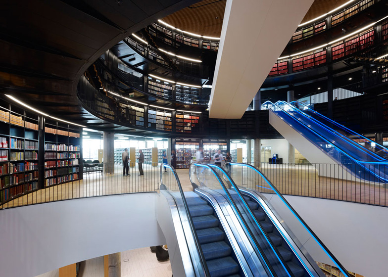
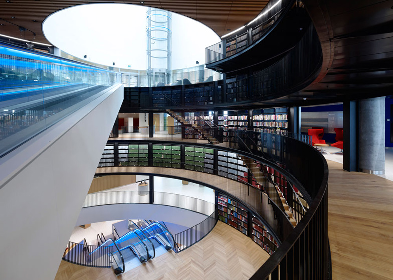
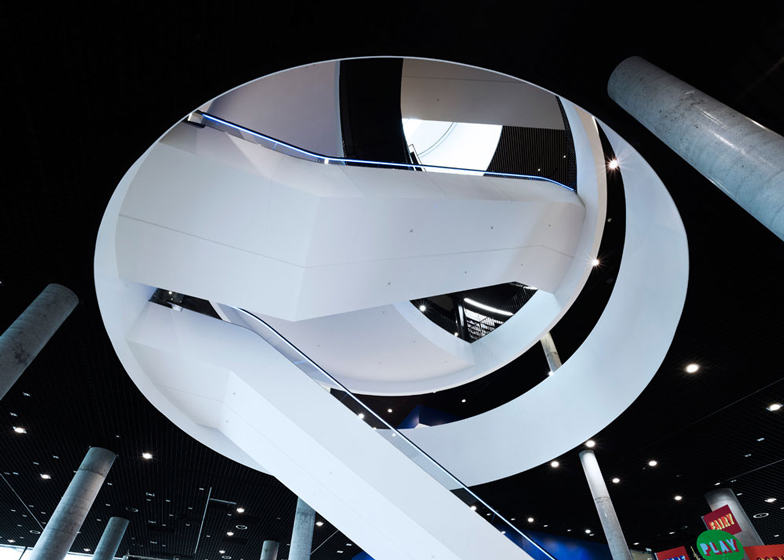
The three main reading-room floors branch out from a staggered rotunda at the centre of the building, integrating rows of bookshelves and clusters of study spaces. There are also benches and stools lining the perimeter, offering views down the square below.
Archives and research spaces occupy the levels above, while an oval space at the top of the structure houses the Shakespeare Memorial Room - dedicated to the library's extensive collection of works by English playwright William Shakespeare. Dating back to 1882, the room has been relocated twice from former library buildings.
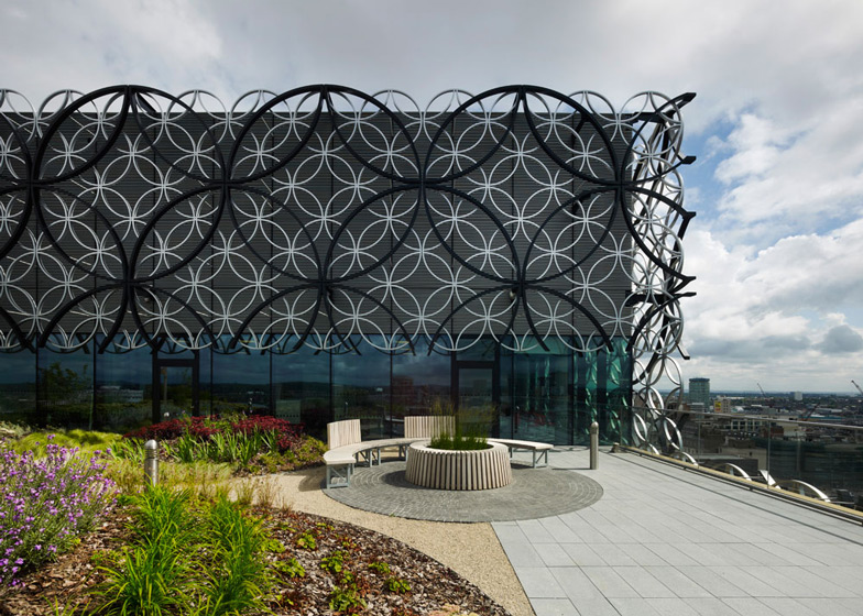
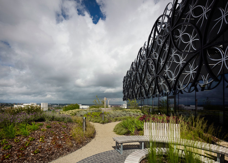
Plant-filled terraces cover two of the rooftops, creating spaces for visitors to read and study outside.
Referring to the library as a "public palace", Houben told Dezeen how she sees the building as an important landmark for the city community. "I think libraries at this moment are the most important public buildings, like cathedrals were many years ago," she said.
Francine Houben founded Mecanoo in 1984 and the studio's best-known designs include the Maritime and Beachcombers Museum and the TU Delft Library, both in the Netherlands. Mecanoo was also recently shortlisted to design the World Expo 2017 exhibition in Astana, Kazakhstan.
Other libraries completed recently include a faceted multimedia library in France and a university library in the US that features a robotic book retrieval system. See more libraries on Dezeen »
Photography is by Christian Richters.
Read on for a project description from Francine Houben:
A People's Palace
In June 2008 I visit Birmingham for the first time of my life. Mecanoo is one of seven international architecture firms shortlisted to design the new Library of Birmingham integrated with the Repertory Theatre (REP). In this project, the written and the spoken word will be united. The client wants to select the best team to help them realise their ambitions for an innovative and world-class library that will become the largest library in Europe with ten thousand people expected to visit every day.
Birmingham is a multicultural British city of a little over one million people from very different backgrounds. It has many identities, both culturally and architecturally. It is not only Europe's youngest city with 25% of the population under 25 years old but it's also a student city with 50,000 students, second in student population only to London.
Library of the future for Birmingham
I meet library director Brian Gambles and his staff, he tells us enthusiastically that "the Library of Birmingham will become a centre of learning, information and culture that will help to foster Birmingham's knowledge economy. It is intended to become the social heart of the city; a building connecting people of all ages, cultures and backgrounds. The modern library is no longer solely the domain of the book – it is a place with all types of content and for all types of people. The library's influence will also extend beyond the physical boundaries of the building, its global digital presence allowing the public to access content from anywhere in the world."
Shakespeare Memorial Room
The very first Library of Birmingham dates back to the year 1865. This building burns down in 1879, along with most of the collection. After the fire a group of citizens unite to form 'Our Shakespeare Club', a civic pride movement that brings together one of the most comprehensive Shakespeare collections in the world. When the Victorian Library opens its doors in 1882 at Radcliff Place, it incorporates a Shakespeare Memorial Room, a reading room designed especially for the Shakespeare Library by John Henry Chamberlain, a member of the city's Shakespeare club. In 1974, the Victorian Library is replaced by the Central Library at Paradise Circus a brutalist building designed by architect John Madin. The Shakespeare Memorial Room is dismantled and stored. Twelve years later it is reassembled in the School of Music, located next to the Central Library. The intention is to integrate the Shakespeare Memorial Room in the new library.
James Watt and Matthew Boulton
Besides the extraordinary Shakespeare Collection, the library staff shows us their unique historic photo collection as well as original drawings and notebooks by 18th and 19th century inventors James Watt and Matthew Boulton. The Birmingham Music Library has extensive special collections. Music groups such as Black Sabbath, UB 40, Electric Light Orchestra, Duran Duran and The Streets are all “Brummies” from Birmingham.
The 'Red Line'
For three days my husband and I endlessly walk through this city I've never been to before. I observe and photograph everything that catches my eye in order to unravel the essence of the city and the people. In the evening we go to a performance at the REP Theatre. From our hotel we try to take the shortest route by foot to the theatre but on our way we are blocked by highways that cut through the city centre. After the show we decide to follow the crowd and discover they take a logical, informal pedestrian route right through the heart of the city. I call this route the 'Red Line' as it connects the Bullring Shopping Centre, New Street Station, New Street, Victoria Place, Centenary Square, the ICC, the canals, Brindley Place and the Westside. The new library site is located in the middle of the Red Line next to the existing REP in Centenary Square.
The rhythm of architectural history
Two things strike me during our walks. First, when following the Red Line, the entire architectural and urban history of Birmingham passes by like a film. The city breathes a rich industrial history: Gothic buildings from the 17th, 18th and early 19th century, Victorian Classicist buildings such as Birmingham Town Hall from 1834, as well as many Victorian buildings made with beautiful craftsmanship. Birmingham has more canals than Venice. These narrow canals were created in the 18th and 19th century in order to guarantee the supply of coal. Also in this frame are buildings such as the Baskerville House from the early 20th century and concrete buildings such as the existing library from the 1960s, the ICC from the eighties, and the Bullring Shopping mall with the Selfridges blob from 2003. Scattered around the city, the steel skeletons of gas holders catch my eye.
Gently sloping hills
The second thing I notice is that Birmingham is built on gently sloping hills. It's a green city, except for the city centre. I love these soft hills. They remind me of my native province of Limburg in the South of the Netherlands. I notice the way train tracks cut through these hills and valleys, appearing and disappearing in the landscape. Birmingham is the geographical centre of the UK and a junction of the British railroads. One train tunnel runs underground diagonally through Centenary Square. It occurs to me that we can surely build underground here, whereas in my own country this is a challenge. This idea becomes a source of inspiration.
Dream
After three days my dream slowly starts to take shape. Back at the office we develop our ideas further. Does the client expect us to make an icon? For sure we do not want to design a building that is just another "incident". We want to make a building that brings coherence to the urban network of Birmingham. Our dream is to create a People's Palace: inviting, welcoming, inspiring for all ages and backgrounds - a real public building that also creates an outdoor public space. One that entices passers-by to enter and embark on a journey of discovery. We imagine visitors moving from one floor to the next through interconnected and overlapping rotunda spaces that serve as the main vertical circulation route. Changing vistas and view lines unfold as you navigate through the building. On the lower levels the route continues below ground nearly to the train tunnel that passes in front of the building, and resurfaces in Centenary Square. At this point this interior route weaves itself with the 'Red Line' route revealing a piece of the inner library world to the public.
Team as a symphony orchestra
In August 2008 the Mayor announces that we have won. I feel confident. I trust that we can make a strong design within the tight one year time schedule. A contractor is to be selected within three months. Mecanoo has a strong team and a lot of experience with libraries and theatres. We also have architectural, urban planning, landscape, interior design and restoration disciplines in house. The Mecanoo team can work together as a symphony orchestra and along with a compact interdisciplinary consultant team. We open our Mecanoo UK office in Birmingham and roll up our sleeves!
The search continues
Our search for the essence of the city continues. Local historian Carl Chinn guides us through Birmingham and explains that building materials used to come from local sources - hence the many buildings made with red and blue bricks and the extensive use of steel. Limestone was the material of choice to represent the international city in the 19th or 20th century. Examples of this are Town Hall and Baskerville House. In the last fifty years additional materials included: concrete, glass, modern red bricks and aluminium disks. So which material are we to use amidst the composition of this city?
The rhythm of the city: not one but two buildings
We want our design to fit into the rhythm of the city, so we make a critical decision that the Library integrated with the REP Theatre will not become one building, but two. Together with Baskerville House, they will form an ensemble of three palazzos along a square, each with its own materialisation - first, Baskerville House, a limestone building from 1938, then the REP Theatre, an optimistic concrete building from 1971. Between them is the library of 2013 with its metal filigree façade of interlocking circles. We propose the three identities to be reflected in Centenary Square: a more formal area in front of Baskerville House containing the Hall of Memory, an open event space in front of the REP and the Symphony Hall, and a more intimate soft landscaped space in front of the library.
Intermezzo: the Repetory Theatre
In February 2009, I have lunch with Graham Winteringham, architect of the Repertory Theatre. I meet a respectable, enthusiastic man of age and a faithful visitor of the REP. "How did you actually come to this project?" I ask him. He tells me that he studied architecture in Birmingham after the Second World War. First he designed the small Crescent Theatre with a revolutionary 360 degree rotating stage. Because he was the only architect in Birmingham with theatre experience, he was commissioned in 1964 to design the theatre for one of the most influential theatre groups in the history of English theatre, the REP. He told me that the project was actually a nightmare. The program requirements were a hall with 900 seats, without balconies. Another salient detail in this program was that there had to be many more men's than ladies' toilets because the audience was mainly male! In 1964, the building is contracted, but the Wilson government orders all public projects on hold. Winteringham must wait three and half years, and in this time, his mind is still designing. But he can no longer make changes, no matter how many reasons there are to do so. Originally, the plan was to have a reflective pond in the front, so he designs arched windows. The water would reflect a beautiful scene. This pond never came to be. Stairs as exterior sculptural elements connecting the underground parking garage also never left the page. A steep slope that looks out of place at the rear of the building is a remnant of the idea to make Cambridge Street one storey lower, making it level with the abrasive highways that cut through the centre of Birmingham. Cambridge Street was never lowered.
I describe our first ideas to Graham Winteringham. We don't intend to demolish the REP, but to maintain the unique hall in the shape of a Greek theatre. We want to restore the original auditorium and foyer and improve the façade by deep cleaning it and replacing the glass with high performance glazing. However, we intend to renew the entire back of house: the theatre technology, logistics and workshops. He is very glad to hear his building will not be demolished.
Four masterplans for Birmingham in eighty years
I realise that this architect has seen four master plans for the city come and go. In the thirties, it was the Grand Plan of a French signature in all public buildings, a monumental type of Champs Elysées. Three buildings have been built in the classical, monumental spirit with limestone facades, including Baskerville House and the circular Hall of Memory in front of it. The Second World War draws a line straight through the Grand Plan. In the sixties, a master plan reflecting the spirit of the times is produced: optimistic grand gestures, many demolitions, space for cars and lots of concrete. A new central library forms the transition to the old city centre. In 1974, a sculptural, brutalist building opens its doors. An influential city architect determines that the facade is created not of marble but in modern pre-cast concrete panels. The REP is also from this period. The master plan of the nineties - the era of urban renewal - generates a large conference centre, the ICC, next to the REP, with a concert hall on the other side of Centenary Square. This is indeed a successful project as Birmingham becomes the conference centre of the UK, second only to London.
In 2008, Birmingham works on its fourth Big City Plan with the new library and the REP as the most important buildings. I feel a great responsibility to bring every period of the last century together at last, in a sustainable way for the coming century.
Composition of three palazzo's
The three palazzo's are all on the sunny side of Centenary Square. We make a large inviting canopy at the entrance that welcomes visitors to both the library and the REP, protecting them from the rain and shading them from the sun. The foyers of both buildings are to be connected. At the transition, the Studio Theatre is located, merging the spoken and the written word.
Once the urban strategy is determined, we conduct several massing studies in order to discern the most appropriate relationship between the new building, its immediate surroundings and the wider city. The result is a building form with three stacked volumes, each connected to the city at a different scale – the lower volume and terrace relating to Centenary Square, the middle volume to the district, and the upper volume to the city scale.
The stacking of the library volumes creates an opportunity for outdoor gardens, each one relating to the city at a different scale. The lower terrace - The Discovery Terrace - overlooks Centenary Square, and is the most public. In contrast, the upper terrace -The Secret Garden - has a more introverted, intimate atmosphere, reflecting its elevated position in the building. The sloping beds of the garden respond to the gentle slopes around Birmingham.
Perceived as an extension of the street, the library's interior journey is intended as a sequence of events and experiences, each discernible from the next. The potential for extending this concept to the exterior was explored and is expressed both in the circular outdoor amphitheatre on Centenary Square and a 'crowning' rotunda on top of the building which houses the Shakespeare Memorial Room.
The essence of the building is the cross section
The layout of the library is organised for maximum public accessibility. One might expect the archives to be placed in the basement of the building, but in collaboration with Brian Gambles, we decide to bring the archives up. When the archives are buried in lower levels, no one sees them. The archives of Birmingham are something to be very proud of, something worth putting on display.
The most public functions are on the ground floor which simplifies the expected flow of 10,000 visitors per day. We need many ground floors, so we introduce a ground floor, a mezzanine, a mid-lower ground floor and a mid-mid-lower ground floor in the form of gently descending terraces. Finally a spacious lower ground floor, which is extended until the edge of the train tunnel, reaches out into Centenary Square. The stepping terraces allow the soft northern light to enter deep into the interior space and the amphitheatre in the square provides yet another source of daylight penetration. The children's library is located on this floor along with the music library. The outdoor circular amphitheatre sets the tone as a performance space. We imagine the sound of a grand piano filling the air, beckoning the passers-by above to peer into the space below and stay a while.
A sequence of rotundas
It's the cross section that drives the building and is based on a sequence of rotundas with the Book Rotunda at its centre. The Book Rotunda connects three floors with three main functions: the Public Library, The Discovery Terrace with the gallery and the Research Library. The Book Rotunda itself has five floors. It is an iconic space that celebrates books and can also be used for different kinds of events. Via escalators and travelators visitors can make their own journey through the Book Rotunda and the building. A round lift leads to The Secret Garden. On this floor are also staff offices and meeting rooms for public use. The Shakespeare Memorial Room on the roof can be reached directly by lift. This public lift with stairs featuring a Mecanoo Blue core forms a point of orientation to visitors making their journey through the library.
An ode to the circle
With its many different functions, the library is wrapped in a filigree pattern of metal circles which are bold and refined interlocking stories of industrial heritage, jewellery, people and knowledge. The large circles may symbolise the craftsmanship of the steel industry while smaller ones might refer to the 200-year tradition of craftsmanship of the gold and silver smiths of the Jewellery Quarter of Birmingham unique in the UK and around the world. Every visitor - every Brummie – can provide their own interpretation, comparing them to the Olympic circles or to the Lord of the Rings. In fact, the façade of the building is designed primarily from within. Entering the library, the repeating circles generate shadows and reflections creating an unforgettable world inside the building. It is an inner world with its own panorama of continuously changing shadows, dependent upon weather, time of day and seasonal expression. With its rotundas and its façade, the building is an ode to the circle: an archetypical form that embodies universality, infinity, unity and timelessness.
The interior: bold and refined
In the many meetings we have with the enthusiastic and involved user groups, we decide to create an interior that is both flexible and timeless, bold and refined, as well as easy to maintain. In the library the main materials and colours are natural stone, white ceramic flooring, oak, Mecanoo Blue, gold, glass and metal, as well as fleeting circles and shadows. In the Repertory Theatre the main materials and colours are concrete, white and red. Inside and outside we try to create a bold and refined building that reflects the spirit of Birmingham.

