Wooden furniture forms sections of staircases at this house in Japan by Tato Architects (+ slideshow).
Japanese studio Tato Architects incorporated items of furniture into the circulation and structure of the three-storey house in Itami, a city in Hyōgo Prefecture.
"Architecture and furniture are mingled," said architect Yo Shimada. "I keep trying to create freedom in rooms as if all of [the furniture] is just randomly placed and used by chance."
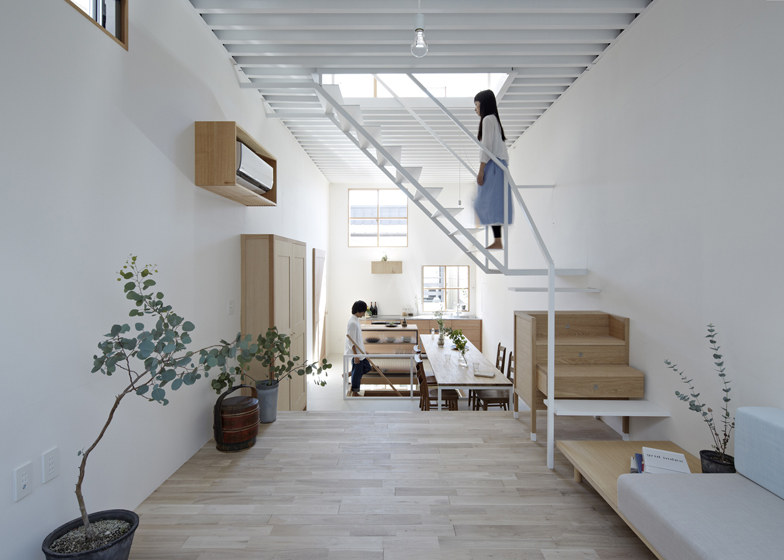
Steps up from the middle floor are created by solid drawers that appear to be pulled out from a dresser, which can still store items inside. A low coffee table provides the first tread.
The furniture fills the gaps between an otherwise white metal staircase ascending to the top floor.
"I always think the way of dealing with stairs is important in houses, especially in small ones, said Shimada. "One of the general methods is to place a stair at the middle of one room allocating functions on both sides."
This central floor functions as an open-plan living space, with the slightly raised seating area connected to the kitchen via two small tables.
A small toilet is housed in what looks like a freestanding cupboard.
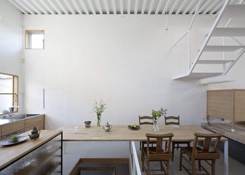
A second staircase leads down to ground level, descending beneath the dining table and through the top of a wardrobe, with the final steps also containing drawers.
The main bedroom and bathroom are located on this lower floor, either side of the entrance and stairs.
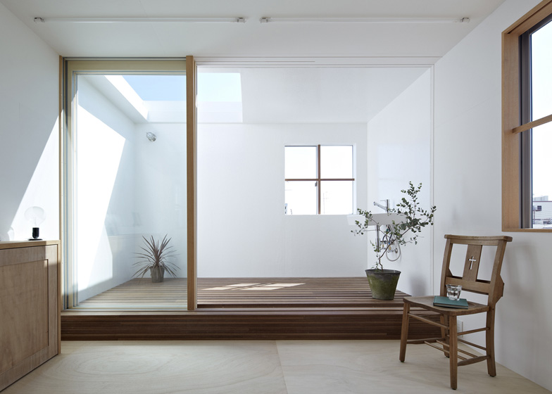
With a slanted roof at one end, the top storey has spare room for an office and guest bedroom plus a small terrace.
Corrugated metal clads the outer walls of the house, which are each set back half a metre from the edge of the plot to comply with Japanese planning regulations for dense urban areas.
Tato Architects also designed public toilets that comprise a single curved wall sheltered beneath a gabled roof and converted a warehouse in Osaka into a house where residents can climb up the walls.
See more Japanese houses »
See more projects by Tato Architects »
Here's the project description sent to us by the architects:
Widening interspace to utilise
Many of the requests to us for designing a house are accompanied with a prerequisite of ensuring a house for a nuclear family at an extremely subdivided lot, to which we cannot easily apply the manners of architecture having been accumulated for long time in Japan. We repeated trials and errors while designing as we think we are in the formative period for a new manner.
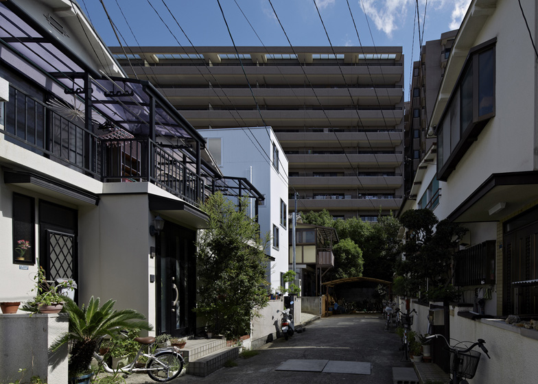
This time was not the exception as well. For this level of density of urban houses, where outer walls of the adjoining houses do not touch each other, the civil law demands 500 millimetres setbacks of outer walls to form interspace of 1000 millimetres in width in-between those.
We have kept thinking if it is used more effectively. In this project, we gave 400 millimetres more setbacks from the boundary line of the north eastern adjacent land. As a result, there was 1400 millimetres wide interspace as a passage, which was 900 millimetres in width from the border of the adjacent plot, utilised by placed an entrance in the middle of the side wall faced to the interspace, which realised to minimise space for routing in the house.
The setback ensured the eave as high as about nine metres avoiding the north side slant line. Non-structural walls were pushed out outward providing space for closets etc. Accordingly, it provided bigger space containing facilities such as a toilet than as it looked from interior space like furniture, which brought ambiguity in perception of space.
Architecture and furniture
When I have the honour of seeing an architect-designed house, I sometimes feel as if design furniture is telling messages. I wonder if it is right to summarise by saying "respect the original space and don’t bring any unnecessary things", but it seems almost like a strong desire as much as to say not to fill the space with anything does not deserve it. Although I cannot say I don’t have such desire at all, I still aim to create space where a variety of things can be brought in and used in everyday life much more freely.
In this house, architectural elements such as stairs, a laundry space, closets, hand rails and toilets are made as if those are furniture. Except for those, there are only floors. As such, architecture and furniture are mingled and those meanings become relative each other, in which way I keep trying to create freedom in rooms as if all of those are just randomly placed and used by chance.
Like choreography notes
I always think the way of dealing with stairs is important in houses, especially in small ones. One of the general methods is to place a stair at the middle of one room allocating functions on both sides. Although it maximises usable area, it leaves the question if it brings rich spatial experience to live seeing every inch of the house and a stair all the time.
The ceiling of the dining room in this house is 3776 millimetres in height, which is determined to make the space under the staircase landing usable as routing. By making it extremely thin, the rest of the height was divided into 1880 millimetres downward and 1850 millimetres upward. Although those are tight dimensions, you can go through between two layers minding your head.
I think it is favourable for a house to have such a scale of physical bodies. Therefore, the dining table was placed over the stair between the ground floor and the first floor leaving space for residents to pass under it. Bodies appear and disappear under the table as residents go up and down the stair.
Once you slide the entrance door and slip into inside of furniture, you reach under the dining table, where faced to a big wall receiving sun light coming through the south window. You see the white wall softly lit from the north as you step on the small stool. To the second floor, you step on the sofa, furniture like a drawer, and the thin stair. At every steps toward upstairs, light conditions change as the direction and the size of space change. Stairs as choreography for spatial experience of this small, thin space.
Structure
As the site is located in the back of a narrow cul-de-sac and carrying-in by vehicle was limited, the structure with light materials such as 100 by 100 millimetres H steel sections for columns and beams, braces with round bars, 75-millimetre deck plates for the floor construction was applied. Those resulted in reducing the amount of steel materials, and the total construction cost to about as same as that of a wooden house.
The horizontal stiffness of floors was acquired with horizontal bracings of six-millimetre flat bars and 50-millimetre squared tie beams beneath concave parts of the deck plates. Floors on different levels were fixed to the columns at both ends so that the continuity of stiffness between those was still kept.


